
Instructive, Seductive, And Decorative Graphics
Richard Mayer’s cognitive theory of multimedia learning (2005) discusses how we process different types of information, the limits to our processing capabilities, and the principles for designing multimedia that make it easier to learn from. One is the multimedia principle, which states: “People learn better from words and pictures than from words alone” (Mayer, 2009).
Significant research shows that when we present words with relevant graphics, people can make connections between the words and the graphics that improve understanding and use. “Graphics” means still graphics such as photographs, illustrations, diagrams, charts, and motion graphics such as animation and video.
Experiment
Let’s consider how this works. The following text is from a lesson for a course on bones in the human body. This lesson is specifically about the bones in the arms and hands. While reading the text, try to visualize how the hand bones fit together.
|
The hand includes three types of bones:
|
Were you able to visualize how the phalanges, metacarpals, and carpal bones fit together? The information in this text doesn’t offer enough detail to know how these bones are arranged. A relevant graphic would be extremely helpful for visualizing the placement of these bones. Now, we’ll add a graphic, a photograph of a hand, to see if it is helpful.
| The hand includes three types of bones:
|
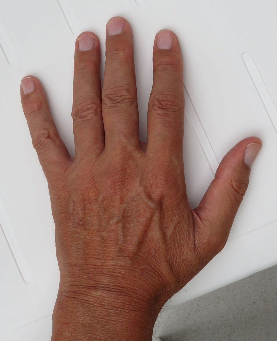
Image Source: see [1] below |
Does this photograph make it easier to visualize the bones of the hand? My answer is, “no.” I still can’t tell how the phalanges, metacarpals, and carpal bones fit together as the photograph doesn’t show what the text discusses. Let’s try another graphic. We’ll swap out the hand photo for a more detailed illustration.
| The hand includes three types of bones:
|
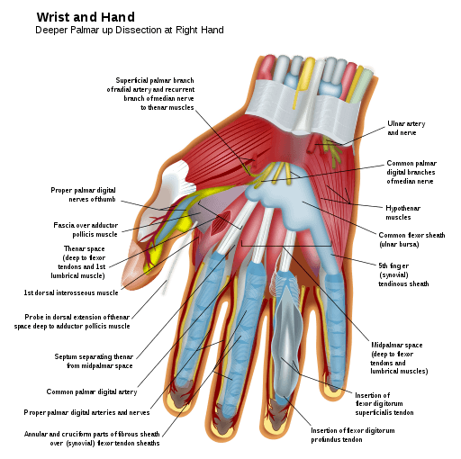
Image Source: see [2] below |
Does this detailed illustration make it easier to visualize the bones of the hand? Again, “no.” It’s a detailed diagram of structures in the hand, but the bones aren’t visualized. The illustration is related to the topic and super interesting (at least to me), but still, it adds little to my understanding of the bones in the hand. Later in the article, I’ll discuss why this type of image often reduces learning and should not be used. But before we get there, let’s swap in one more image.
| The hand includes three types of bones:
|
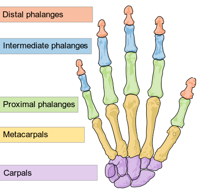
Image Source: see [3] below |
The illustration and labels show where the bones discussed in the text are located and how they fit together. The graphic “shows” what the text discusses, so text and graphics work together to improve understanding. The illustration has no unnecessary details and makes it easier to understand the text. Perfect! This is a good graphic to use to improve the understanding of the text.
The Relevance And Interestingness Of Graphics In Instruction
All graphics aren’t equally effective in promoting learning. The table below shows three types of graphics typically used in instruction and the learning effects of each type (Sung and Mayer, 2012).
| Graphic Type | Description | Example | Learning Effects |
| Instructive | Directly relevant to the instructional goal. | Illustration showing the bones in the hand in a lesson about the bones that make up the hand. | Often good for learning, typically high relevance, typically neutral to high interestingness. |
| Seductive | Very interesting but not directly relevant to the instructional goal. | Colorful illustration showing a hand dissection in a lesson about the bones that make up the hand. | Often reduces learning, typically low relevance, typically high interestingness. |
| Decorative | Neutral but not directly relevant to the instructional goal. | Photograph of a human hand in a lesson about the bones that make up the hand. | Often neutral to learning, typically low relevance, typically neutral to low in interestingness. |
The types of graphics and effects in the table above are adapted from Sung and Mayer, 2012.
Remember the experiment where I swapped graphics until I found the most appropriate graphic to use? The last graphic was instructive, the middle graphic was seductive, and the initial graphic was decorative.
These three kinds of graphics differ in terms of their relevance to the instructional goal. “Relevance” is the degree to which the graphic supports the instructional objective(s) and displays relationships or other significant attributes described in the text. Instructive graphics are the only type that is high in relevance (Sung and Mayer, 2012).
Graphics also differ in terms of their interestingness. “Interestingness” is the degree to which the graphic draws the learner’s attention. Seductive graphics tend to be low in relevance but quite high in interestingness whereas decorative graphics tend to be low in relevance and neutral to low in interestingness. Instructive graphics are high in relevance and are often neutral to high in interestingness.
Seductive graphics “seduce”: “learners to process…irrelevant information…at the expense of relevant information” (Bender, Renkl, and Eitel, 2021). We tend to add seductive graphics to make content more interesting, but many people don’t realize that “seductive details… hamper rather than help learning” (Bender, Renkl, and Eitel, 2021).
Q: Which type(s) of graphics are highly interesting but tend to damage learning? (Select the correct answer)
a) Instructive
b) Seductive
c) Decorative
The answer is at the end of this article.
How Seductive Graphics Damage Learning
Learning with multimedia frequently places high demands on working memory, which is needed to process new information but is limited. Relevant graphics are useful because they help participants make connections between the text and the graphic, which helps with the deeper processing of important aspects of the content. For example, photographs of the items used to test blood sugar at home (lancet device, glucometer, glucose strips, alcohol wipes) would be valuable in a pamphlet showing people newly diagnosed with diabetes how to test blood sugar at home.
Using attention-grabbing but irrelevant (seductive) graphics damages learning by encouraging participants to process aspects that have little to do with the instructional content and by making them try to figure out the relationships between different content elements (including the seductive graphics). An example of seductive graphics in the testing pamphlet might be a table showing increases in type 2 diabetes diagnoses from 1960 to the last year when the pamphlet is specifically about testing your blood sugar at home.
Seductive graphics use limited working memory capacity for content that is currently irrelevant, so we expect that seductive graphics will decrease learning, and many studies show this to be the case. Seductive graphics are most harmful when participants process content that doesn’t support the instructional objectives and waste the attention and processing that is needed for more important content. There are three ways that seductive graphics can lead to reduced learning, as described below (Bender, Renkl, and Eitel, 2021):
| Problem | Description |
| Distraction | Focus and attention shift from important to seductive content. |
| Disruption | Seductive content interferes with building an accurate understanding of important content. |
| Diversion | Participants integrate seductive graphics into important content, causing misconceptions. |
The table above is adapted from Bender, Renkl, and Eitel, 2021.
The cognitive load that irrelevant information adds can make learning more difficult and less clear. If you are building instructional materials, leave out seductive graphics to make it easier for participants to make sense of complex materials or learn without overload, especially for people with less prior knowledge (newer to the content).
If you’re using others’ materials and they contain seductive information, you can help participants by telling them which information isn’t relevant and can therefore be skipped (Sundararajan and Adesope, 2020).
If you want to add interestingness, stay away from seductive materials. Instead, add breaks, discussions, Q&A sessions, relevant practice, and stories that illustrate important principles.
Q: Which of these graphic characteristics is most critical to helping people learn? (Select the correct answer)
a) Relevancy
b) Interestingness
c) Complexity
The answer is at the end of this article.
Q: Which of these graphics would be most relevant to use in a lesson on traveling while in northern Italy? (Select the best answer)
a) A photographic collage of places to visit in Milan and Turin
b) A map showing passenger rail lines throughout northern Italy
c) A full-color spread showing the dinner menu from a hilltop trattoria
The answer is at the end of this article.
References:
- Bender, L., A. Renkl, and A. Eitel, A. 2021. “Seductive details do their damage also in longer learning sessions—When the details are perceived as relevant.” Journal of Computer Assisted Learning 37 (5): 1248–1262.
- Mayer, R. E. 2005. “Cognitive theory of multimedia learning.” In The Cambridge Handbook of Multimedia Learning, edited by R.E. Maye, 31–48. New York: Cambridge University Press.
- Mayer, R. E. 2009. Multimedia learning. 2nd ed. Cambridge: Cambridge University Press.
- Sorden, S. D. 2013. “The cognitive theory of multimedia learning.” In The Handbook of Educational Theories, edited by B. J. Irby, G. Brown, R. Lara-Alecio, and S. Jackson, 155–167. Charlotte, NC: Information Age Publishing.
- Sundararajan, N., and O Adesope. 2020. “Keep it coherent: A meta-analysis of the seductive details effect.” Educational Psychology Review 32: 707–734.
- Sung, E., and R. E. Mayer. 2012. “When graphics improve liking but not learning from online lessons.” Computers in Human Behavior 28 (5), 1618–1625.
Correct Answers To Questions:
Which type(s) of graphics are highly interesting but tend to damage learning?
a) Instructive
b) Seductive
c) Decorative
Which of these graphic characteristics is most critical to helping people learn?
a) Relevancy
b) Interestingness
c) Complexity
Which of these graphics would be most relevant to use in a lesson on traveling while in northern Italy?
a) A photographic collage of places to visit in Milan and Turin
b) A map showing passenger rail lines throughout northern Italy
c) A full-color spread showing the dinner menu from a hilltop trattoria
Image Sources:
[1] Sciencia58, CC BY-SA 4.0 <https://creativecommons.org/licenses/by-sa/4.0> via Wikimedia Commons.
[2] Wilfredor, CC BY-SA 3.0 <https://creativecommons.org/licenses/by-sa/3.0>, via Wikimedia Commons.
[3] LadyofHats, Public domain via Wikimedia Commons.