
Did you know that more than 40% of your potential customers will leave after viewing a single page?
The average bounce rate for eCommerce in 2020 and 2021 ranged from 42.5% to 44.1%. That means that about half of your web visitors leave before you’ve had a chance to convince them to buy something from you.
In rare cases, high bounce rates aren’t a cause for concern. This includes single-page sites and blogs where the aim isn’t to get people to click through to a product page but to view the content they came to see.
For example, suppose a potential customer searches for your physical address. In that case, it’s safe to say that them landing on your contact page, locating your address, then closing their browser tab counts as a conversion even though that person left your site after viewing a single page.
But for eCommerce websites, high bounce rates are the ultimate conversion killer. They stop you from capturing new leads, indicate poor UX design, and signal that your content may not be optimized to appeal to your target audience.
New eCommerce websites face even more significant challenges because they are building a new audience and haven’t yet had time to optimize their landing pages. As we emphasized in our guide on how to start an eCommerce business:
It’s not enough to have a pretty website. There need to be some serious coding guts behind the design to make an eCommerce website do everything that it needs to do – and do it well.
The optimal bounce rates for most eCommerce sites range from 25% to 40%. If your website’s bounce rate is higher, you have a terrific opportunity to grow your business faster through conversion rate optimization.
So, without further ado, let’s explore eight tips for engaging your website visitors and reducing bounce rates to ensure all potential customers see your business’s value.
Lead with a powerful value proposition
One of the easiest ways to lower the bounce rate on your website is to take a good look at your value proposition. Ask yourself:
- How well does it communicate the unique value you offer to potential customers?
- Does it match customer expectations and buyer intent?
- Does it differentiate you from the competition?
The key to engaging website audiences lies in expertly zooming in on their pain points and instantaneously offering a solution.
People don’t want to read through pages of text to see what your brand can do for them. Research from the past two decades proves that people don’t want to read on the internet. They skim pages until they land on a piece of information they need and want.
Powerfully simple strategy for business growth

Our brand identity workbook has actionable insights and steps to help you build a strong brand identity.
We just emailed the brand identity workbook to you.
So, to minimize bounce rates, you have to ensure that your webpage has the potential of showing that visitors have come to the right place. That means you’ll have to look for ways to optimize your value proposition.
There are several easy ways you can do this:
- Remember, you only have about 50 milliseconds to leave a positive impression on website visitors. To do so, keep your hero section clutter-free, with your unique selling proposition taking center stage.
- Address your audience’s pain points to hold onto their attention and pique their interest.
- Use concise and meaningful text to communicate your message.
- Don’t try to sell your products right away. People want to see what they will get first. Then, they’ll be ready to decide whether to buy from you or not.
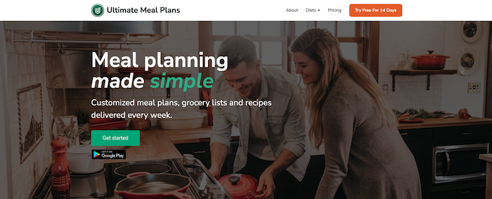
An outstanding example of a brand that manages to engage web visitors with a powerful value proposition comes from Ultimate Meal Plans. This company’s selling proposition says: “Meal planning made simple.” The 4-word sentence perfectly addresses the company’s audience’s pain points and describes the brand’s offer.
Then, the text below elaborates on the sales proposition, explaining what potential buyers can expect and communicating the types of value people receive by subscribing to the service.
Showcase striking visuals early
What factors do buyers consider when making purchasing decisions?
Some resources state that up to 95% of purchase intent-affecting elements are subconscious. Namely, they come from people’s emotional response to the products they’re considering buying.
But, more recent research shows something else that impacts consumers’ willingness to buy: aesthetic appeal.
Good website design is good business. Your company’s visual identity is essential to build trust and overcome friction commonly found when people visit your website.
So, knowing that design can encourage (or discourage) your target audience to make a buying decision, why not use it to reduce your bounce rates and keep people interacting with your site?
A simple way of doing this is to use your (hopefully next-level) product photography to get an early opportunity to make your offer appealing to consumers.
For example, the MannequinMall website showcases the brand’s most sought-after products in the hero header. The visual solution works because it gives first-time visitors a taster of what they can expect when browsing the product pages.
Moreover, it proves that MannequinMall makes high-quality items guaranteed to satisfy even the most demanding client’s standards.

Limit distracting ads
A few years ago, the Nielsen Norman Group decided to study the most hated online advertising techniques. Interestingly, they found three elements the majority of web users detested:
- Modal ads (popups)
- Ads that reorganize content
- Autoplaying videos
So, if your goal is to engage web visitors and keep them from bailing from your site, try looking for ways to stop these elements from ruining a great user experience.
Of course, this doesn’t mean that you should say goodbye to all ads on your site. For example, popups have an average conversion rate of 11.09%. The number is far from being insignificant, especially if your goal is to capture leads or move consumers through the sales funnel.
However, it is safe to say that including too many popups (or other intrusive elements) on your homepage won’t boost your conversions but will lead to high bounce rates.
For an example of what you should avoid doing if you want to engage web visitors and minimize your bounce rate, check out the SHEIN homepage. Upon landing, visitors are immediately presented with a popup, which is not a bad strategy. However, as soon as they close the first ad, they’re presented with another.
To improve the site’s UX, the brand should increase the time between the two popups and reduce the number of CTAs on the homepage. That way, web visitors will have a chance to see what the store offers, but they won’t feel bombarded by sales propositions from the moment they land on the website.
Understand your audience
One of the leading causes of high bounce rates on business websites is poor targeting.
No matter how hard you work to improve the conversion rate on your site, you won’t get results if you don’t have a clear understanding of your audience.
And even if you invest thousands of dollars in marketing and get an exceptionally high volume of traffic to your site, targeting the wrong people will ensure that all those bucks are, effectively, money down the drain.
So, to reduce your bounce rate and ensure that you have the highest chance of converting web visitors into customers, look for ways to improve the way you target your audience.
- Start by creating a buyer persona. Identify your ideal customer, their pain points, and their age, location, income, and interests. Knowing who you’re trying to reach will be of essential importance in attracting the people who could become buyers and will give you ideas on how to grab their attention.
- Determine the best marketing channels to build website traffic. A clear understanding of your audience ensures that you don’t waste time (or money) on the wrong marketing channels. For example, if you’re selling professional-grade tech products, you probably won’t want to squander your precious marketing budget on teenage TikTok users browsing gaming videos between classes at school.
- Optimize your messages to speak to your audience. Finally, to get your target audience to interact with your website, don’t forget to compose messages that resonate with your website visitors. If they came to your site looking for Broadway tickets, then your copy had better mention those Broadway tickets. (Unless, of course, you want them to buy from your competitors.)
For an example of a brand that understands what it takes to get its audience engaged, check out the Bullet Journal website.

The brand mentions two main selling points in the hero section: productivity and mindfulness. Furthermore, it also uses the homepage copy to continue appealing to its target audience by repeating keywords like productivity, system, practice, intentional life, growth, etc.
This shows that the marketers behind the brand understand their audience’s pain points and ambitions and know what they need to offer to get those people to consider giving the Bullet Journal method a try.
Ensure your copy has high readability scores
Using complicated language is one super-easy way to alienate your audiences and make sure they don’t stick around on your website.
Yes, you read that right. When looking to engage website visitors, reduce bounce rates, and boost conversions, the worst thing you can do is make your copy inaccessible to the majority of the population. And statistical data shows that the average American reads at the 7th to 8th-grade level.
So, what does this mean for improving your bounce rate? You should focus your energy on optimizing your website copy for readability.
An experienced copywriter will already know how to do this.
However, if you’re taking the do-it-yourself (DIY) route, there are ways you can ensure that all your web visitors understand your copy:
- Keep sentences short and to the point.
- Avoid using industry-specific jargon when targeting general audiences.
- Utilize formatting techniques and bullet points to break the text into bite-sized bits.
- Choose bigger fonts and check the contrast between the text and the background.
- Hide long explanations between collapsible UI elements to avoid overwhelming first-time web visitors.
- Use negative space to add some breathing room to your text website and to draw user attention to the highest-value elements on your page.
- Design great lead conversion forms.
- Check your copy with a tool like Hemingway, Grammarly, or Linguix.
To see how easy it can be to explain complex products to a large (non-expert) audience, check out the SomniFix homepage. The website implements the above tips and utilizes a combination of text and visuals to explain how the product works and why mouth taping solves issues like snoring and poor sleep quality.

Make use of explainer videos
Did you know that videos get higher engagement rates than any other content format?
Video marketing can be a powerful tool in your marketing arsenal. According to statistical data, people love watching videos. In fact, in 2021, the average adult watched 103 minutes of digital video per day.
And that’s not all. Consumers love it when brands use videos too. Wyzowl’s State of Video Marketing Report for 2022 shows that:
- 73% of consumers like learning about new products by watching a short video.
- 88% have been convinced to purchase a product after watching a video.
- Audiences are 2x as likely to share a video with their friends than any other format.
So, knowing that videos work particularly well in engaging customers, why not use the format to reduce bounce rates and get more people to convert?
Address common customer trust issues
If you experience high bounce rates on your website, ask yourself whether you’re doing enough to win customer trust.
After all, if they’re not sure whether your business can be depended upon to deliver on its promises, people most likely won’t want to waste time browsing your offer.
Fortunately, addressing customer trust issues and inspiring people to have faith in your business is something you can do with just a couple of homepage elements. This should be an essential part of your brand strategy.
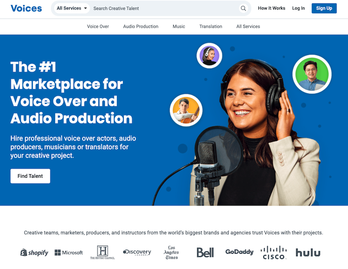
For one, displaying social proof is an excellent strategy to show the value your existing clients got from your brand. You can show off testimonials, ratings, and media mentions. You can even showcase your well-known customers, as Voices does, just below the hero header of its homepage.

Secondly, you can further build trust and encourage web visitors to interact with your website by using elements like trust badges. Use these to communicate that you guarantee transactional security, that you offer free shipping, that your products come with quality assurance, or that you have systems to keep user data secure.
Telegram, for example, does all this while adding a cuteness factor to its trust badges in the form of a rubber duck. If that doesn’t convince web visitors to stick around, not much else will.

Finally, to ensure that your audience understands that your brand is to be trusted, don’t forget to make it super-easy for them to get in touch with your customer service team.
Take a look at the Rain or Shine Golf homepage. You’ll see that the brand allows potential buyers to get in touch via live chat and phone, and email. It’s made it convenient for them to reach out and ask their questions (and, hopefully, convert them into customers).

Use exit-intent popups to re-engage visitors
Finally, as you look for strategies that will help you engage website visitors and reduce your bounce rate, understand that, in some cases, your audience won’t feel compelled enough to stick around on your site.
However, there’s one last tactic you can try to keep them browsing: using exit-intent popups.
Being fully optimized to deliver maximum value to web visitors who haven’t converted on your site, exit-intent popups are a super-effective method to display high-value offers to web visitors you’re sure to see the back of.
Popupsmart uses these ads perfectly, inviting blog readers to schedule a product demo meeting or sign up for a free trial and experience first-hand the benefits of using the brand’s products.

Sure, using exit-intent popups is a simple strategy. Nonetheless, when targeting users looking for quick fixes, it might be the best approach for holding onto their attention and maximizing their chances of converting.
Final thoughts
Many businesses, including industry leaders, struggle with high bounce rates. So, if you’re among those who see this KPI regularly surpass the 50% mark, don’t be discouraged.
The truth is that it takes time to reduce bounce rates. Fortunately, it’s not that difficult to do as long as you’re prepared to experiment with your value proposition, invest in high-quality website design, and understand your target audience.
So, go ahead and give these tips a try. You might find that implementing just one or two is enough to get you to an optimal 20-40% bounce rate. Or, you might discover that your offer needs a bit more work.
But rest assured, whatever the outcome, you’ll have done a great deal to ensure the future of your business. And even if getting web visitors to stick around requires more advanced solutions, by applying the strategies from this article, you’ll have covered your bases and have created a strong foundation on which to build your success.

