Several months back, our photographer Michelle and I were planning our upcoming shoots and discussing how much we wanted a light-filled space to shoot recipes in. As much as I love our kitchen, it’s actually the spot in our house that gets the least amount of natural light, making photo and video shoots tricky in there. Plus, the fact that it’s also where our family hangs out everyday makes it a less-than-idea place for our team to get creative work done.
“It’s too bad we couldn’t turn your guest bedroom into a studio,” Michelle remarked. “It gets the best light in the house.”
“Oh I wish!” I answered. But then I thought… wait. Could we?
I couldn’t let go of the idea, and within the week, I’d convinced Adam that we really could do without our guest bedroom. We’re both big believers in using every area of the home to its fullest capacity, and though I didn’t exactly love the idea of giving up our only guest room, knowing that this new space would be one that would support our daily creativity and collaboration far outweighed our reservations.
Goals for this design project
As I started planning how to turn this bedroom into an actual studio to support all kinds of creative work, I had a few main goals in mind:
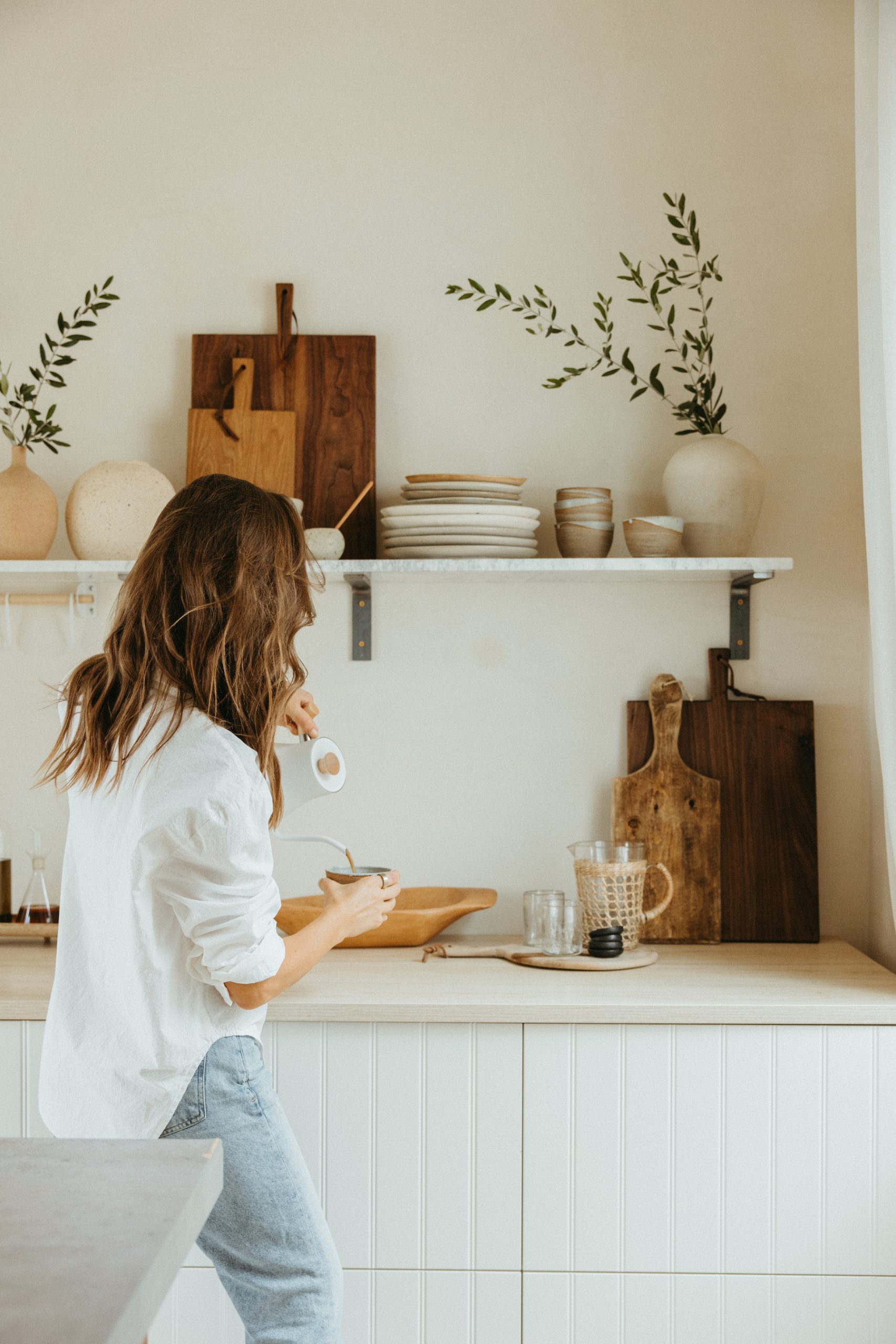
Kitchen prep space. This would be the space where we’d be shooting our recipe photos and videos. Though I wasn’t going to be able to install true kitchen appliances, I wanted it to have countertops and prep areas to function (and read) like a real kitchen.
Maximize the light. We chose this room for the incredible light that it gets, so I wanted to position the layout to maximize the angles of sunlight throughout the day
Create a backdrop for shooting Casa Zuma. In addition to our recipe content, I wanted to have a space where we could quickly shoot new products for the Casa Zuma website. Having lots of pretty neutral backdrops and open display shelving was a must.
A central worktable for projects and collaboration. Crafting, cooking, setting up our laptops for meetings—we needed a central worktable and island that was an open space for collaboration.
Budget. I needed to do it all on the cheap! I knew I’d have to get creative to make this space as beautiful as I was envisioning, without dropping tons of cash. I’m proud to say that the entire project came in at just over $2,800.
Before and after
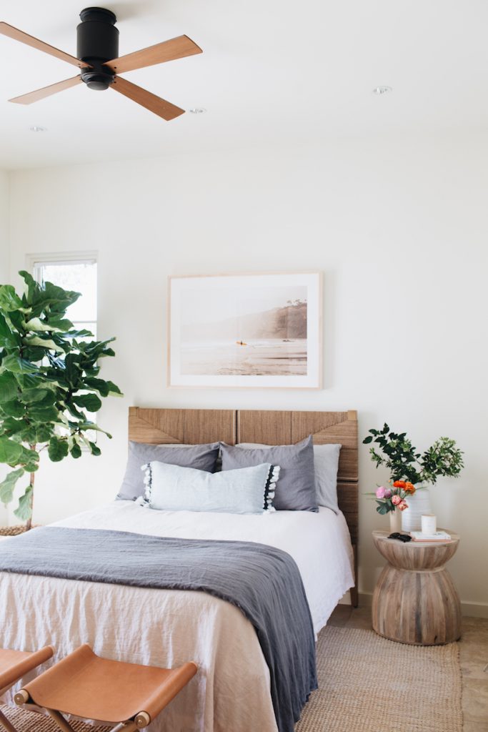
On the left: the “before” space when it was setup as our guest bedroom. I really loved the space, but since almost all of our family lives in Austin, we didn’t end up using it that much, and I’m not a fan of having rooms that sit empty in a house when they could serve a much more useful purpose! Plus, it was time for Henry to get a bigger bed, and this woven neutral headboard was perfect to repurpose for his bedroom upstairs.
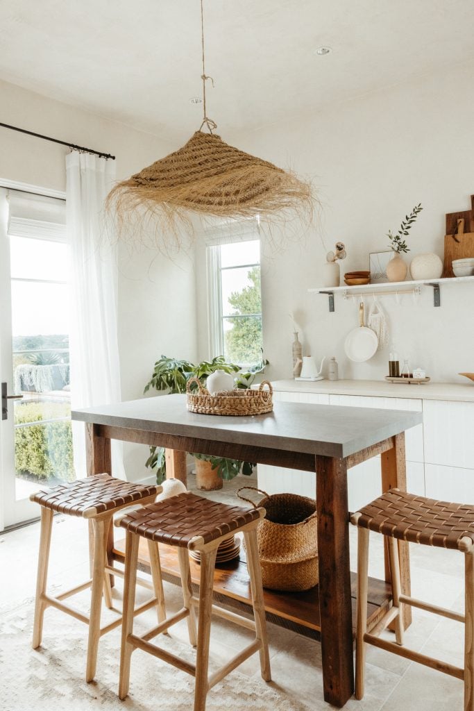
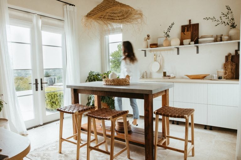
On the right: the after! The new studio has turned out to be an amazing place for our team to work, with tons of light and great energy. The one budget item that I didn’t include in my total calculations was plastering the walls, which you’ll see adds a lot of depth to the after photo. We actually did this in our mini-remodel a couple years ago that I covered right here.
Scroll on as I break down the main elements that brought this room together…
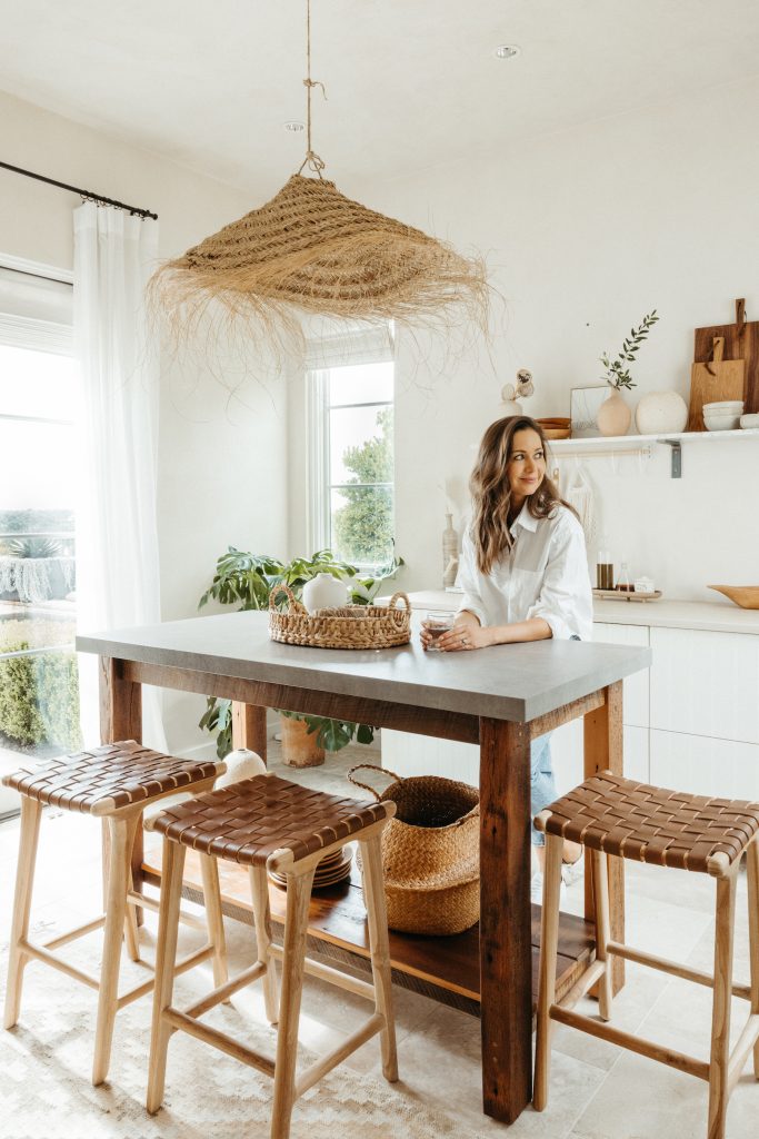
The island / workbench
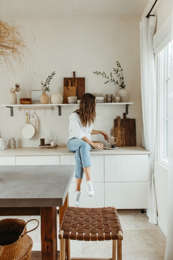
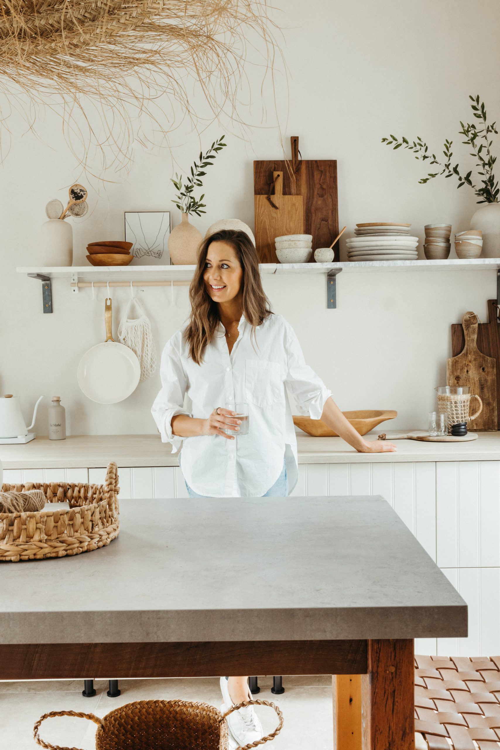
I searched high and low for a counter-height island that was the right dimensions for this room. It needed to be big enough to provide plenty of workspace, but not so big as to make it difficult for us to freely move around the room. And I wanted something with a timeless, rustic design, and vintage vibes–which meant using reclaimed wood.
My initial search came up empty, but then stumbled upon an Etsy shop called Whatman Barn Furniture that makes custom islands out of reclaimed wood. I reached out and let him know what I was looking for, and 6 weeks later a huge crate showed up in my driveway with our beautiful new island.
I surrounded it with three of my woven leather counter stools from Saffron + Poe, and it feels just perfect.
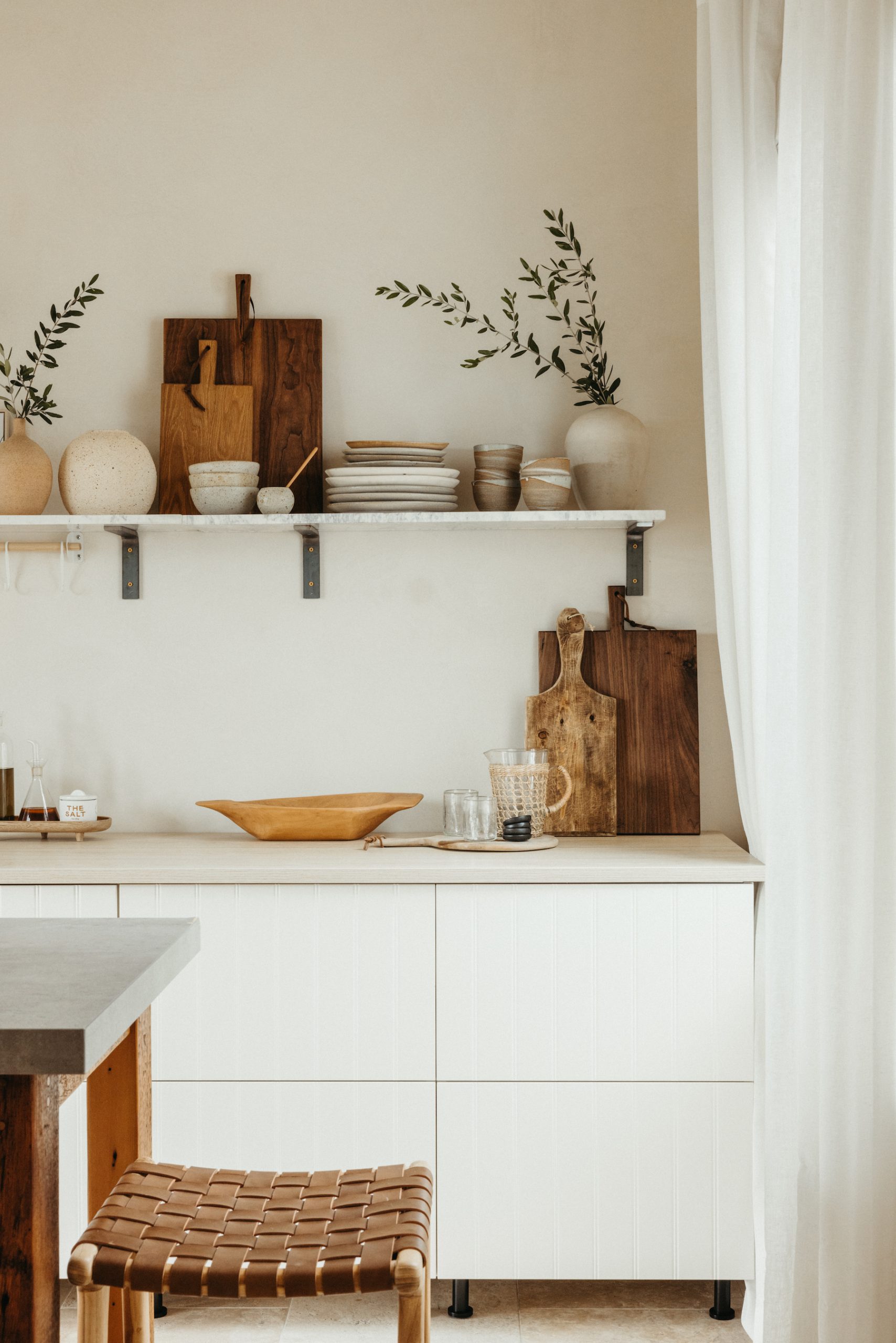
The lower cabinetry and countertop
IKEA scores all the way, baby! I was super excited when I found these sets of drawers with a texture resembling shiplap for that classic, European farmhouse-style vibe I was going for (I think that finish is gone, but there are lots of other good ones. I love the light ash.) I topped them with a big slab of their laminate countertop in a bleached wood tone, and we were set. One note that I learned the hard way: if you want these to be counter-height, be sure to order the little legs that go on the bottom to raise the counter up off the floor.
The open shelving
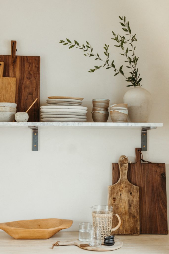
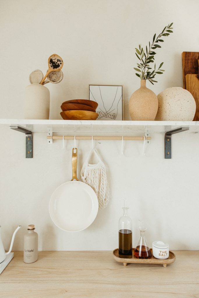
This was a tricky one for a few reasons. I wanted a single marble shelf that ran the length of the countertop for an elevated, graceful spot to display dishes, cutting boards, and Casa Zuma pieces. However marble shelves tend to be (a) very expensive, and (b) difficult to mount because they’re extremely heavy. Here was my solution—I’ll admit it’s not perfect, but it really was the best bang-for-the-buck and I’m mostly happy with how it turned out.
First, I found these marble shelves on clearance at Ballard Designs (yes, that required a deep internet search, and yes, sometimes the most unlikely sources turn out to be a gold mine.) Since I didn’t want to have to cut into the drywall to mount internal brackets, I decided to use visible steel brackets for a slightly industrial look. I ordered these from Etsy.
Next, it was time to mount them on the wall, which didn’t go as smoothly as I’d hoped. I wanted to space the 4 brackets out exactly evenly across the wall; however once we started drilling, we ran into some inconvenient wall studs that prevented us from placing the brackets exactly where I’d wanted. We made it work though, by getting a little creative with the spacing. Progress not perfection is the goal, guys (I keep telling myself that. And yes, this is probably something I’ll want to redo later.)
The woven light fixture (it was $39!)
This woven pendant in the center of the room is definitely my favorite steal. I found it on Etsy from the Beldi Boheme shop, and it was exactly the California-meets-Mallorca vibe I was looking for. We removed the ceiling fan that was in the room previously and replaced it with a simple lightbulb pendant that runs right through the center of the straw basket. It’s exactly the finishing touch this room needed.
