When we initially decided to add 1,000 square feet to our Malibu beach house as part of the renovation, I mentally divvied it up into various parts of the house: extending the primary suite, maybe adding on a new bathroom and closet, expanding the kitchen. That type of thing. So, when I laid eyes on our architect Doug Burdge’s first draft of our renovation plans, I was surprised that he’d put all of our additional square footage into one space, which he dubbed “The Great Room.” Upon greater examination, it turned out to be one giant open kitchen with a fireplace on one end. Huh.
Though my initial response was surprise (“Are we sure that’s the best use of space?”), Doug’s plan revealed what I consider to be a very modern approach to architecture—designing with our needs and personal values first, even if that meant throwing out a few expectations in the process.
Since our family’s top priority is to create an atmosphere for connection and making people feel welcome, what better way to foster that sense of togetherness than through one big open room that’s made for gathering? The more I looked through my inspiration photos and envisioned the family holidays and dinners with friends in this house, the more excited I got about the space.
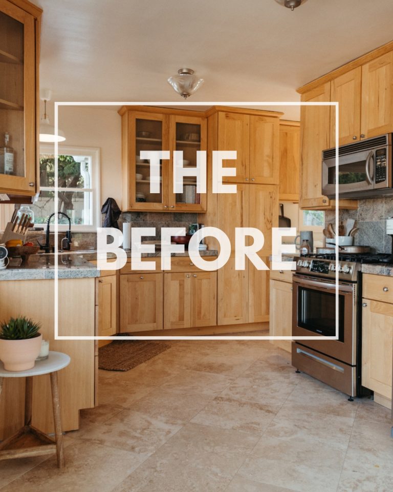
So, let’s start with a look at the house’s current kitchen, to give you an idea of the less-than-ideal conditions we’re working with (and why we’re starting from scratch with it.)
Here is the current kitchen:
The current bungalow kitchen is wedged into a corner of the back of the house. When I’m cooking or doing dishes, my back is turned to anyone else in the room. Overall it has a closed-off feeling that’s not conducive to my style of cooking, which is all about casually conversing with Adam or my kids while I chop.
I have a long-held dream of a massive kitchen window above the sink that floods the room with sunshine.
It’s a design element I’ve never had in a house that I’ve lived in, hence why my “Dream Kitchen” Pinterest board is covered in huge kitchen windows.
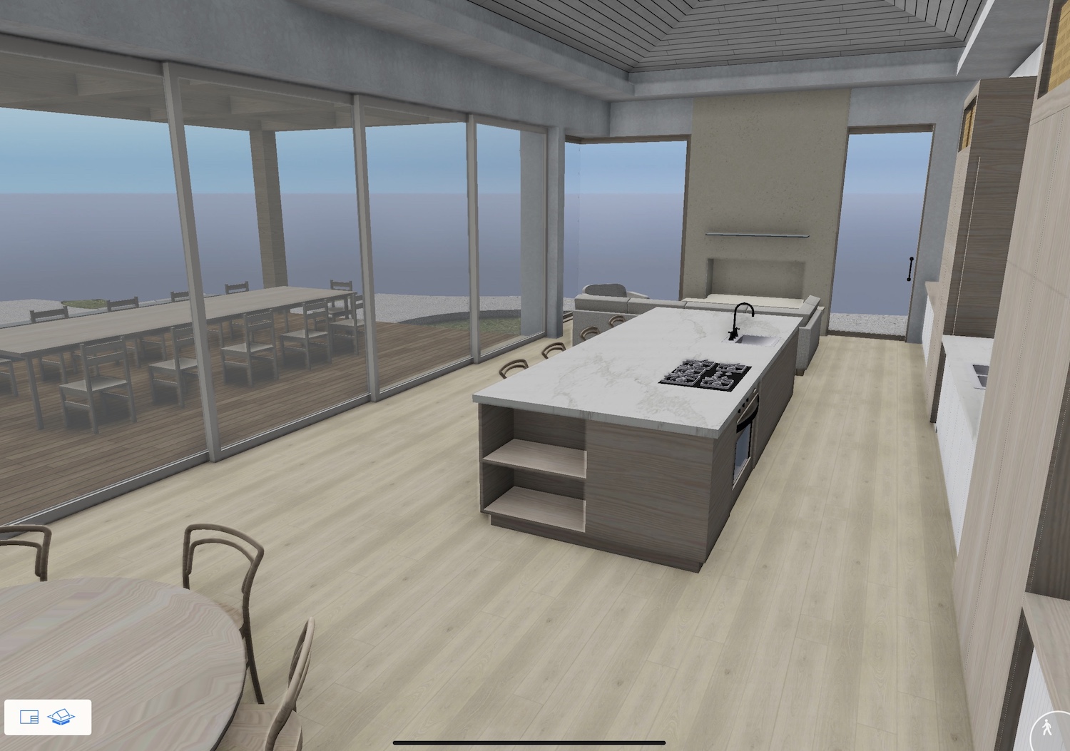
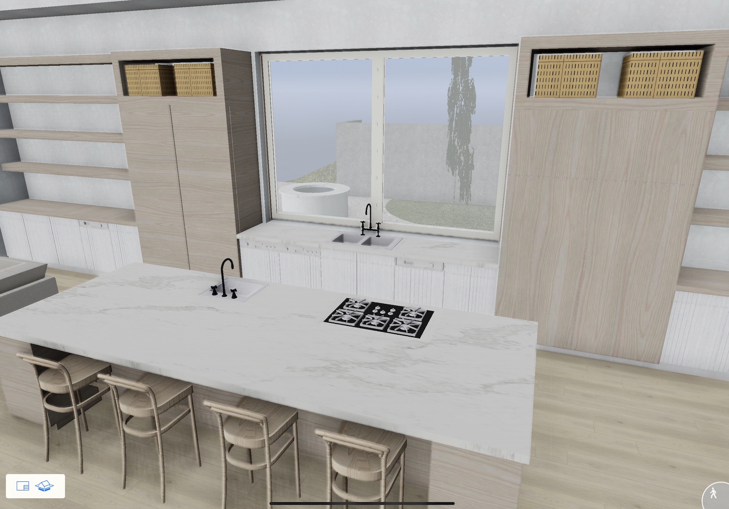
And now, for the new Great Room addition—I’ll lead with the visuals to give you an idea of what we’re envisioning, and then I’ll explain. Here is the interior rendering—note that colors and finishes aren’t accurate yet, but this shows the space:
I can’t wait until the day when I’m prepping for dinner with the music turned up, glass of wine in hand, and ocean breezes blowing in through the open doors.
Here are a few of the key elements that we’ve carved out for this space:
Wall of doors that fully opens
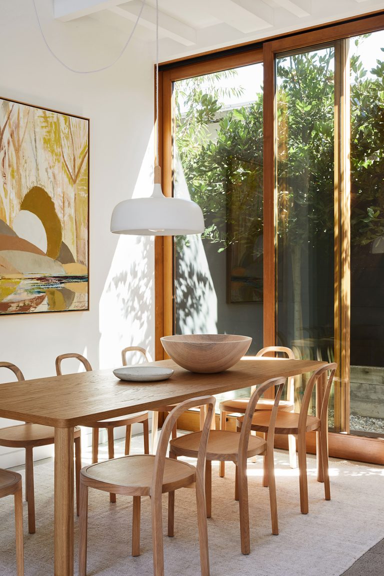
I think that every house should have one element that makes a major statement. It’s the design moment that, if guests remember little else, at least they won’t forget it. In our beach house project, the 30-foot wall of pocket doors that open straight to the outside is, without a doubt, that statement. Since one of the reasons we’re drawn to Southern California is the ability to spend 12 months of the year outside, one of our top priorities is creating a natural flow between the indoors and out. All of our windows and doors are coming from Marvin, and I’m really excited about the beautiful wood-framed selections we’re going with.
PHOTO: inspiration image from our home tour with jodie fried
Plus, this seamless transition enables us to turn the covered terrace into an outdoor dining room that will feel like part of the great room space. No, it’s not a conventional approach to a dining room, but for a family that loves to eat as many meals outdoors as possible, it works.
Oversized kitchen island
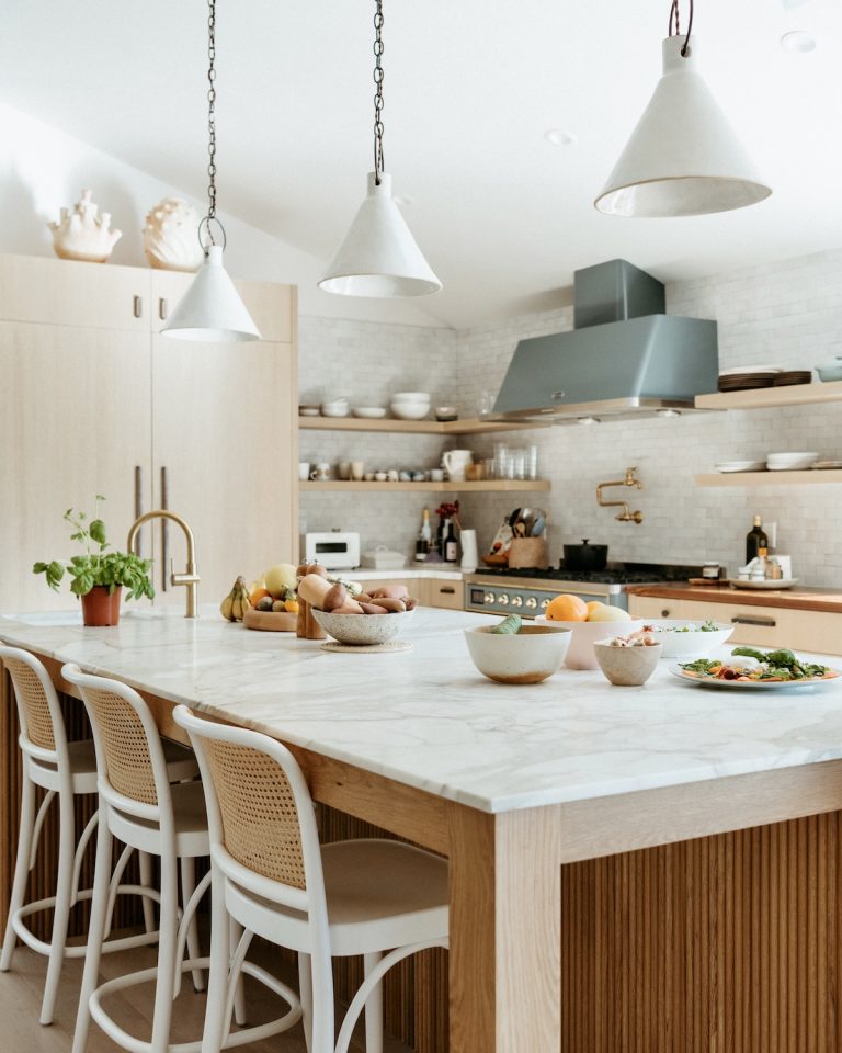
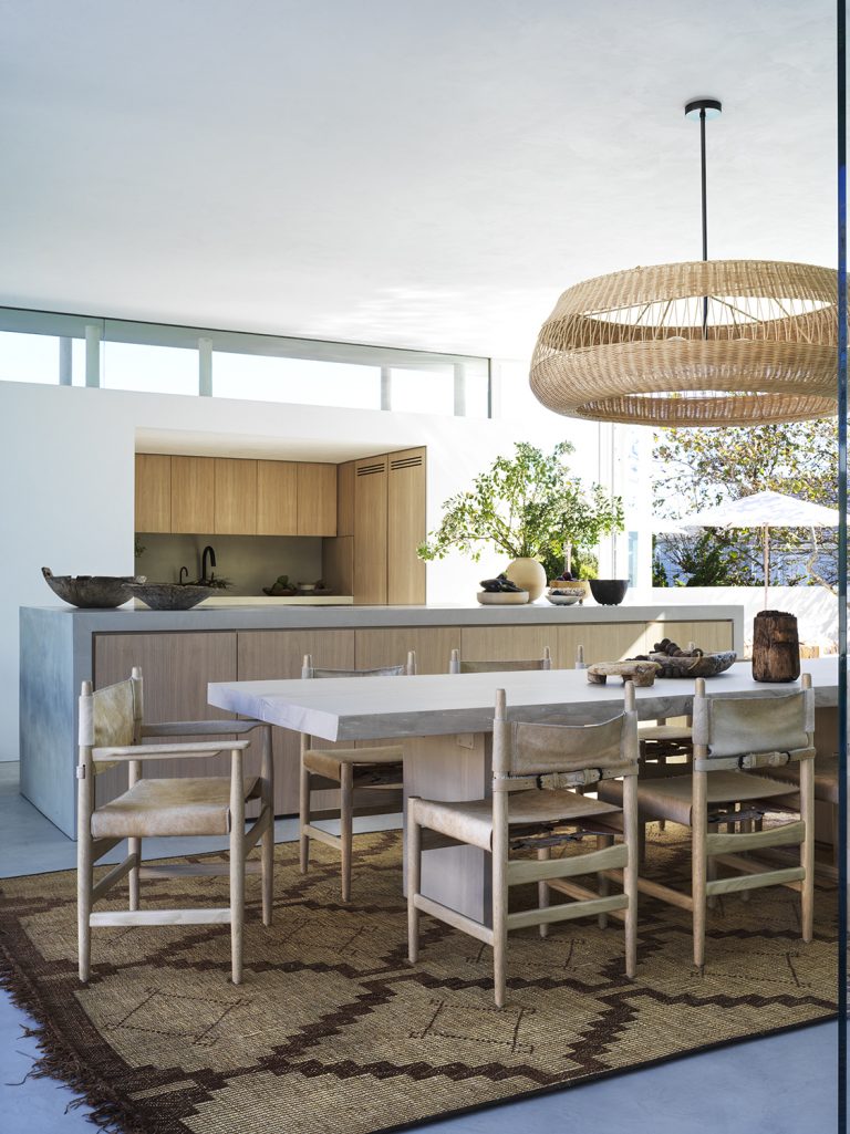
The Great Room’s focal point is a 13-foot kitchen island that at first felt almost too big, but upon further investigation, is scaled just right in context with the size of this room. This is a hardworking island that will more than earn its keep—not only will it be the central gathering place for kitchen prep and casual dining, but it will also house the cooktop and main sink, plus tons of storage. The interior side of the island will have deep drawers where we’ll keep everything from plates and bowls to flatware. The side facing outward will have open shelving for cookbooks and display objects on the corners with space for barstools in the center. Since the rest of the kitchen has minimal cabinetry, we’re relying on this island to hold a lot.
PHOTO: kitchen island inspo from our home tour with Brian and Jessie De Lowe
Fireplace to anchor the room
Since we’re not adding a designated “living room” to the house, we’ve carved out one end of the great room as the area where we’ll cozy up with a glass of wine and a good book. And there’s nothing like a fireplace to welcome everyone to kick up their feet —plus it’s a design element that will provide clear differentiation between the “cooking” part of the room and the “relaxing” part of the room, even though they won’t be separated by an actual wall. We’re planning to position a round table surrounded by low-slung chairs in front of the fire—an inviting spot for a cozy dinner for two or game night with the kids.
Beverage station
I wanted to design the more “lounge-y” side of the great room (near the fireplace) in a way that flowed with the kitchen, but didn’t feel like you were still in the kitchen. However, since we traded in most of our upper cabinetry for a massive kitchen window (more on that below), we needed all the extra storage we could get. So, I designated the wall that runs perpendicular to the fireplace as a bar and beverage station. It will hold practical items like wine storage, coffeemaker, mugs, and glassware. And it will also feature more design-forward elements, like our vintage turntable and sculptural objects on the open shelving, to keep it from feeling too much like part of the kitchen.
And last but not least… I finally get my big kitchen window!
As mentioned, I’ve long dreamed of a statement kitchen window that floods the space with sunshine. And not only will our 10-foot wide x 6-foot high window let in tons of natural light, but it is also a fully functioning slider that opens up to the back patio. There will be a counter on the exterior side that’s perfect for serving drinks and passing food to throw on the grill.
One design decision I’m still contemplating is what type of tree to plant just outside this window. As the visual focal point to this room, it’s as crucial to the design elements as any interior piece of art, so I’m approaching it with the same level of thoughtfulness. As of now, my top contenders are either a gnarly, twisting ornamental olive tree, or a lush citrus tree—just imagine being able to open up the window and pluck a ripe orange right off the branches! It’s hard to picture anything dreamier, but I’ll let you know where we end up.
