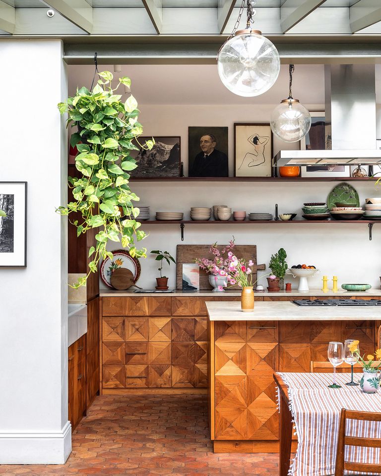
Now that I’m a healthy distance from the completion of our kitchen remodel, I’ve really enjoyed browsing the beautiful kitchens other designers have brought to life. Any kitchen remodel, whether big or small, is a labor of love, and I wanted to pay homage to the thoughtful intention that goes into each design.
Today I’m sharing seven kitchen design examples I love most and exactly what makes each remodeled space so very good.
01
Shavonda Gardner (shown above)
I love the eclectic nature of Shavonda’s kitchen design and the way she mixes color and texture. The colors are unexpected and create a space that feels rich and alive. I love the mix of somewhat formal wallpaper with informal open shelving, and how light from the skylight brightens a space filled with darker colors and ornate patterns. It doesn’t feel like a brand new kitchen, which I mean in the best possible way.
I also love the idea of having a table in the middle of the kitchen. It feels delightfully informal, quaint, and inviting. I was talked out of putting a table in our kitchen in favor of a built-in island. I think from a storage perspective it was the right decision but seeing how lovely a table looks in this kitchen makes me still want one.
02
Sara Charlesworth
I love that the design of this kitchen strikes a balance of modern with a traditional nod. The use of the terracotta color on the checkerboard floor is my favorite part. Sara took classic color combos and warmed them up a bit which I think makes the design feel really fresh.
I also think the lack of upper cabinets makes the space feel larger. Upper cabinets can sometimes create more of a “cave-like” feeling in kitchens (although they are of course often a necessity for storage purposes). I think that’s why people gravitate toward open shelving; it has that bigger, open, informal feeling. It’s part of what makes kitchens feel like genuine living spaces vs. solely workspaces.
03
Matilda Goad
I first found Matilda’s design work when I was in a place where I wasn’t stretching my creative muscles as much as I would have liked. Ever since, I’ve soaked up all the details, big and small, in her designs.
Matilda’s kitchen is a custom masterpiece. What I love most about it are all of the unique, very personal touches—the scalloped edge behind the sink, the checkerboard tile framing the oven, and even a beautiful antique stone swan. I think that’s the biggest thing we can take away from her kitchen—the power of peppering in design elements that are unique to your own personal taste and style.
04
Laura Jackson

Laura Jackson’s home design is really inspiring to me. When I think of Laura’s kitchen, I think of the terracotta floor tiles and the ceiling windows above the dining area. I love that nothing about the spaces she designs feels brand new and that she really leans into buying secondhand pieces. It goes to show that you can think outside of the box for what the design of your home “should” look like.
05
Architect Murray Baker + Artist Esther Stewart
This pistachio and orange color combination is absolutely killer. It’s an easy color palette to mess up but they did it so well. While it’s not for everyone, I think it shows you that a kitchen with minimal design elements is not boring. The overall feel is so subtle and stunning. I particularly love the idea of using oversized hardware in the same color as your cabinets—it’s a simple element that feels really unique in its execution.
06
Ashley Montgomery
When I first saw this kitchen, I felt like I was going to fall out of my chair. It’s the opposite of the kitchen above, which highlights beautiful design done with minimal elements. Ashley’s design expertly balances a large range of materials and textures through really intentional scale and placement. This is also a very functional kitchen that doesn’t spare any space for cabinets or storage. As a whole, this design feels rich and full of life.
07
Friederike – @haus_an_der_linde
I love that this design takes a very modern, Scandinavian-esque layout and cabinet selection and pairs them with incredible lights that look like they belong in a dimly lit bar over a cocktail table. I love the large wood table, the marble backsplash, and the rich wood floors—it’s a spectacular mix of materials and incredibly functional too. The blue color of the cabinets is also beautiful. I’ve been wanting to use a similar color for years in our home and keep getting talked out of it; seeing this kitchen makes me want to go for it.

Kate is currently learning to play the Ukulele, much to the despair of her husband, kids, and dogs. Follow her on Instagram at @witanddelight_.