
As the two most popular platforms, WooCommerce and Shopify are often compared by sellers both new and experienced. In this post, we’ll examine how the process of creating the main parts of an ecommerce store differs between WooCommerce vs. Shopify.
It isn’t always easy to know the difference between ecommerce platforms. Most provide the same core features, but can differ significantly in how they are implemented and how much control you are given.
Understanding the core difference between WooCommerce vs. Shopify
Shopify’s main focus is ease of use. It aims to give store owners everything needed to launch a store without much experience. Because it’s a hosted platform, Shopify users don’t have to worry about the more technical aspects of running an online store.
This makes it a preferred platform for those looking to create a store quickly and without the need to control every aspect of the website.
But it also means it is more difficult for experienced web developers to make further optimizations.
WooCommerce takes an entirely different approach to ecommerce. It is a self-hosted solution that runs as a plugin installed on websites with the WordPress CMS. This means you need to set up a hosting environment to deploy your website.
WooCommerce’s strength lies in customization and extensibility. You can expand the platform’s core functionality with additional software and have free access to code to make custom changes.
Choosing the right hosting for WooCommerce
The choice of web hosting is a crucial component of your store’s success. You need a provider that offers strong performance. It is also beneficial to have a web host that lightens your workload by handling many technical tasks.
For example, with GoDaddy’s Managed WordPress Ecommerce Hosting, you get helpful extensions such as Google Analytics, Shipment Tracking, and Cost of Goods Sold — pre-built into the platform.
Your site is fully optimized for performance, allowing you to spend more time crafting a stand-out customer experience and driving more sales.
Creating your frontend designs: WooCommerce vs. Shopify
WooCommerce and Shopify both rely on themes for implementing the overall appearance of your website. These themes are simply a folder consisting of files and style sheets that create the design of your site.
Shopify themes and design
When you first create your Shopify store, it comes pre-installed with a minimalist theme. To view your current theme or activate a new one, you need to go to Online Store > Themes.
The Live theme section shows the active theme. Further down the page, you’ll see links for more free themes as well as the Shopify theme store.
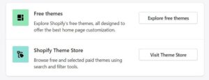
The theme store contains hundreds of higher quality, paid themes. These come with more pre-made templates and additional content blocks for designing your site.
Many developers have also created themes that are not accessible through the market. You can find these on third-party sites. To activate a third-party theme, you need to download the theme files and upload them to the Theme library under Add theme.

The Shopify Themes page is also where you modify your site’s design. To do so, you navigate to the Live theme section and select Customize.
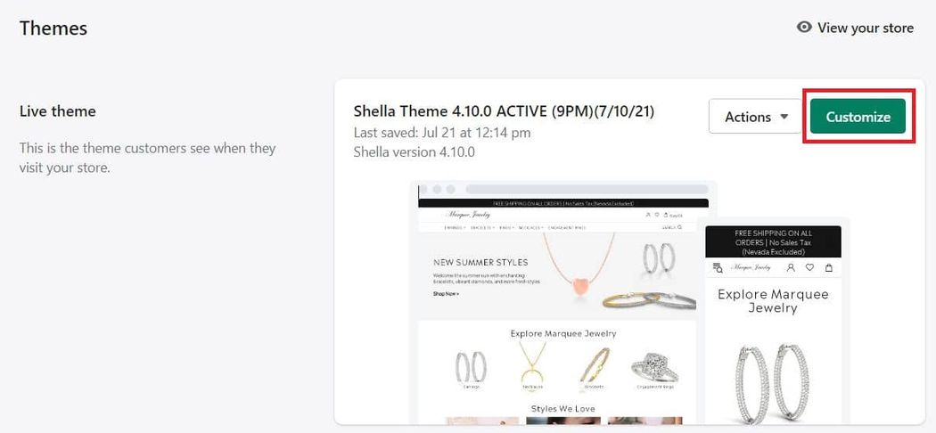
This will open the theme editor where you can edit the design for the homepage, category pages, product pages, and other parts of the store.

With Shopify, you can add customizations to inactive themes to test their design without affecting the live appearance of your shop.
WooCommerce themes and design
WooCommerce themes function in a similar manner. By navigating to Appearance > Themes, you’ll find a list of downloaded themes and an annotation of which one is active.

It is from here that you can edit the design of the active theme by clicking Customize .
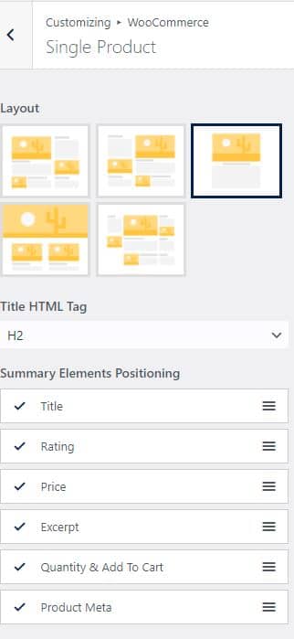
When you open the theme editor, you’ll find a list of sections that you can edit in a left-hand menu and page preview to the right. The exact components that you’ll be able to change depends on the particular theme. At the very least, most WooCommerce themes let you edit:
- Category page layout
- Product page layout
- Cart icons
- Image sizes
Below is an example of how you can modify your single product page layout in a theme editor.
Structuring categories and taxonomies
Categories help keep your catalog organized and make it easy for customers to search and find items on your site. It is common practice for ecommerce sites to use category pages to provide a single repository for a particular type of product.
These pages are an important part of an optimized customer experience, as many shoppers will go straight to a category page to look for products after landing on your site.
Creating categories in Shopify
Shopify is different from other ecommerce platforms in that it does not have true product categories. Instead of categories, Shopify uses Collections. On the surface, there isn’t much difference between the two. However, Shopify’s Collections do not allow nesting.
As such, there is no way to implement subcategories. This does not stop you from creating what is essentially a sub-collection, but it will not be linked to any parent collection, and therefore will lack navigation features such as breadcrumb menus that make it easy for customers to go back and forth between pages.
Each Collection has a type: Manual or Automated. With a Manual Collection, you add products one by one. With an Automated Collection, you define certain product conditions and then items that match those characteristics are automatically added to the collection.
Automated collections can help you group products faster but they are limited as they do not allow you to manually add any products.
Creating categories in WooCommerce
WooCommerce uses more traditional taxonomies. You can create categories for a specific type of item by going to WooCommerce > Products > Categories.
There you have the option to add a description, display type, and featured image for the category.

You can create a hierarchical structure by defining a parent for each category. This chain of categories and subcategories appears in breadcrumb navigation and faceted filters to make it easier for customers to move between pages.
Products are added to categories individually from the product editor. The product categories tab displays a list of all your store’s categories where you can select one, multiple, or leave the item uncategorized.
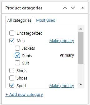
Each item is assigned a primary category. This will determine which category appears next to the item on your Shop archive page. It also determines which category will show in your product’s URLs (if you have the category string enabled).
WooCommerce’s native functionality limits the degree to which you can tweak the design of your category pages. However, there are several useful page builders and other plugins that allow you to customize your category pages according to your needs.
Optimizing your store for SEO
Search engine optimization (SEO) is vital for driving shoppers to your ecommerce store. If your site isn’t designed with SEO in mind, it is difficult to get visitors from organic search traffic. Let’s see how you can set up each platform for SEO success.
WooCommerce SEO
WooCommerce’s codebase is optimized for SEO. The platform makes it easy to add meta details to each product and alt text to all of your images.
There are also several powerful plugins designed to improve SEO. For example with Yoast, you can assign a target keyword to each page to receive an overview of well the page is optimized for the term.
Another big SEO factor is your URLs. With WooCommerce, you get complete control over your URL structure. You can choose to add generic bases to your products and categories such as /category.
Or you can follow the more optimized practice of making the URLs as short as possible by removing the base entirely or using a single character. For example, yourstore.com/p/product-name.

Shopify SEO
Shopify’s native SEO features are similar to WooCommerce. You can add metadata and image alt text and the platform automatically generates an XML sitemap to make it easy for search engines to crawl your site. The main area where the two platforms differ is URLs.
If you build your ecommerce store using Shopify, you have no choice but to abide by its URL structure. Your only option for changing the permalinks is to edit the final URL string.
Unfortunately, the fixed settings are not the best for SEO. The URL for each collection contains a /collections prefix. For example, yourstore.com/collections/t-shirts. Similarly, product URLs contain a /product prefix.
By default, Shopify also uses multiple links for each product. Specifically, there is the standard /product URL as well as /collections/product URL strings for each collection that the product is a part of.
If a customer goes to a product page through a collection page, they will be directed to the /collection/product URL. The platform takes steps to add canonical tags to the main link to reduce the SEO impact of the duplicate URLs.
Blogging and content
Content is one of the best ways to attract visitors through SEO. This is one area where WooCommerce has a considerable advantage. Built on top of the WordPress CMS, store owners get access to the best blogging capabilities on the web.
Shopify has blog functionality but it is rather limited. The interface is user-friendly and you have the ability to apply tags, add media to posts, manage comments from your visitors, and modify the meta field for each post.
That’s about it for blog functionality. This makes content creation more difficult when compared to WordPress. Particularly, if you want to embed products into your posts.
Despite the plethora of third-party apps in its marketplace, there aren’t many viable solutions for fixing the limitations of Shopify’s native blog.
Checkout experience
All the efforts put into creating a great ecommerce store ultimately lead to the checkout experience. It is at this moment that shoppers decide whether or not to complete their purchase. This is one of the most important aspects of your store as the slightest differences can impact a customer’s decisions.
WooCommerce checkout experience
The default WooCommerce checkout experience is designed to be as simple as possible. Customers can proceed to the checkout page through the cart page or from the checkout button in the header menu.
From there, they are taken to a single page checkout where they can view an order summary and enter their billing and shipping details. This simple design minimizes distractions and reduces the time needed to complete the checkout.
Customers can choose from your various payment and shipping options. If a gateway such as PayPal takes users off-site, there is a notification making sure they have clear expectations.
While the default WooCommerce experience is streamlined, you may want to customize it to better suit your business. The core checkout principles are constant but each industry and product will have varying features needed to create the optimal experience.
For example, if you sell personalized products or high-consideration goods, customers will be more mindful of the items they’ve added to their carts. As such, they will likely want to carefully review the item specifications at the last moment before completing the purchase.
A hastened checkout that rushes through the final steps while omitting important details could be perceived negatively.
For other products, shoppers may want an even faster checkout experience. One way you can use WooCommerce to provide faster checkouts is to let visitors checkout directly from individual product pages.
With the One Page Checkout extension, you can turn any page into a checkout page. When you enable one-page checkout for a product customers can add the item to their cart, enter their billing and shipping details, and complete payment without having to wait for new pages to load.
Implementing the one-page experience is easy as you simply need to activate One Page Checkout from the edit product page.
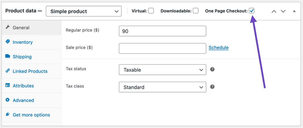
You also have the option to manually add the one page checkout with the following shortcode: [woocommerce_one_page_checkout]. This shortcode works on any page or custom post type, and you can customize the page by editing the shortcode’s attributes.
Another way to customize the checkout experience is to use the Checkout Field Editor extension to modify the information customers need to provide when completing their orders. Unnecessary fields increase the time to complete the order process and can quickly drive interested shoppers away.
The plugin gives you several options for customizing the checkout design. For example, if you wanted to change the default button value, you could add the following code to your functions.php file:
function custom_override_checkout_fields ( $fields ) {
$fields['billing']['test_radio']['default'] = 'one';
return $fields;
} // End custom_override_checkout_fields()

add_filter( 'woocommerce_checkout_fields' , 'custom_override_checkout_fields' );
Shopify checkout experience
Shopify’s limitations are best reflected in the checkout experience. Users can make slight changes to the cart page by using the theme editor or directly modifying the cart-template.liquid file. However, you do not have the ability to customize the checkout page.
The standard checkout process is broken into three steps: information, shipping, and payment.
The information page contains basic fields for contact information and shipping address on the left side of the page and an order summary on the right. The shipping page is where you select your delivery type.
And finally, the Payment page is where you enter your payment details. It is also where you can add your billing information if it is different from the shipping address.
As you can see, unlike WooCommerce, which condenses the checkout to a single page, Shopify requires buyers to make multiple steps to complete their purchase. While this approach works for some stores, it is not ideal for those seeking an expedited checkout process.
You have the option to enable Express checkout for payment methods like PayPal, Google Pay, and Shop Pay. These options are displayed at the top of the information page.
While these can help speed up the process, it can sometimes be confusing for customers that simply want to pay via credit card. Some will assume they can only pay with the options on the initial page and the option to enter your card details won’t appear until you reach the final page.
Payment gateways
The more payment methods, you can support, the better. Customers have their own preferences and may leave your site if they can not pay the way they want.
Both WooCommerce and Shopify support the most popular payment gateways. And you can set up multiple payment methods with just a few clicks.
One caveat here is a form of vendor lock-in with Shopify. The platform has its own payment gateway named Shopify Payments which it hopes you use as your default payment method. Any transaction processed with another gateway incurs extra transaction fees on top of said processor’s standard fees.
These fees can quickly add up and are an unnecessary burden if you would prefer to use any other external gateway.
WooCommerce also has its own payment solution but you won’t have any extra fees if you choose to use something else.
Clsing thoughts on WooCommerce vs. Shopify
So we can see there are many similarities in how you would approach building a store with WooCommerce and Shopify. The key difference is how deep each platform lets you go with the various steps involved.
Either through native functionality, adding plugins, or tweaking some code, WooCommerce lets you change every little detail of your store. Shopify limits certain areas, making you settle for what they give you.
As your ecommerce business grows and you look for new ways to differentiate your brand, the granular control offered by WooCommerce can prove an invaluable tool for creating a site your customers love.