
Choosing the right font for your business can impact your target audience and their engagement level with your brand.
People have pronounced feelings, responses, and associations when they see specific colors. They also react to typefaces and fonts. So, it’s vital that you use these emotional reactions to your advantage.
Typography is the art and technique of arranging type to make written language legible, readable and appealing when displayed. Typography can make or break the overall effectiveness of your design and message, and it plays a vital role in your brand’s identity.
One of the essential elements of successful typography is the right typeface. Many typefaces are available, and this can feel pretty overwhelming.
The best fonts should be memorable, legible, work on all platforms offline and online, and communicate your brand personality.
We’ve outlined some of the broad ideas you should consider in your brand strategy to narrow down your choices and pick the typeface best for your brand.
1. Serif or Sans Serif?

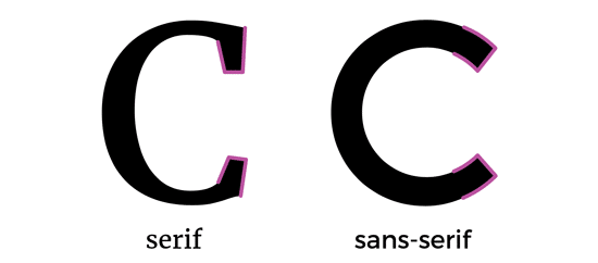
One primary way typefaces and fonts are classified are whether or not they have “serifs,” which are the tiny flourishes found at the end of a letter’s strokes.
Serif typefaces have these added bits, and sans-serif typefaces are, as you can guess, literally; “sans [without] serifs.”
WHICH LOGO IS BEST?

Serif typefaces are associated with tradition and stability.
Serif typefaces are great for premium brands as they convey elegance, prestige, heritage and authority.

Finance, fashion, journalism, and other prestigious industries incorporate that classic style into their designs to significant effect.
You’ll see many company logo designs in those industries with the serif typecase. For example, Burberry uses a custom-designed serif font, eliciting an immediate feeling of luxury.

Serifs give a visual anchor to characters, contributing to their solid and traditional feel, as in the TIME logo (which uses your college professor’s favorite, Times New Roman).
They also improve the readability of lengthier amounts of text, delivering a professional and trustworthy impression.
When you’re designing something with a great deal of text to read, choosing a serif font is an excellent choice to make sure your readers don’t wear themselves out visually.
Sans-serif types became popular around the 1800s, right around the same time that modernism took off.
With design moving toward a universal style and focusing on inclusive thinking, Sans-serif typefaces deconstructed the traditional letterforms and modernized them into an accessible and appealing aesthetic.


Popular sans-serif typefaces like Helvetica, as used by Skype and Target, are everywhere on the web because they fit right in with the modern aesthetic. That makes them a stellar choice for branding and marketing systems, though their omnipresence does make them a less distinctive choice.
If you spend the time to make sure the typeface you love reflects your brand’s personality, though, you won’t go wrong.
2. Traditional or Whimsical?

Typefaces have personalities. Certain typefaces, classified as “whimsical,” convey playfulness or even mischief, while “traditional” typefaces can establish a brand as trustworthy or serious.

Since typefaces vary so much, figuring out which one fits your brand can be overwhelming. Figuring out if you want a traditional or a whimsical vibe is an excellent place to get started. Some typefaces look like the handwriting you wish you had: elegant and refined, like Cadillac’s cursive serif (based on English 157).

A traditionally styled font, like American Airlines’ use of Helvetica, will ground your design in a classic and respectable fashion.
Choosing something staid in tradition will loan your brand credibility and the assurance of a secure, trustworthy organization.


A more whimsical choice–think about the friendly Disney font or even the futuristic-looking hand tweaked version of Futura that Hulu uses–gives off a distinct vibe for your brand. Understanding that a progressive choice will gain notice can work to your advantage. Just make sure that it fits with your brand’s personality!
3. To Mix or Not To Mix?

It’s a delicate art to mix two (or more, like LG did!) typefaces, but your project will project a much more engaging presence than you might get from using just one typeface.
A good rule to follow is to select a typeface as your foundation: your body text is a good choice since this will be the one you use most.
Build off of this by choosing a core element to branch off from and then selecting your contrasting text.

If you want to try out variety but choosing specific typefaces feels too difficult, try putting in contrast within the same typeface family. Some typefaces include variations within the same typeface family (like “Myriad” and “Myriad Bold”).
You can also vary the size and boldness of the same font, as Linkedin did with their logo.
4. Know the rules to break them
Typography is an effective way to convey more than just the words involved in written communication. It showcases personality by visually representing the tenor and tone of what you’re talking about.
You may find that your purpose is best met by using a font with a vibrant personality throughout your website or using an amalgamation of sans and serif typefaces.
However, it is imperative to proceed very carefully when you decide to embark on a less traditional road with your typeface design.
Making sure that you are familiar with the conventions and rules typically adhered to in design puts you in a much better position to break those rules.
Once you know how typography and design work together, you can intelligently move away from standard form to create a compelling, fresh design.
How you use typography has a decided impact on how your brand and content are perceived, which means that your font choice can have a real dollar influence on your company.
