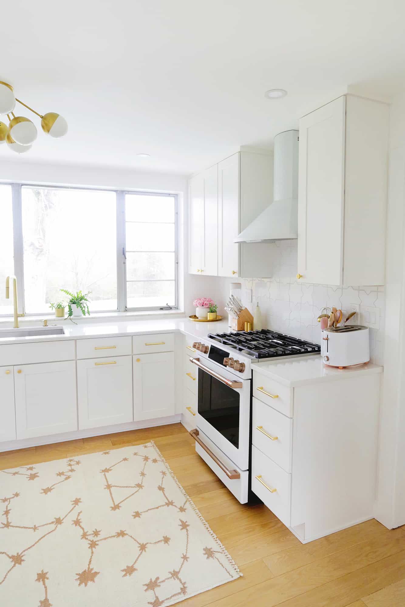
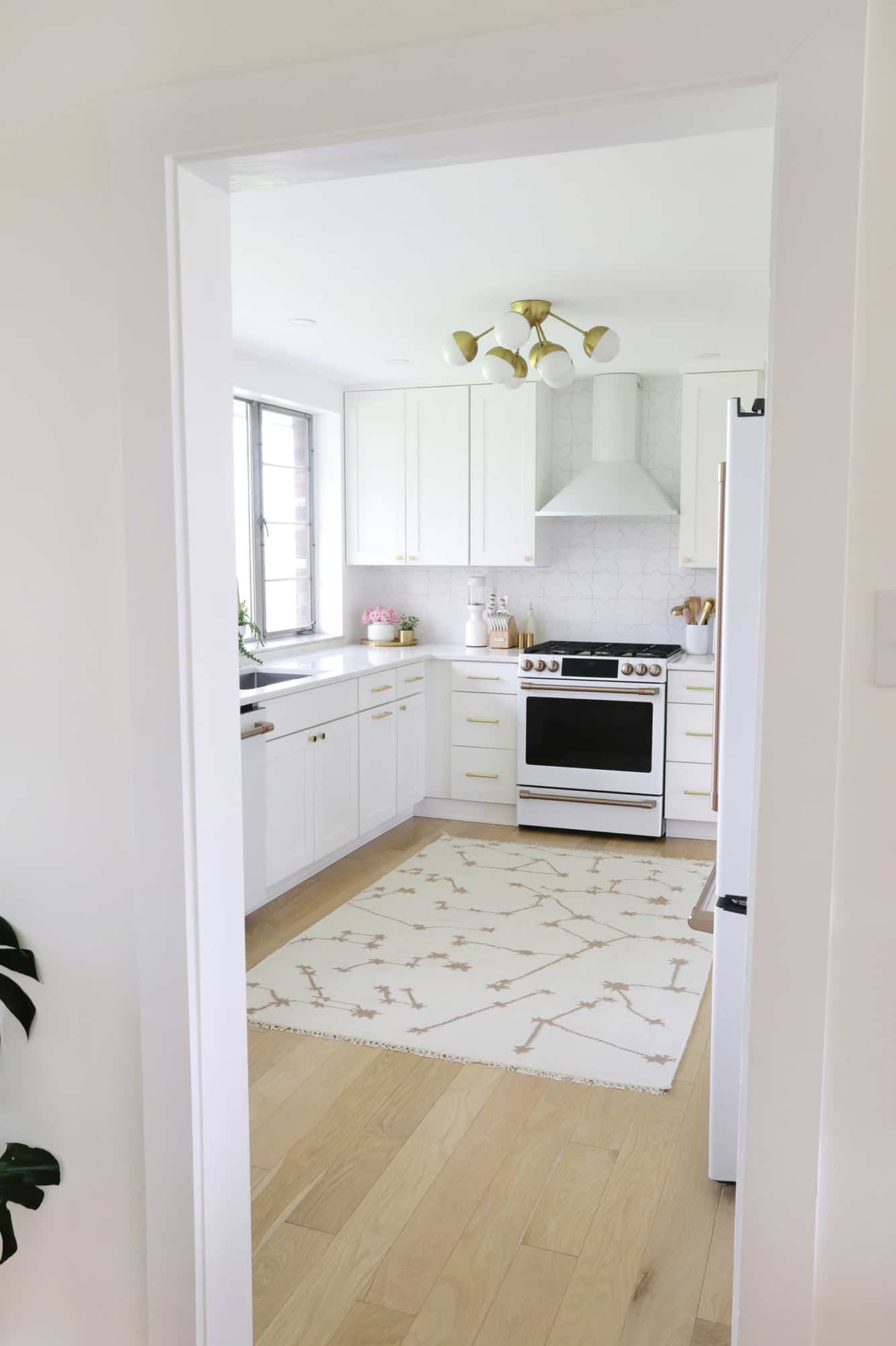
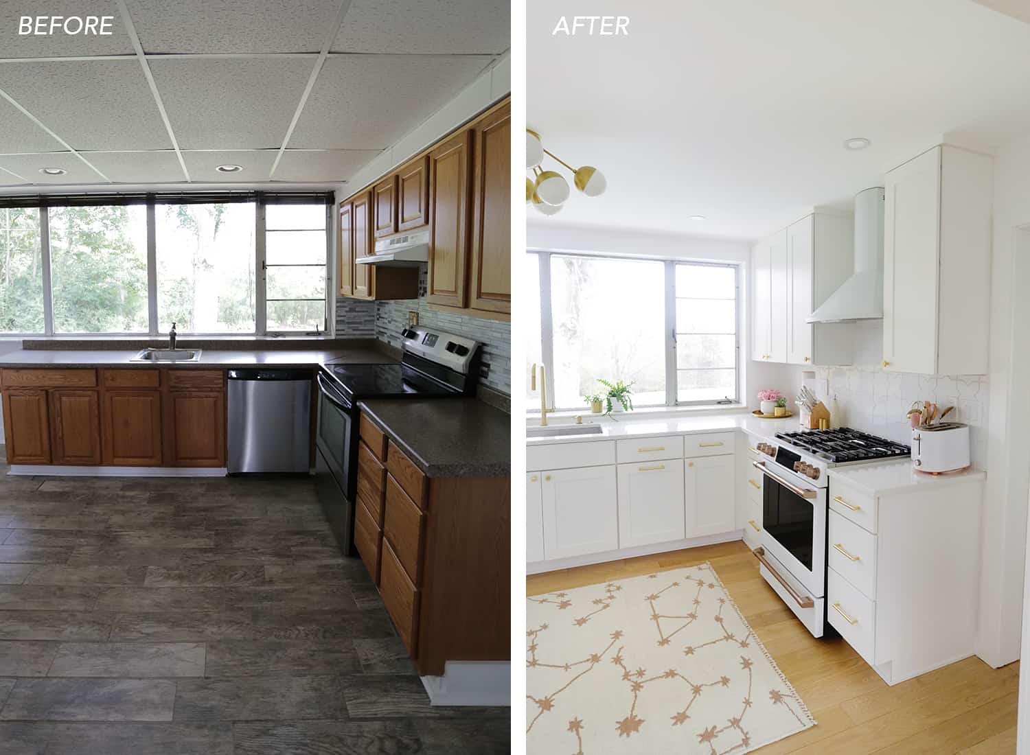
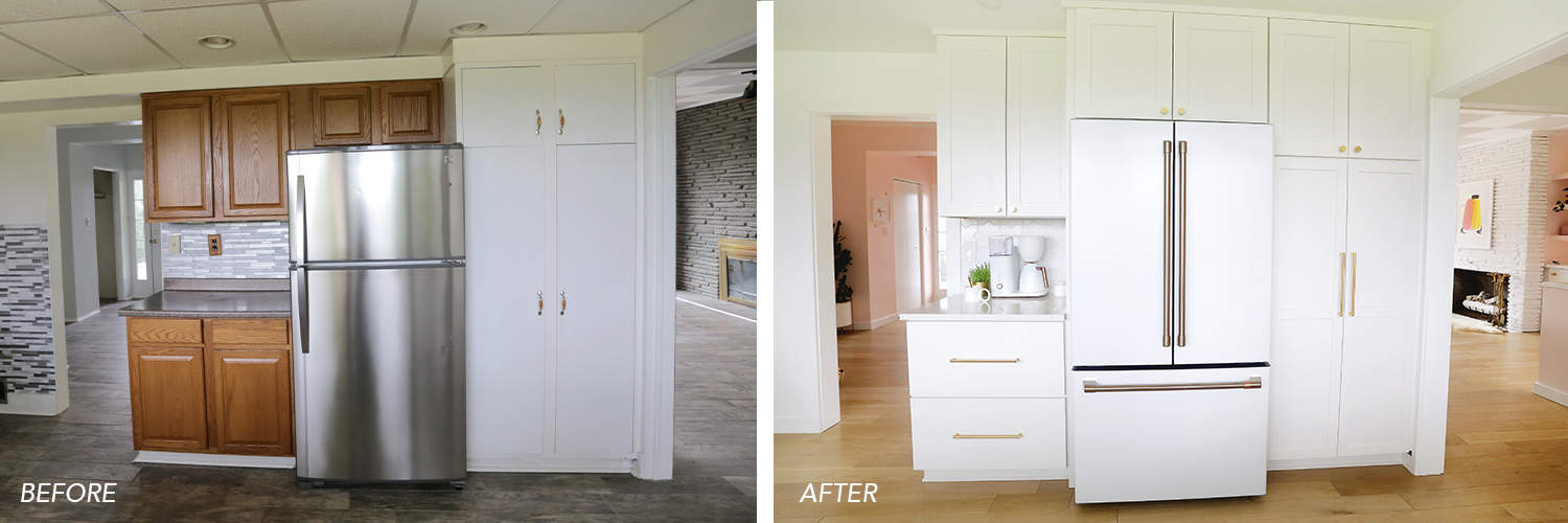
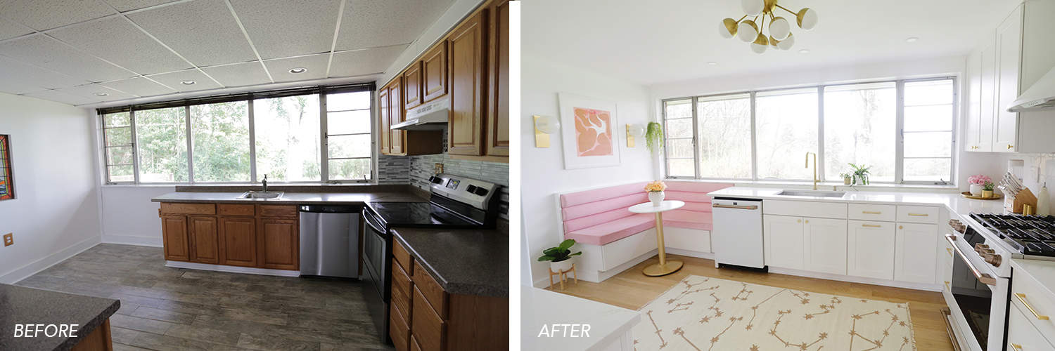
Wow, wow, wow. Out of all the rooms that we’ve made over here in our mid-century Pittsburgh home, this kitchen before and after is really a good one (here’s what the house looked like when we moved in).
When I saw the listing photos of the kitchen before we bought it, we fell in love with the huge windows to the backyard, but I could tell the actual kitchen was not my aesthetic.
From the pictures, it looked like it was in decent shape, but once we drove up to see the house in person (after buying over Skype) it was apparent that the photos really didn’t show the actual state of the room.

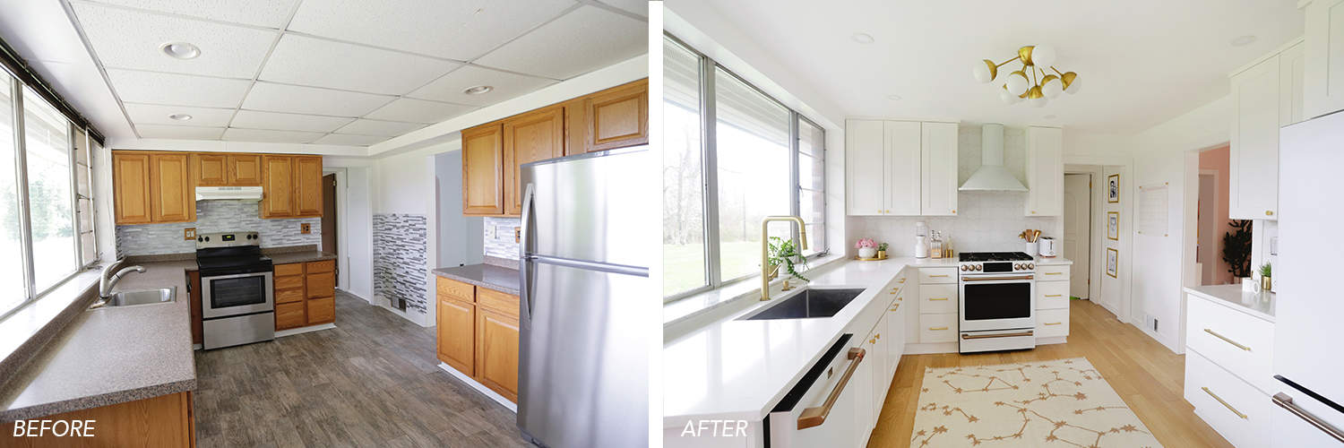
Besides the tile floors that had been installed incorrectly (the spacing was all over the place and tiles were popping out all over the house), there were parts of the laminated countertop that were attached with Scotch tape and the dishwasher was installed so close to the oven that it hit the oven door every time you opened it.
A lot of the faux wood cabinets were warped/peeling/water damaged, the “tile” backsplash was simply stick on plastic sheets, it had a dropped acoustic paneled ceiling (like in an office building), and the pantry was small (and wasted half the space because of how the shelves were laid out).
Oh, and the baseboards/wood trim came together in a way that looked like an M.C. Escher staircase. You can see more in my “NotHowYouDoThat” highlight on my Instagram. It was a hot mess. It also had a plastic stained glass window of a sailboat in the kitchen wall, so that needed to go as well.
We knew we would want to totally gut the kitchen and start from scratch, but we waited until we worked on all the flooring that run throughout the main floor so we could demo the kitchen, have all the white oak flooring run throughout, and then put the kitchen back together on top.
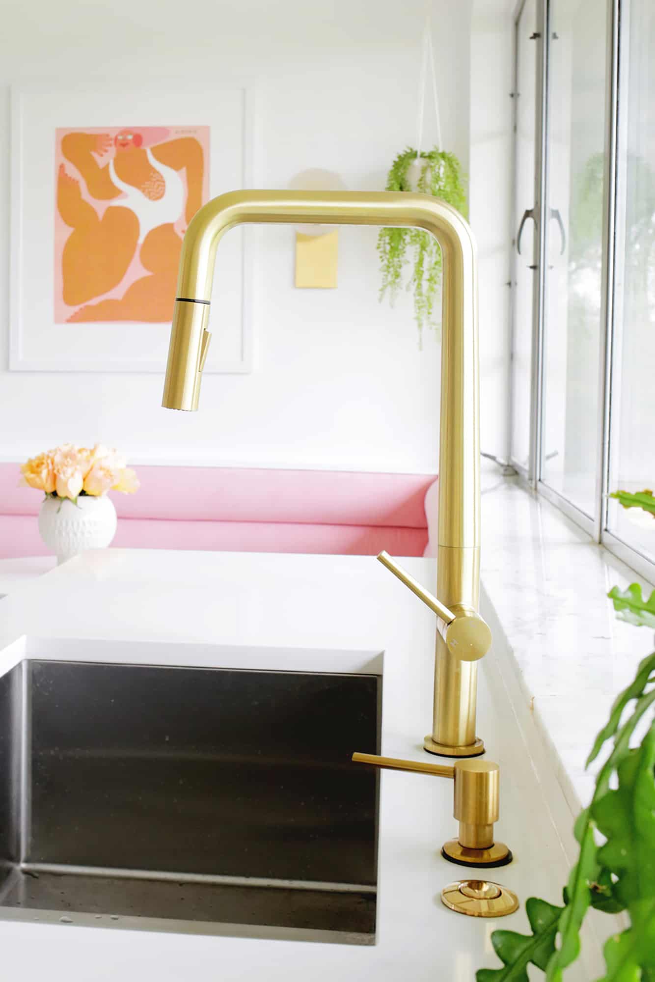
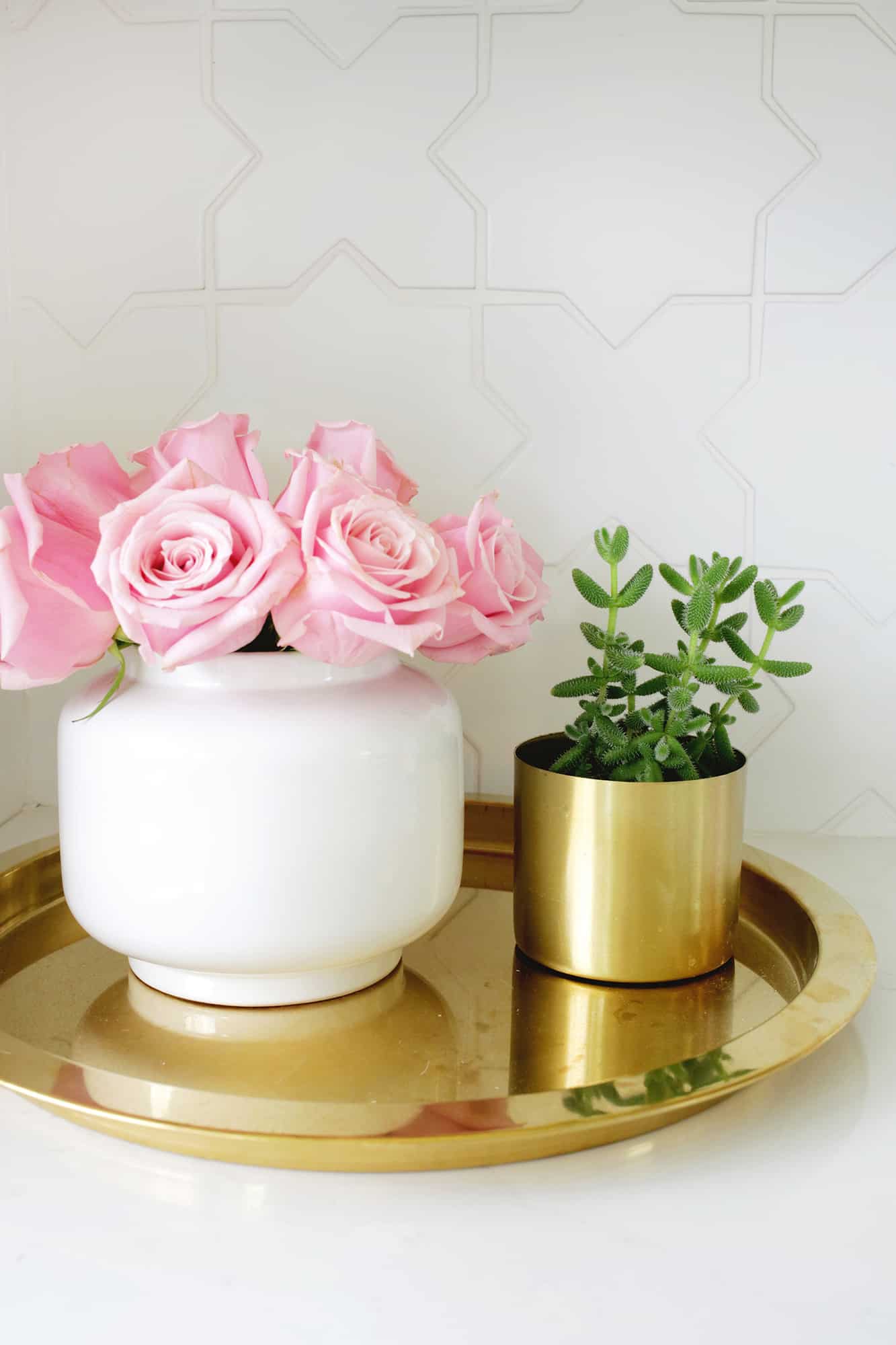
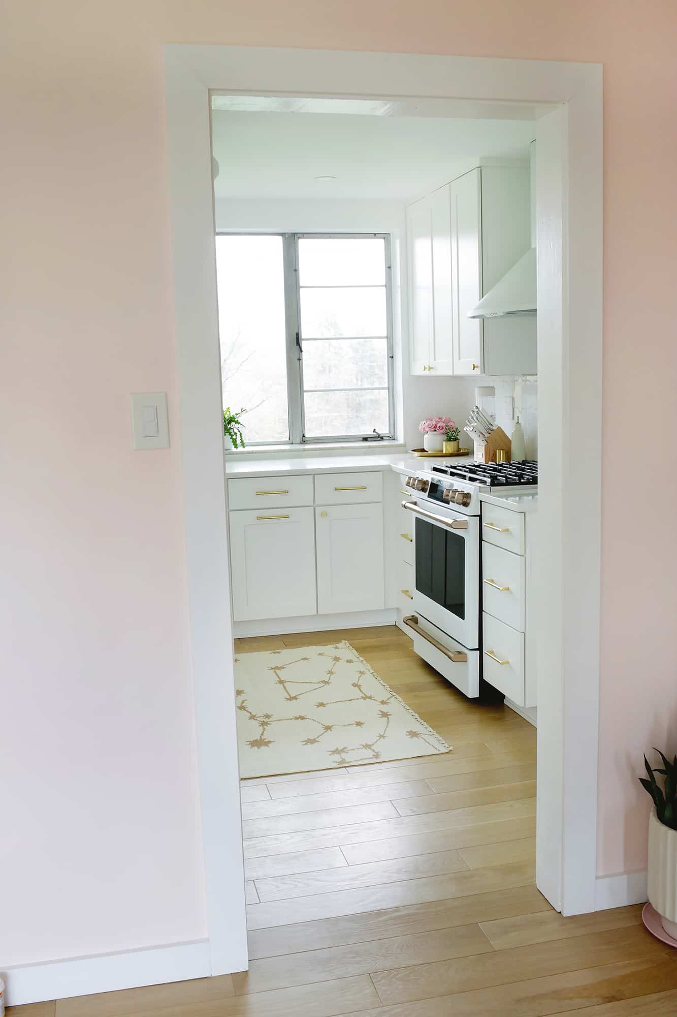
In redoing the kitchen, the only thing we kept were the windows and the marble window sill underneath. The ceiling was removed to show an orange metal ceiling underneath (!!), but we took that out as well and drywalled instead to gain a lot more height in the space.
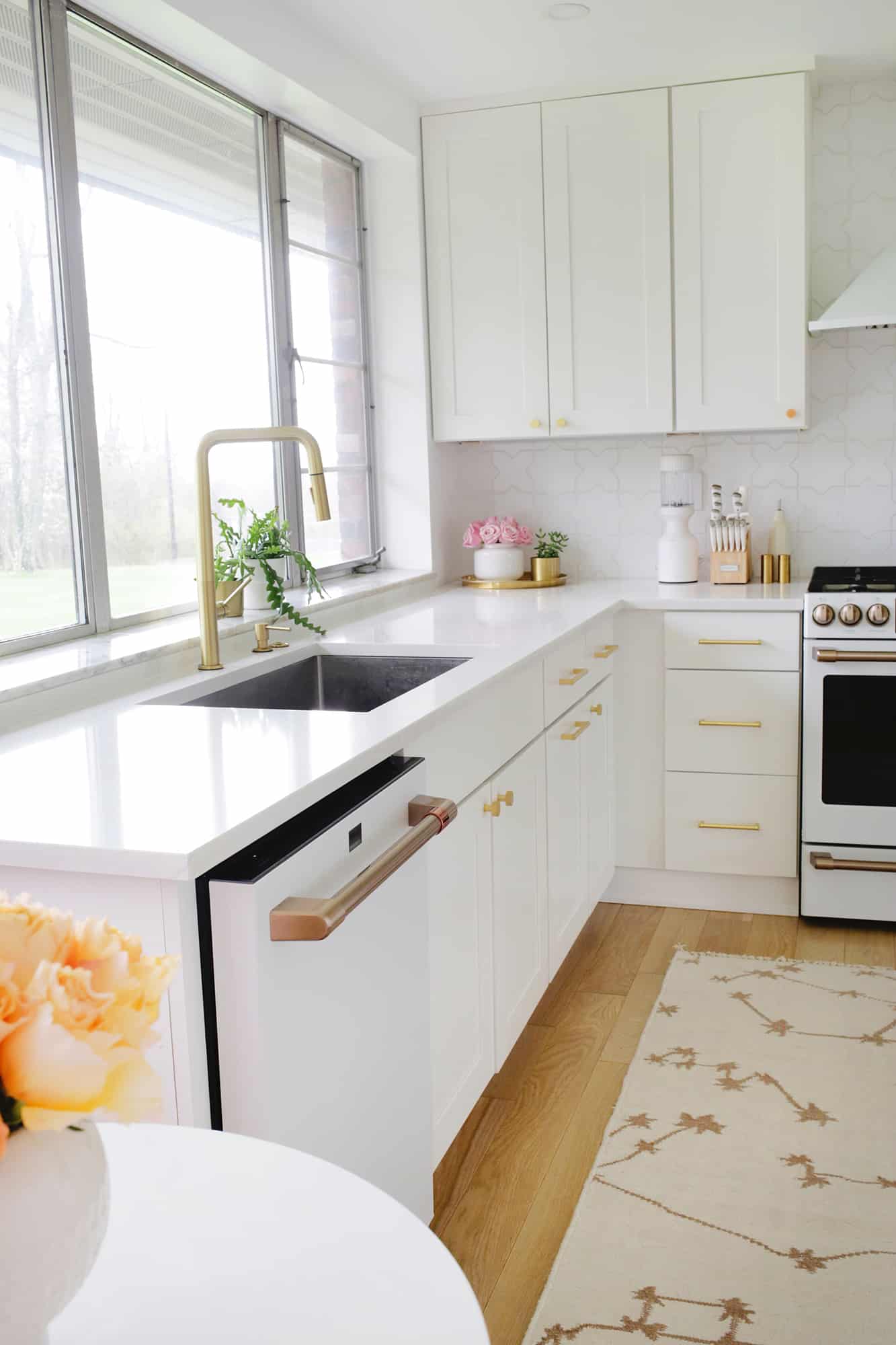
I got white shaker-style cabinet doors mixed with flat front drawers for a trendy-yet-timeless look, and used these drawer handles and pulls to add a touch of gold. I don’t usually splurge on hardware for every spot in the house, but I usually do for kitchens.
The handles get used the most, and when I buy cheaper gold/brass options they always start to tarnish after just a year or so. I’d rather start with something good quality and use them for a long time.
We also added in a double sink that has a 60/40 split so we have a bigger area to wash dishes and a space for drying what we wash by hand throughout the day. I also got this faucet to keep the gold colors going, and I like that it has a pull down feature as well.
I used quartz in our last kitchen and was really happy with it, so I chose that again in this pattern.
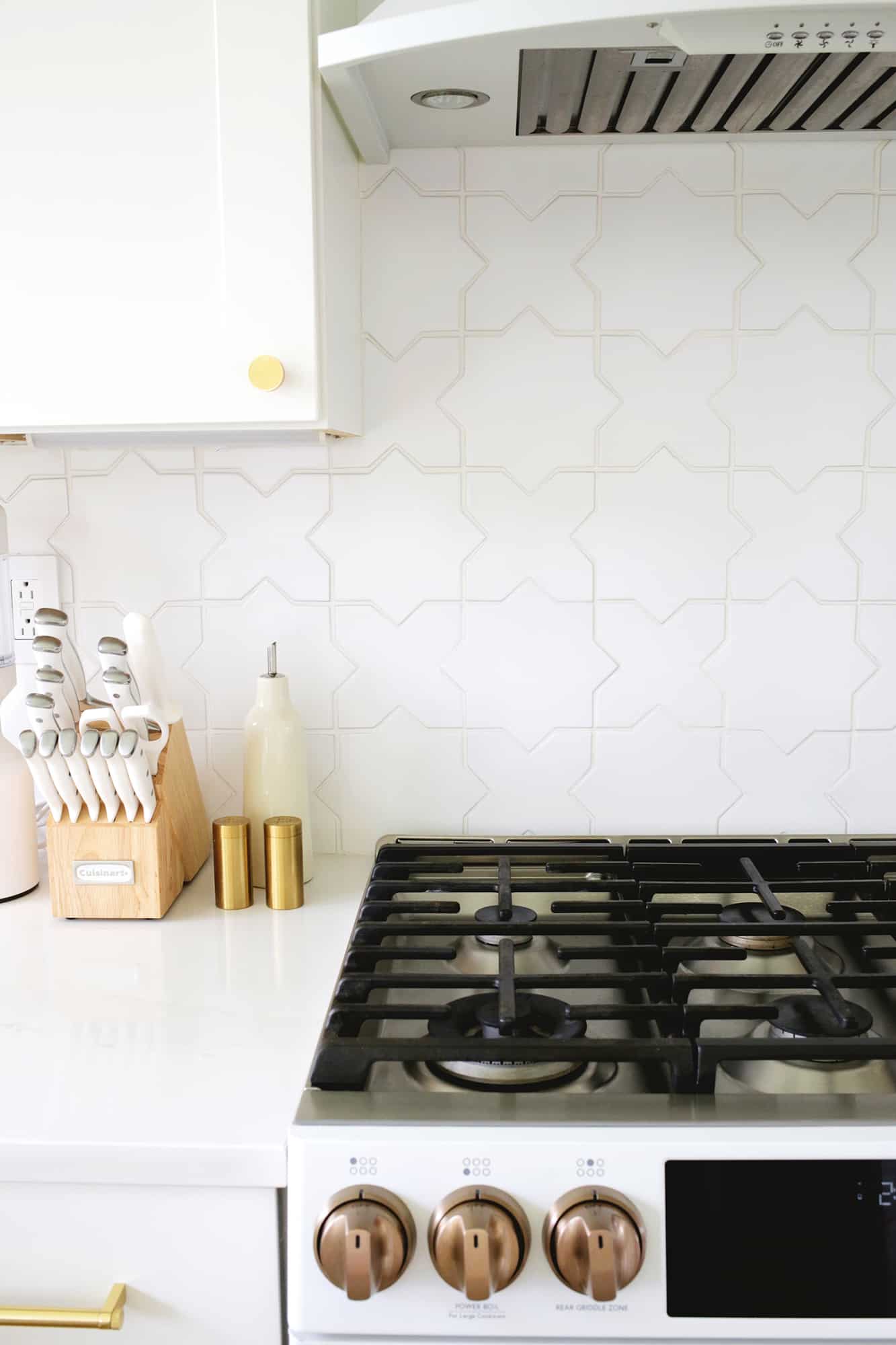
For the “real” tile backsplash, I picked this gorgeous star and cross pattern from Fireclay (Elsie has the same pattern in her office coffee bar) and I love how it adds a subtle pattern to the space without being overwhelming.
The tiles are handmade, so they are all a tiny bit different, which gives the backsplash an organic feel as well.
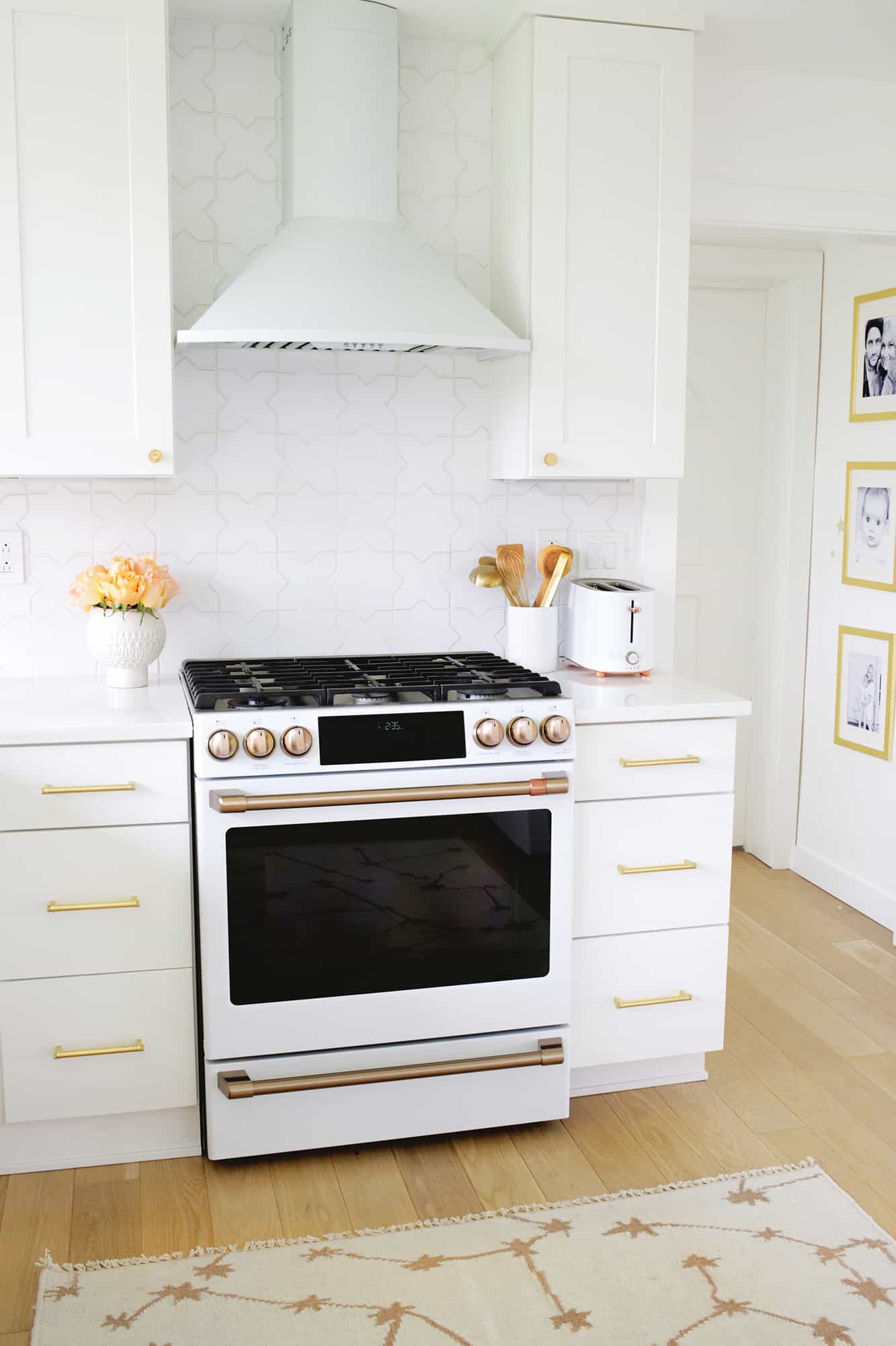
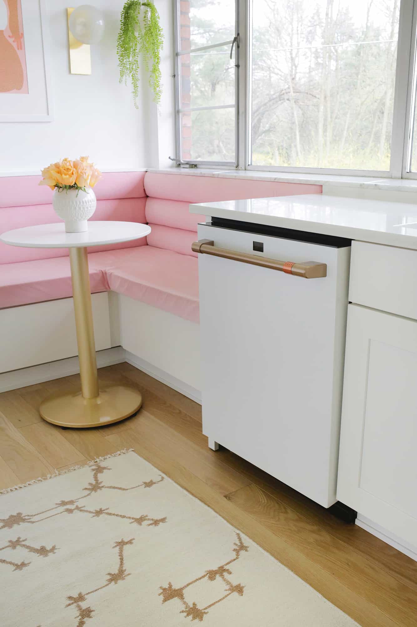
For our appliances, I’ve been dreaming of getting Café appliances since I saw them hit the market a few years ago, and I’m so glad we decided to use them for our kitchen.
This is the fourth house we’ve lived in, and I’ve actually never had a new kitchen appliance in any previous home, so I was thrilled to actually pick out something I would want.
Not only is our Café dishwasher, French-door fridge, and gas stove beautiful, but we love using them—you can connect them to your phone, so we’ve been able to preheat the oven when on the way home, and little things like that make it feel like an extra luxury.
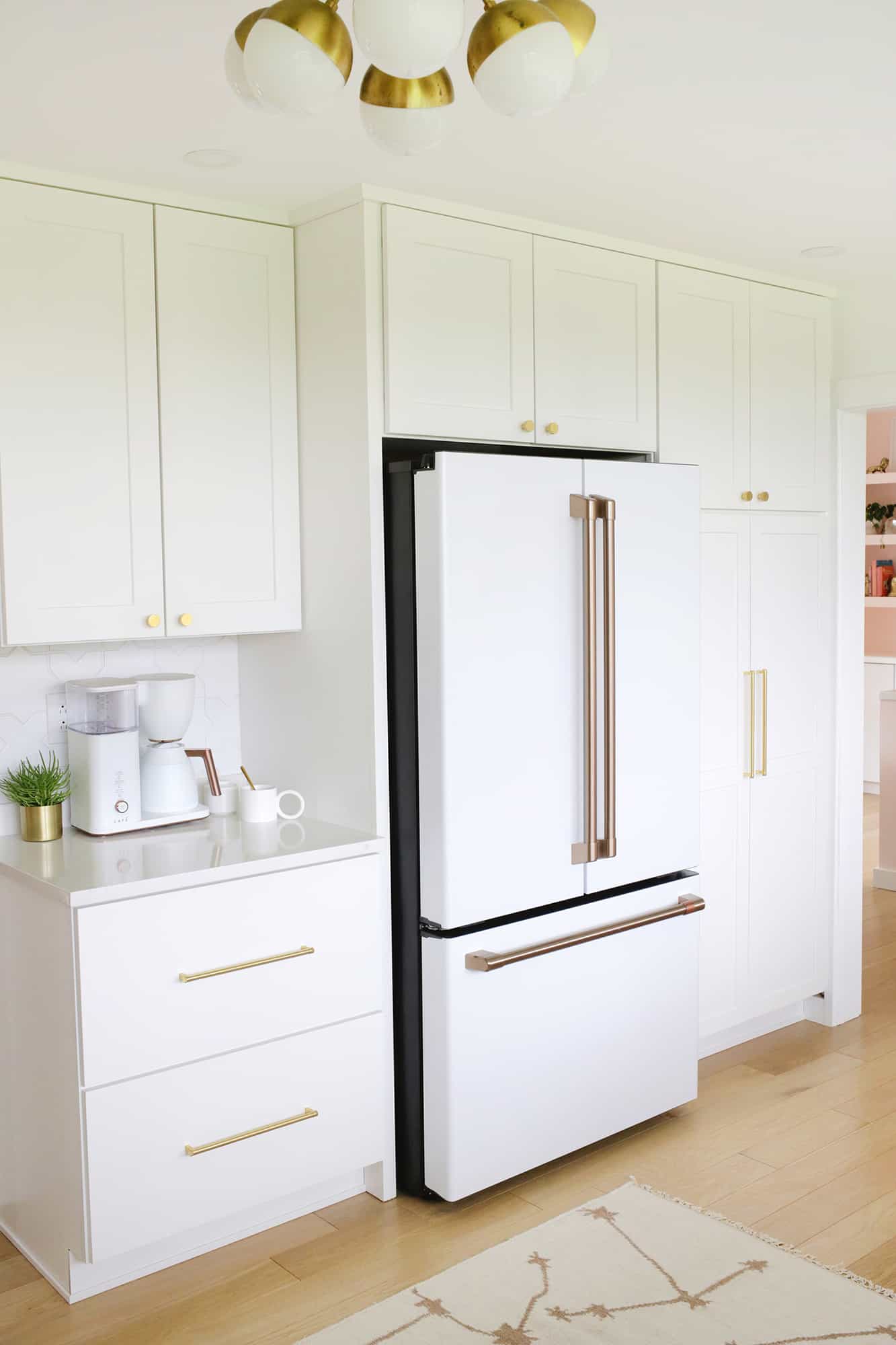
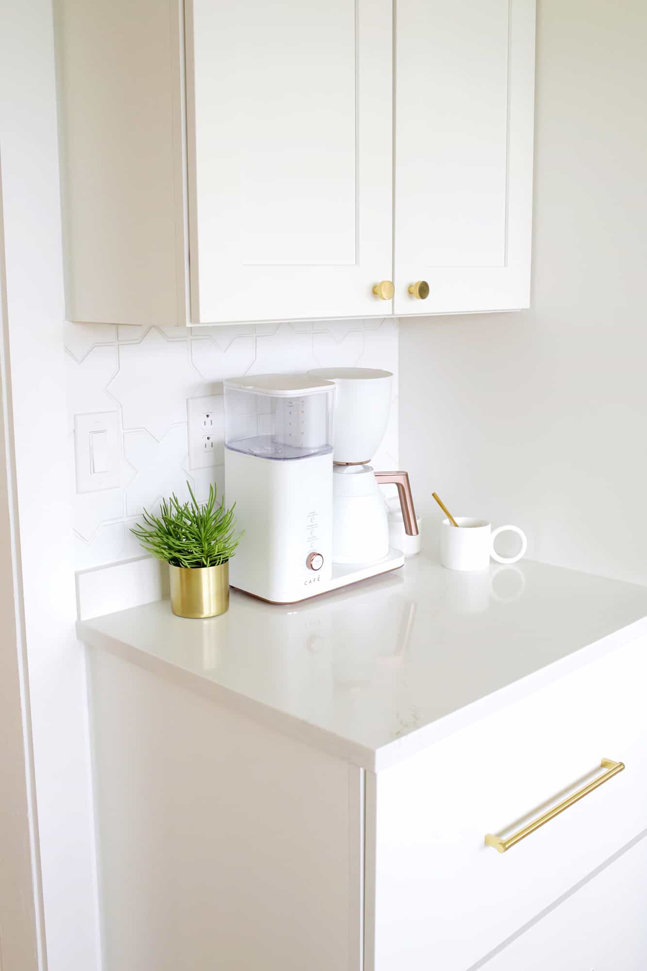
My husband got me the matching Cafe toaster last year for Mother’s Day and their beautiful coffee maker completes the set.
We also replaced the pantry cabinet with one that was a little taller, and had deep drawers and shelves put in throughout to really maximize the pantry space, which has also helped a lot in everyday life.
I bought the same light fixture from our last kitchen and I feel like it fits this room really well, too.
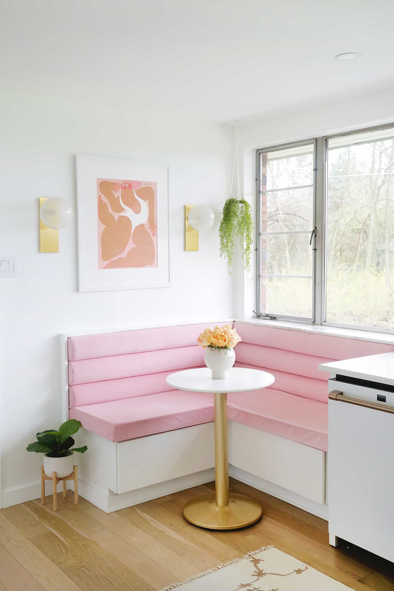
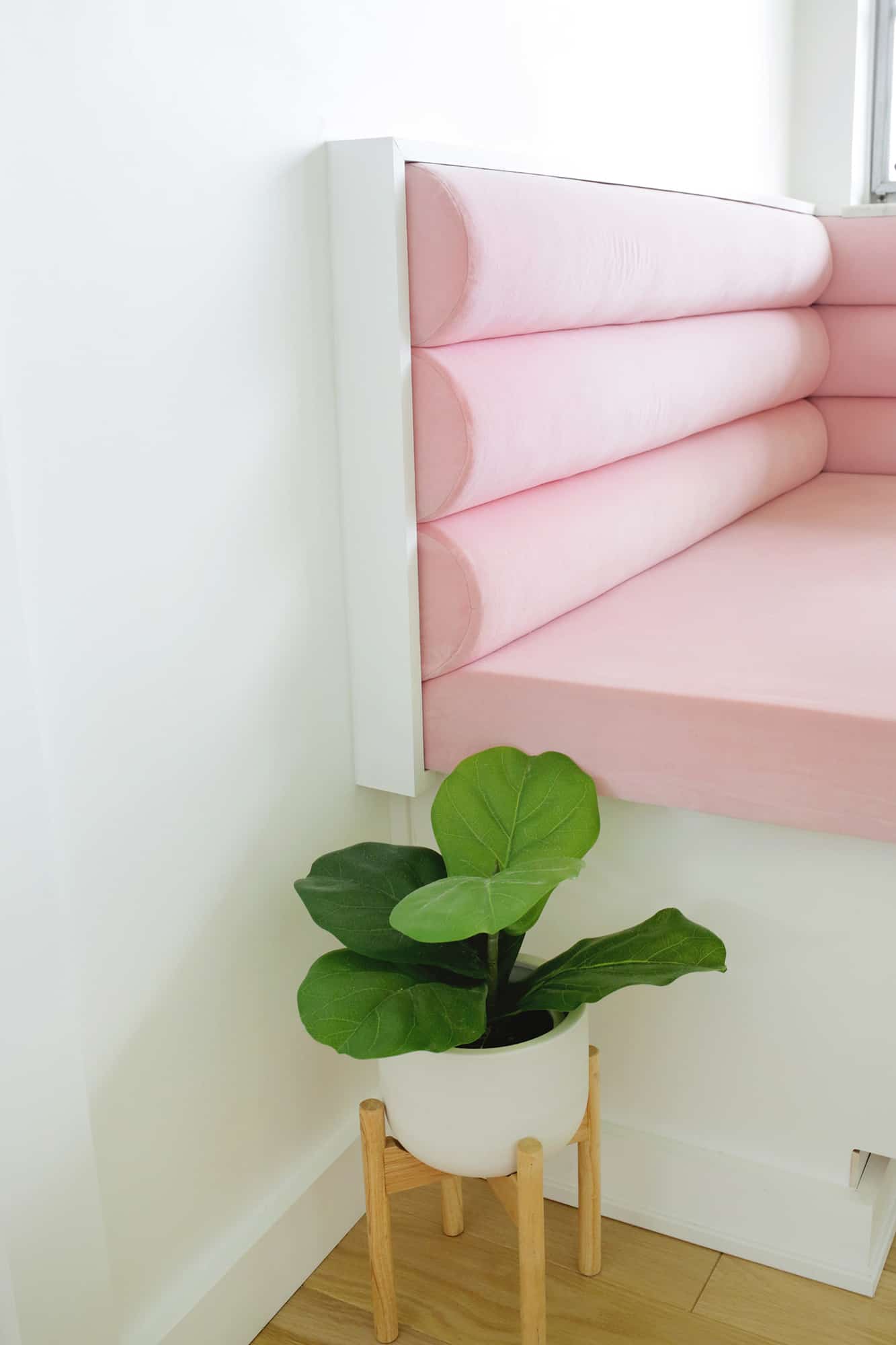
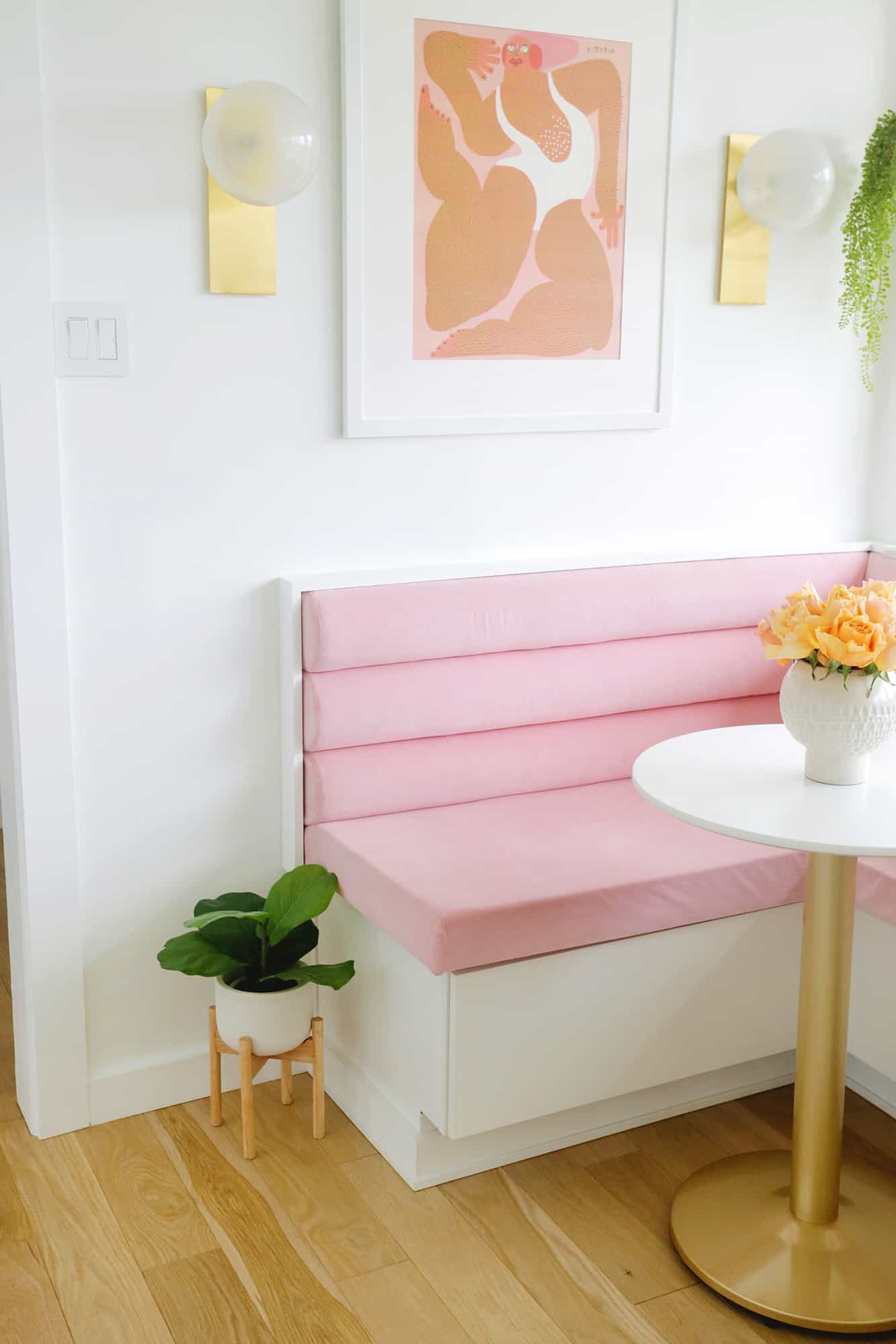
It took me almost a year to get this pink velvet banquette built into the space, and while it’s one of the trickier DIYs I’ve completed, I really love it and it makes the area feel extra special.
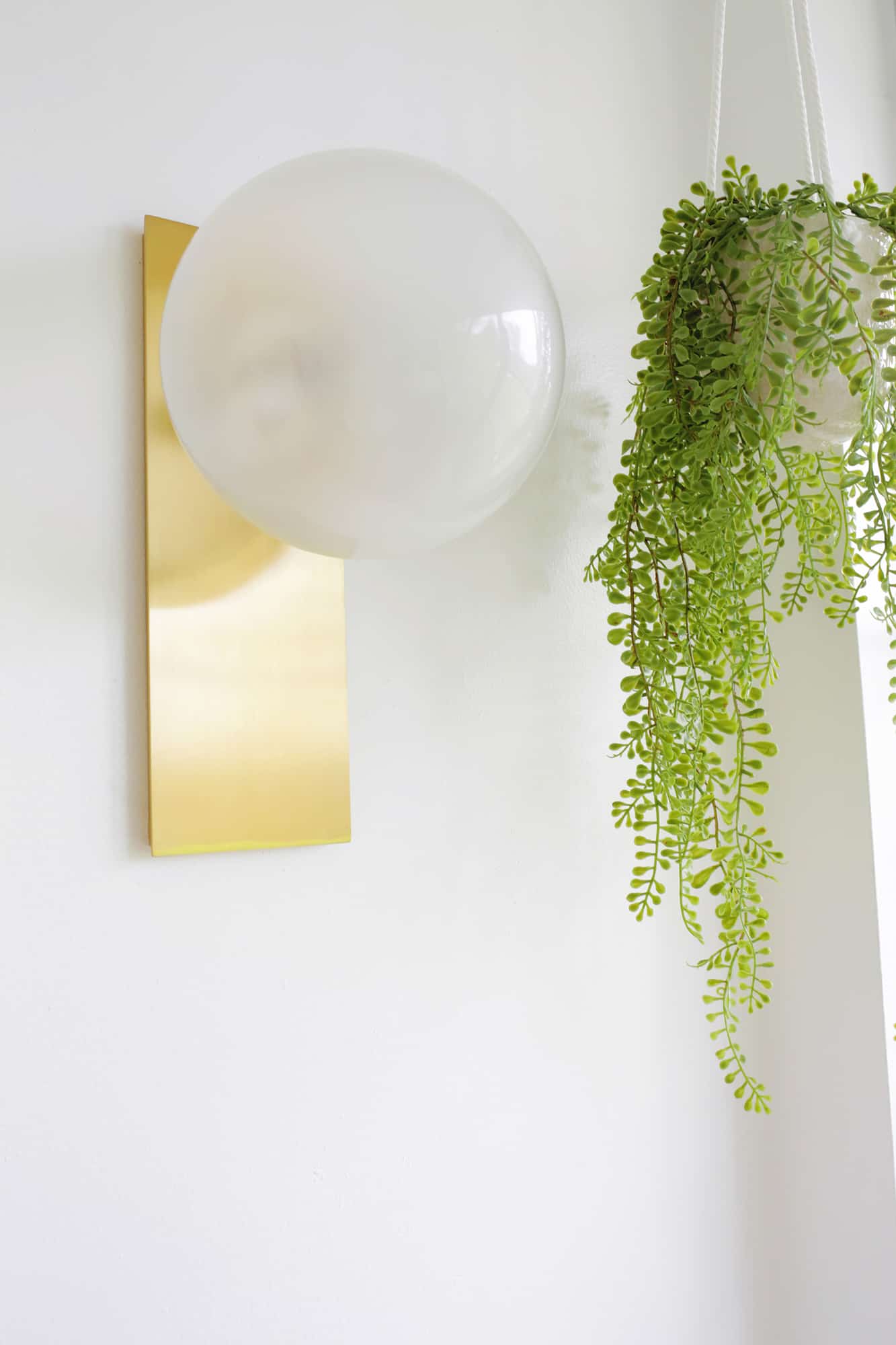
I hung this whimsical print by one of my favorite artists above the seating and added these gorgeous sconces to either side. The kitchen really didn’t have much lighting at all besides giant can lights in the dropped ceiling, so I really wanted to add layers of light through the room.
I added under mount cabinet lights, task lighting in the ceiling, a flush mount in the middle of the room, and sconces on the wall so we can turn on/dim areas of light as needed. So. Much. Better.
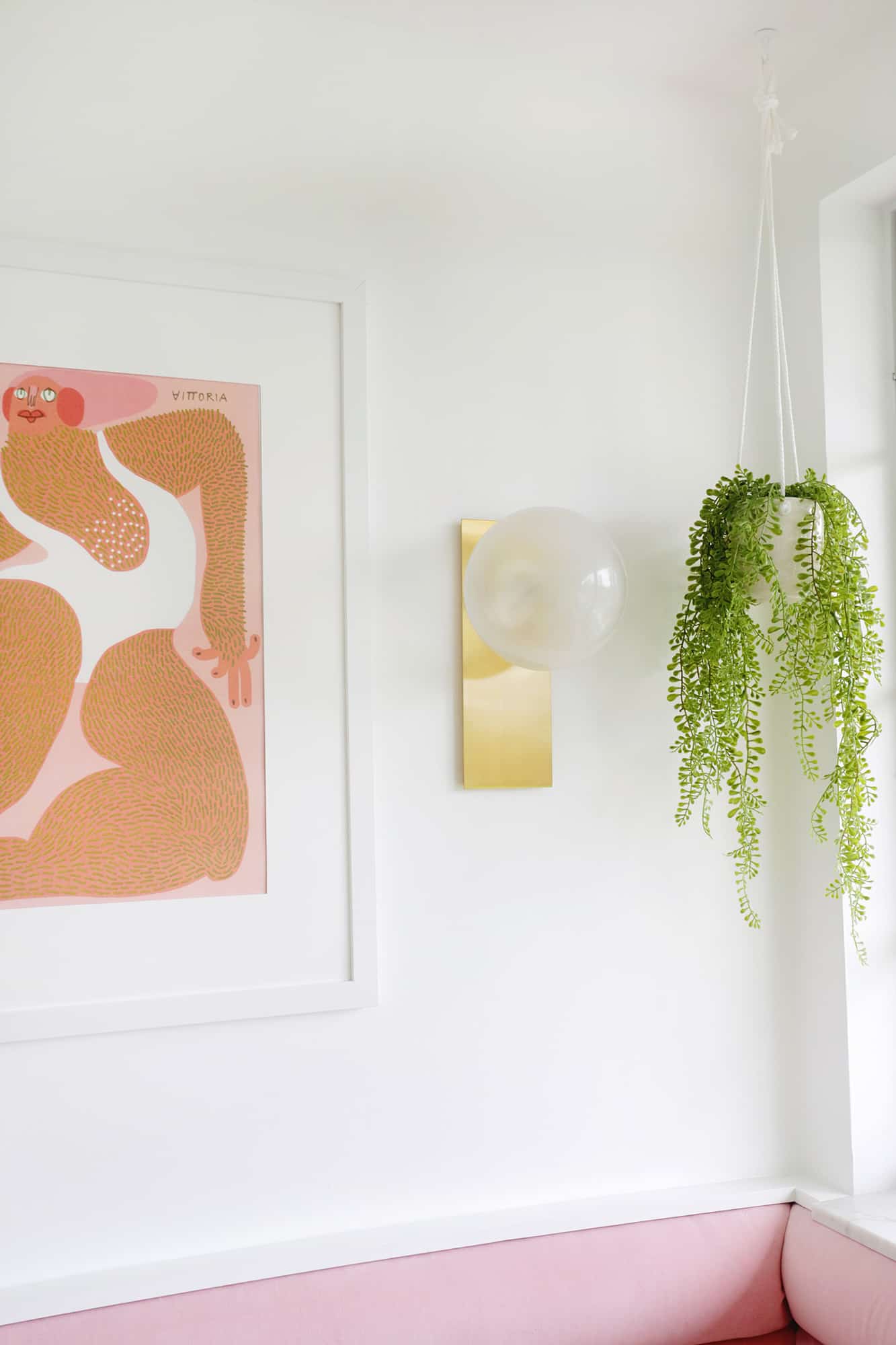
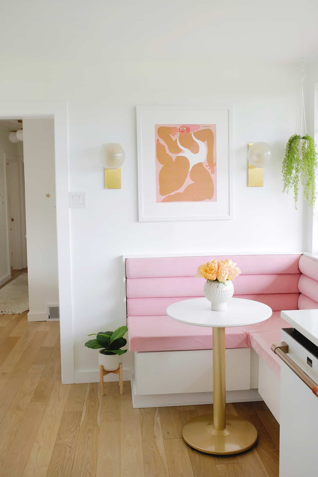
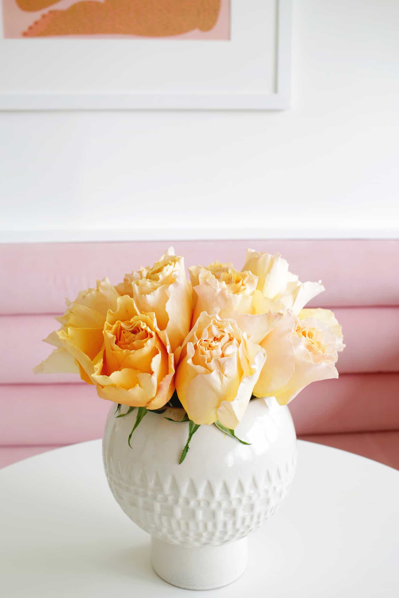
I changed the twine on this cute hanging plant to a white rope to match the kitchen better, but I love having some permanent greenery in the space. And since it’s faux, I don’t have to water it (which is a plus with its location).
I got a small bistro table (similar here) and it’s the perfect size for having a snack or breakfast. It gets used a lot by my daughter to color while I’m making dinner when she wants to be nearby.
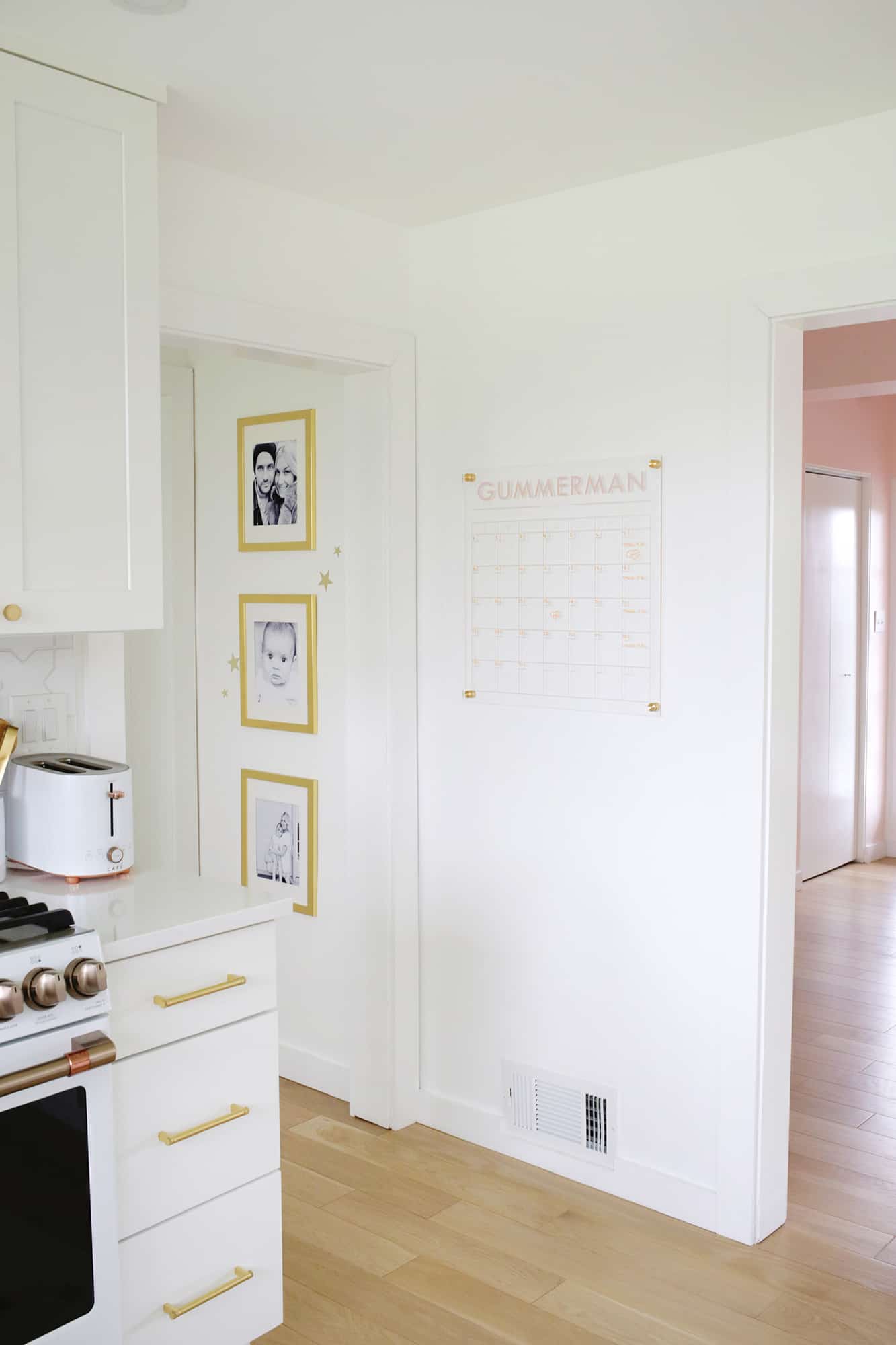
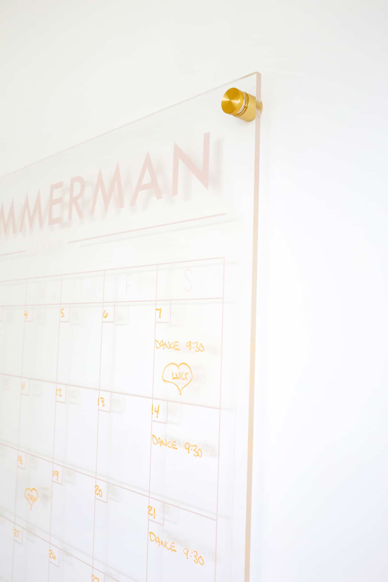
To keep our little family life organized, I got this customized calendar to hang in the kitchen and I love it. It’s a great way to keep track of appointments and events and the central location of it means that I see it often so I don’t forget what’s coming up for everyone.
I also like that even though it’s large, I got it in a lighter color and use lighter color chalk markers—so even when it’s full of writing, it doesn’t stand out in the space in a negative way.
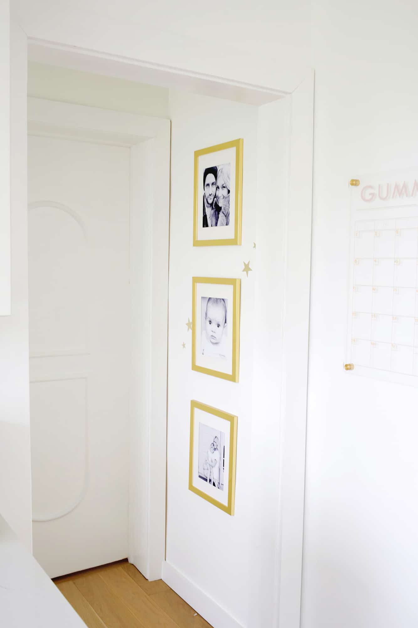
I also added some black and white family photos to the top of the stairs since you can see it from the kitchen as well (similar gold frames here). These are three of my favorite photos.
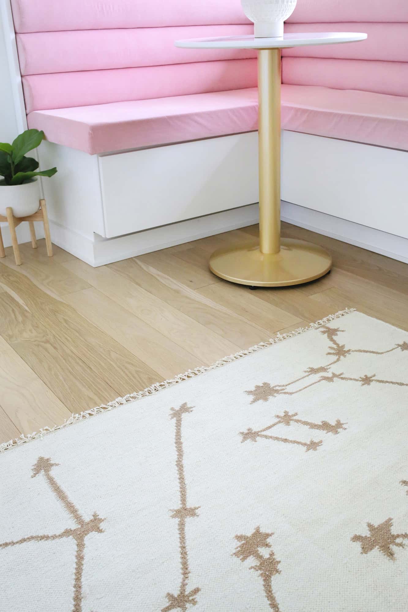
I had the hardest time finding a rug that worked for this room. Originally, I wanted to get something with color to add another pop to the space, but most flat weave rugs just aren’t my style (a lot of traditional or oriental prints). I was pretty stuck for about nine months until I found this neutral star pattern rug.
While it doesn’t have the pop of color I was hoping for, the neutral colors fit perfectly in the room and the star/constellation pattern fits with the backsplash (and makes it a little fun, too).
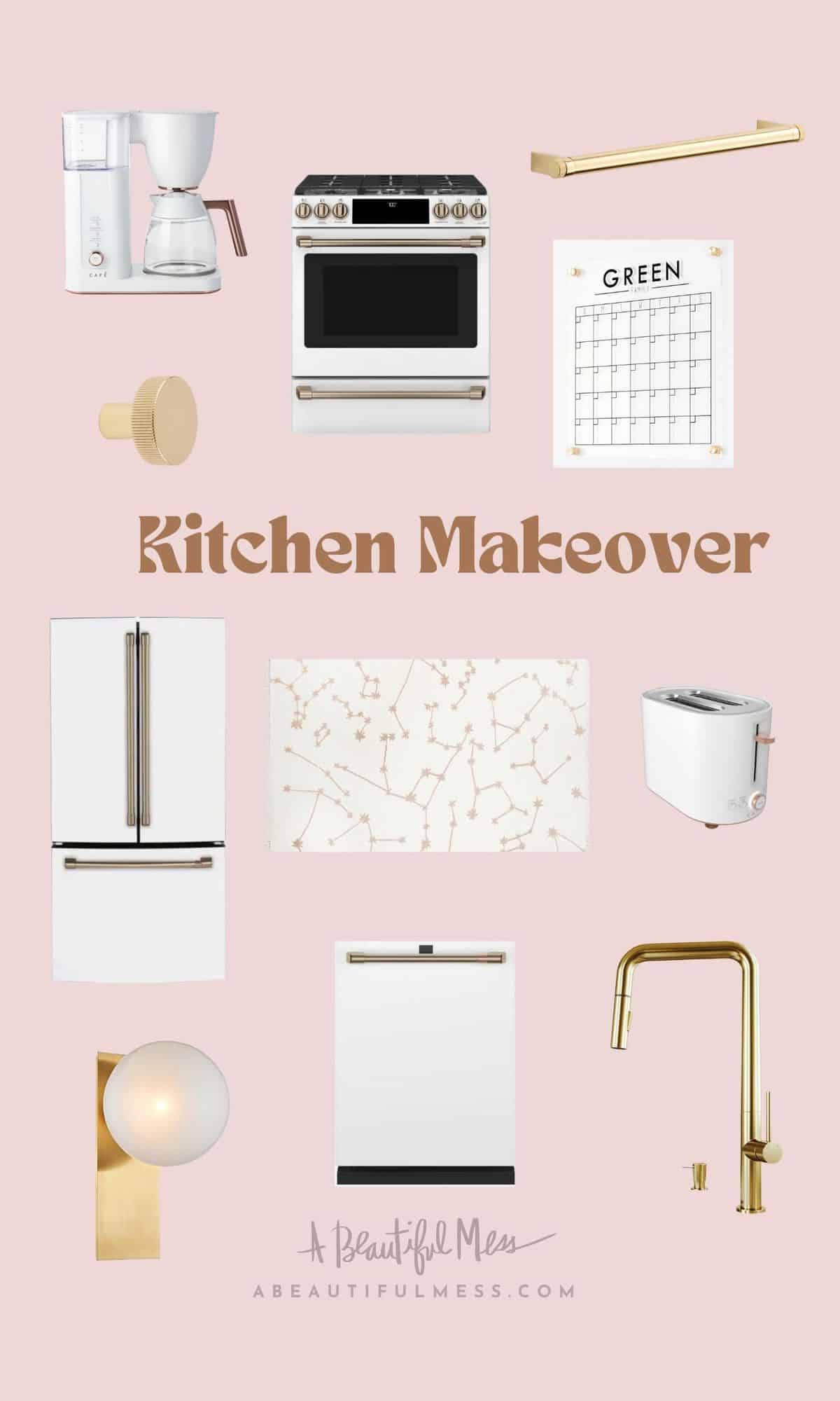
Coffee Maker / Gas Range / Brass Pulls / Brass Knobs / Family Calendar / Refrigerator / Star Rug / Toaster / Globe Sconce / Dishwasher /Brass Faucet
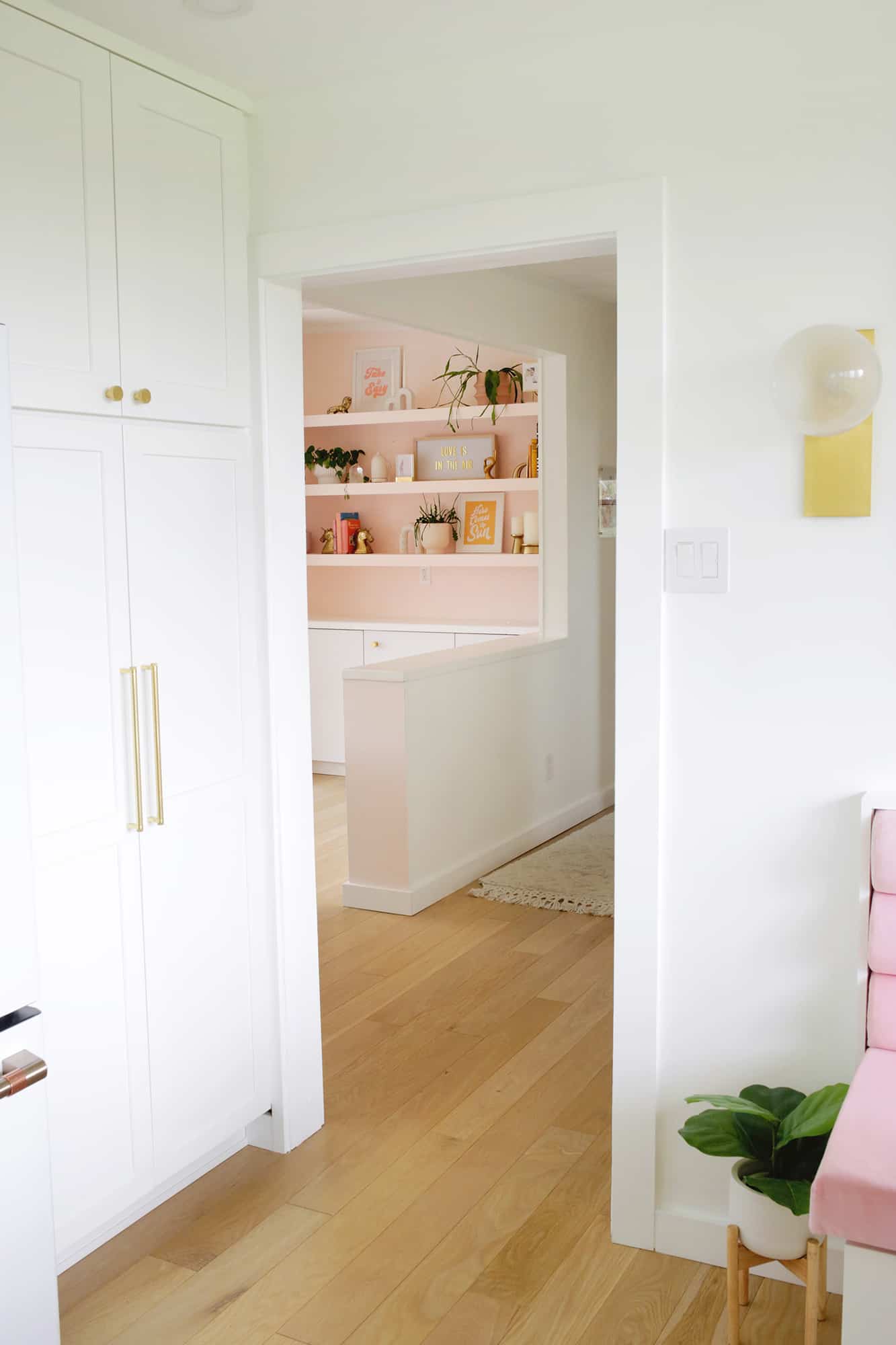
The overall feeling in this kitchen is overwhelmingly different from when we first moved in. The new white oak floors, higher ceiling, bright and open feeling with the light cabinets and countertop, and the pop of pink in the corner make it all feel so modern, yet homey. And, the giant windows really stand out as a feature.
It feels like I finally got a dream kitchen on our fourth home since we’ve been married, and if you ask me, it was totally worth the wait! xo. Laura
Want to see other room makeovers in my house? Check out …
Café appliances c/o Café
