When you buy a house that you plan to renovate, there’s always one room that you categorize as the “worst” room in the house.
While our current 1960s-era home is FULL of weird decisions and quirky spots throughout, the main (and only) bathroom on the main floor of the home was just a lot to take in.
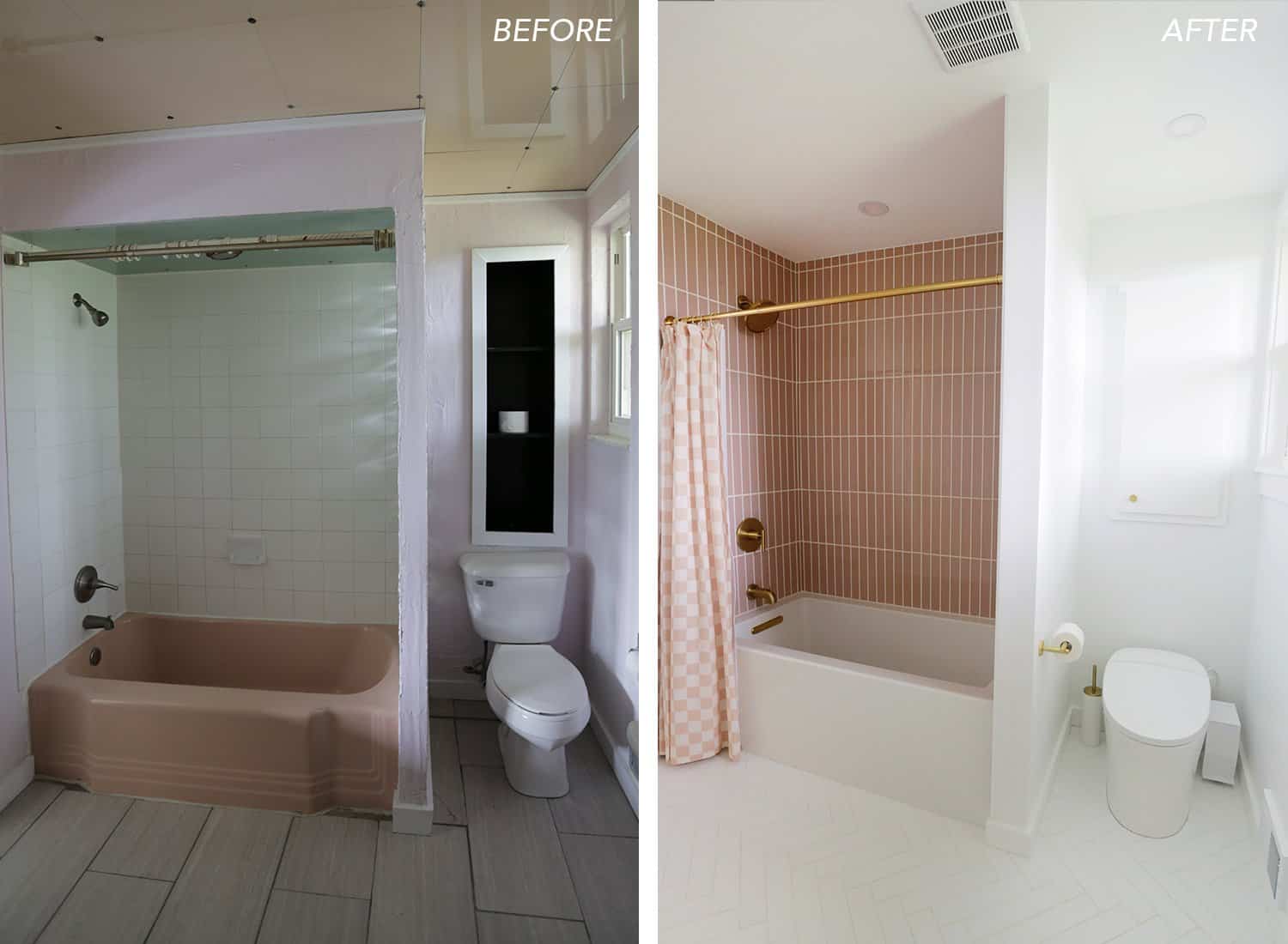
Originally, the walls were some sort of green glass tile that was stuccoed over decades ago (!!!) and painted purple.
There was glass block everywhere, the ceiling was half green glass tile and half pink glass tile, and the floor was grey wood-look tile that was one of the worst installation jobs we’ve ever seen.
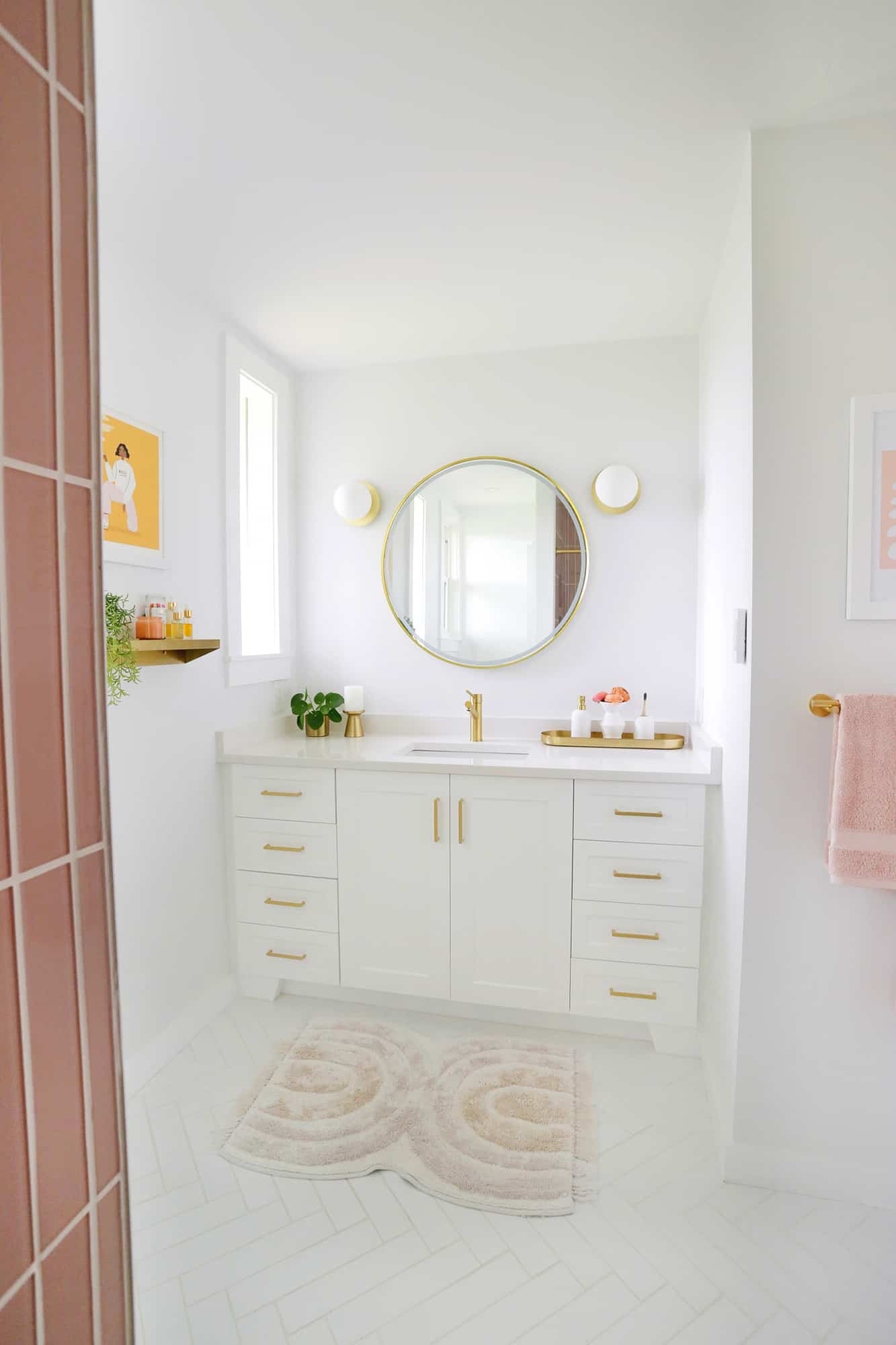
The grout lines ranged from 1/4″ wide to up to 2″ wide in spots and you could stub your toe on the unevenness) and the shower was made of four different white tiles.
There was a full-on Broadway-style makeup desk with exposed light bulbs flanking both sides, and the only light for the room was a old vanity light attached to a board.
It loosely hung on the wall like a picture frame over the sink with wires everywhere. Oh, and there was just a big hole in the wall where an old medicine cabinet used to be, so they just hung a mirror up to cover it. It was a lot.
Bathroom makeovers are expensive, and this one needed everything and more done in order to do it right, so I wasn’t sure if we would ever get around to doing this space anytime soon after moving in.
The first year, we focused on the rest of the upstairs, but as we neared the end of that major overhaul, it became apparent that the upstairs was looking so nice now that we really needed to do the bathroom in order for it to match the rest of the house.
Since this gut job was way beyond my DIY skills, we used our contractor to get it done this winter and the result is simply amazing.
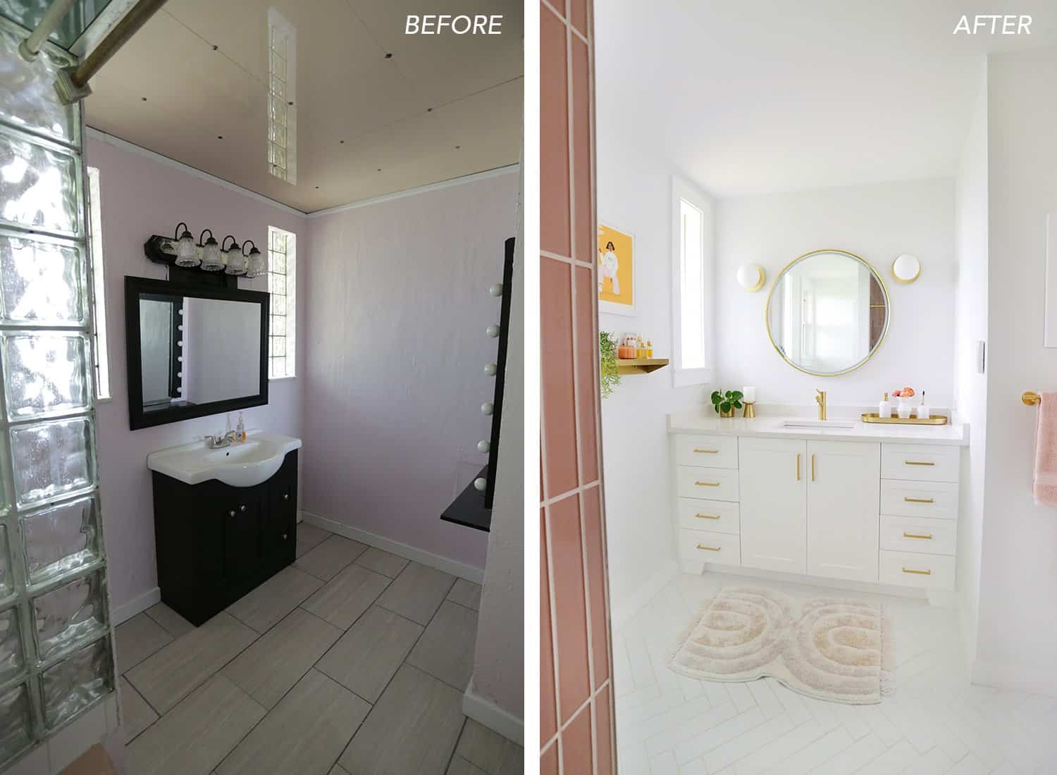
Probably the best decision I made in the reno was to move the location of the tiny sink cabinet to the wider alcove on the right side of the room so that we could put in a vanity and countertop that spanned the whole width of the alcove.
The previous sink was in the way of getting to the toilet and the “countertop space” wasn’t wide enough to keep my curling iron from falling off constantly. It also didn’t help the one outlet in the space was on the opposite side of the room, haha.
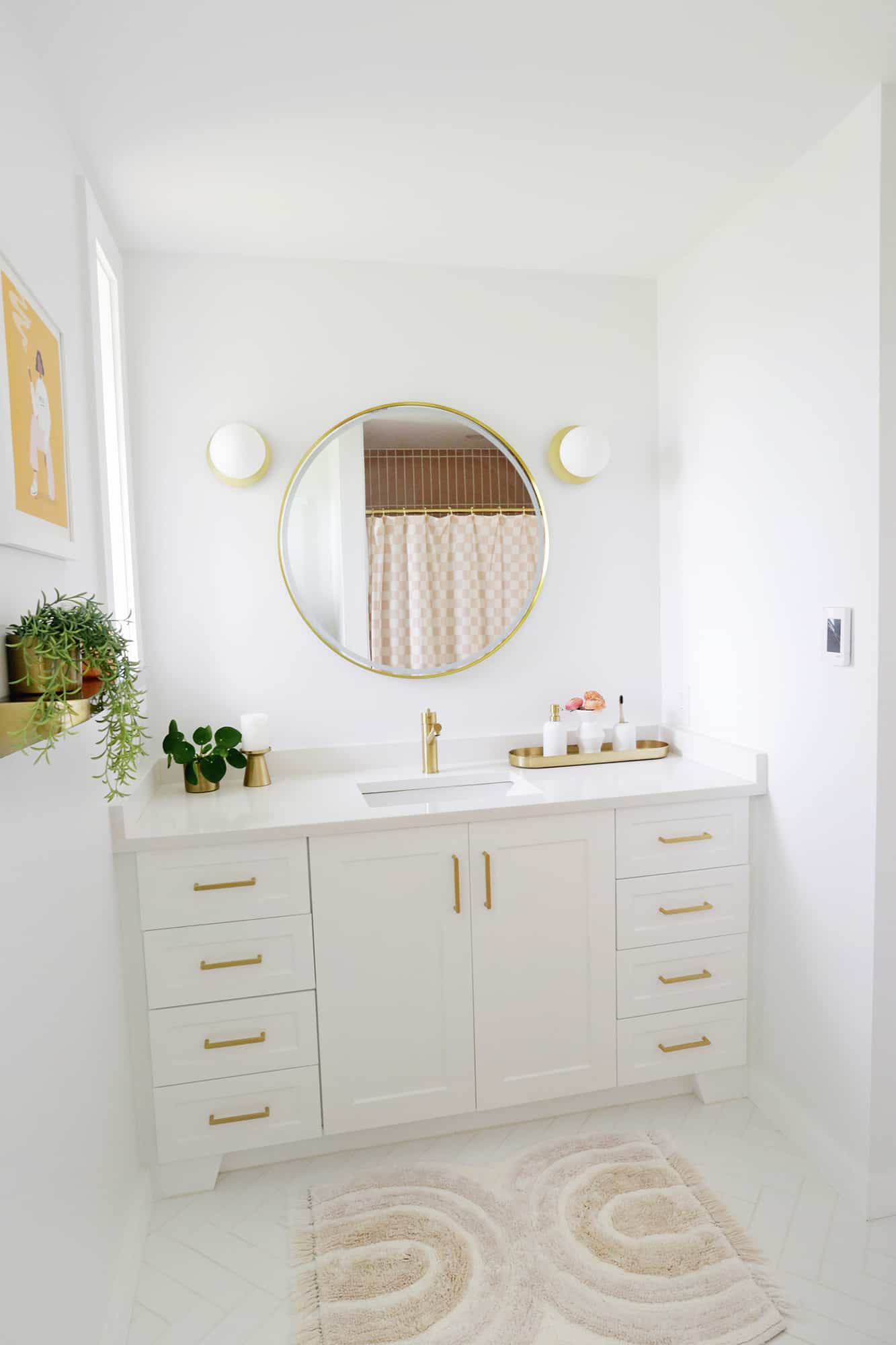
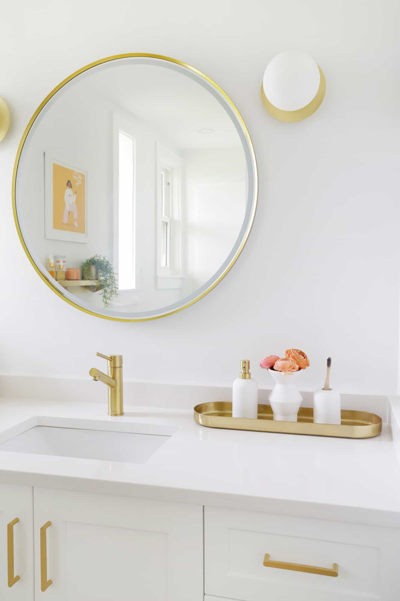
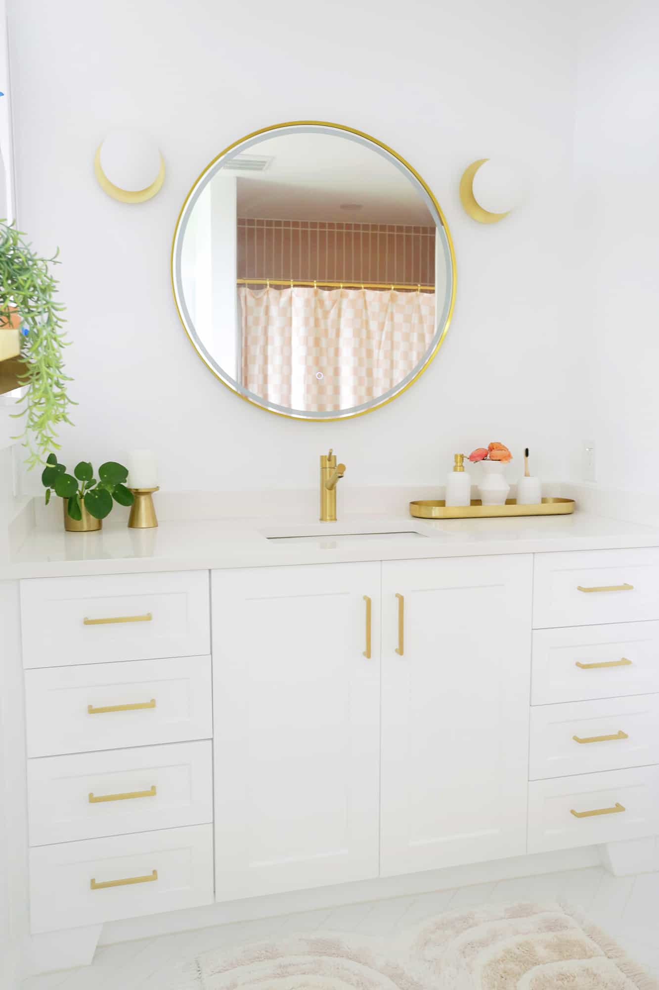
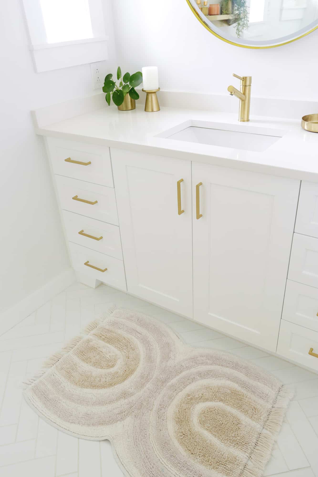
Now we have a much bigger countertop area (it feels huge!) and I got a white quartz countertop to hold up to the traffic of the main bathroom in the house.
Oh, and there are two outlets above the vanity now, so I can actually get close enough to the mirror to see and curl my hair, haha. That gold faucet is really pretty, and I feel like single handle faucets are easier for kids to use as well.
There was almost zero storage in the old bathroom (previous owners seemed to all put a huge cabinet in the room just to have a place to put things), so it’s amazing to have this vanity (similar here) with all the drawers as well (they slide out under the sink for taller items).
I switched out the pulls on the vanity for these that were a brighter gold with rounded edges to match the other finishings better, and they are so pretty. I also added this soap dispenser and toothbrush holder that are rounded to continue the curve feel here and there.
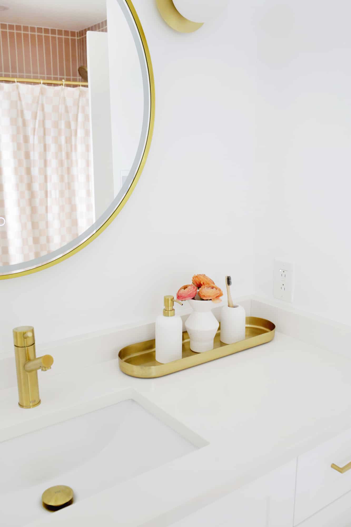
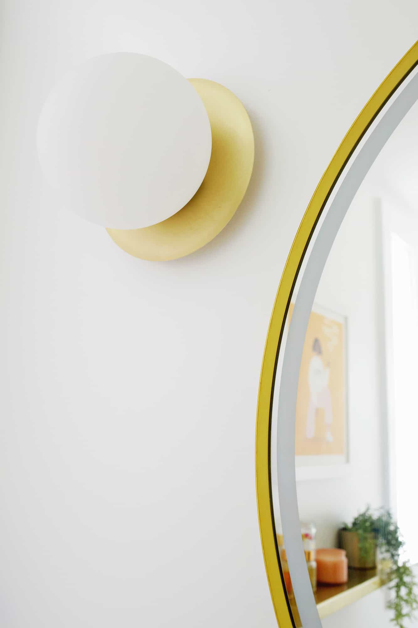
The light in the bathroom is also very one-directional since all the windows are on one wall, so I used these ’70s feel globe lights to flank the mirror and chose a mirror that also has its own built-in ring light (similar here) to evenly light the face for makeup application, etc.
I also love that the mirror light dims to a soft glow, and we use that as our bathroom nightlight so we and our kiddo can see in the middle of the night.
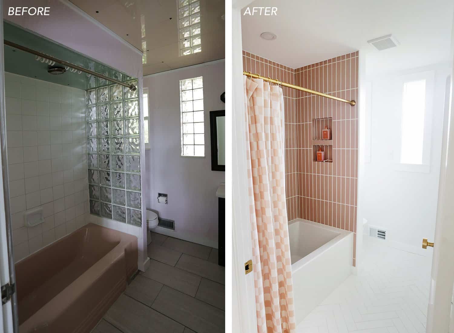
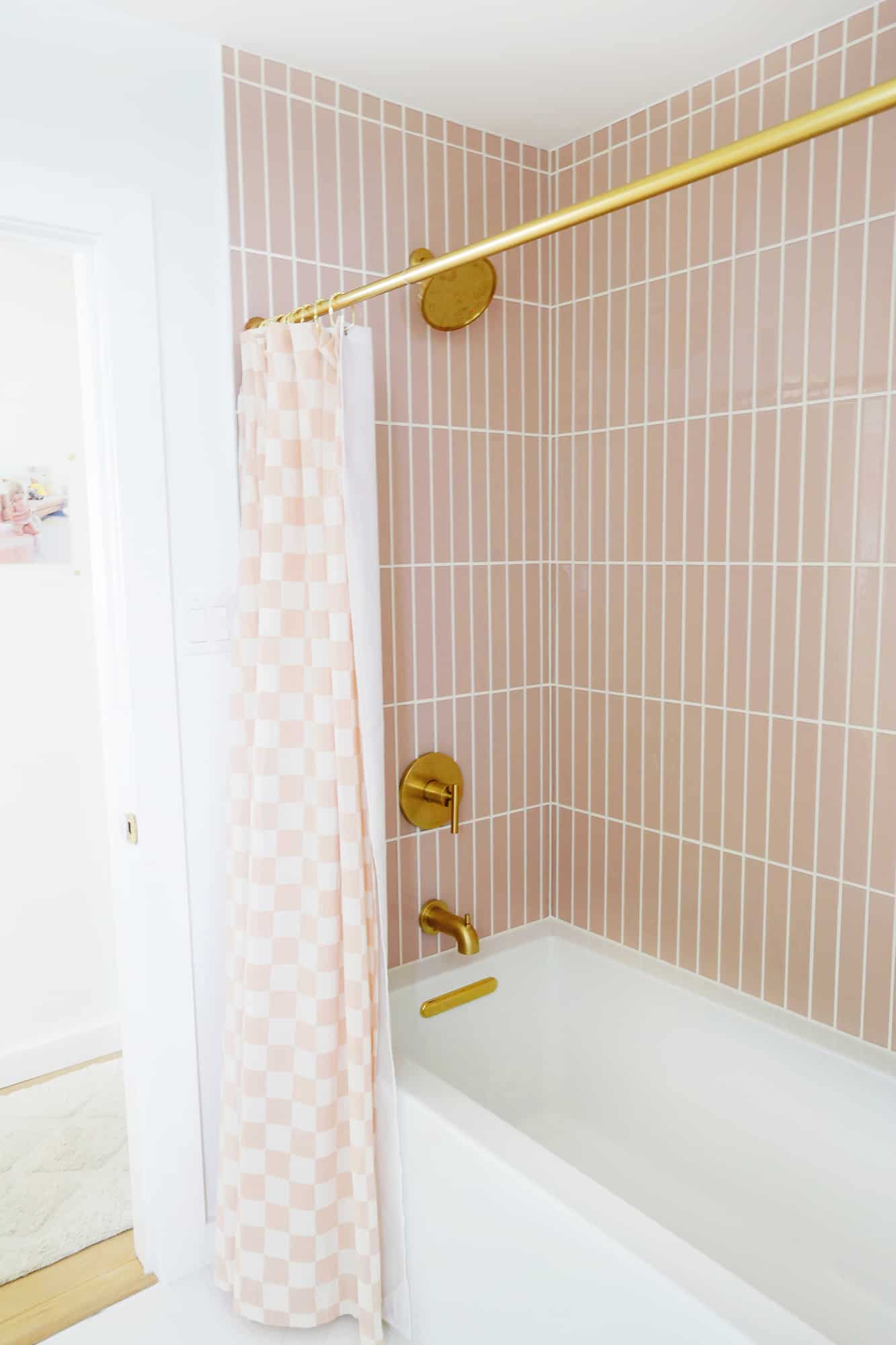
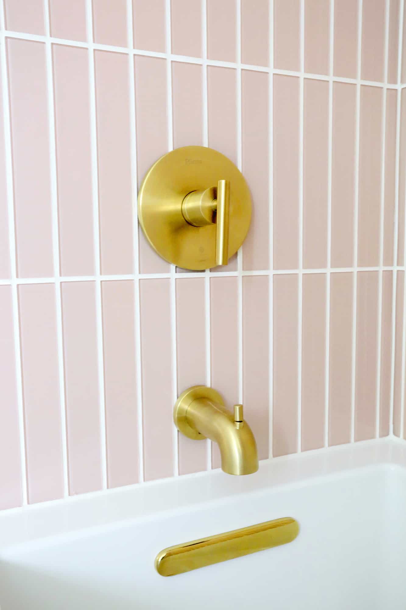
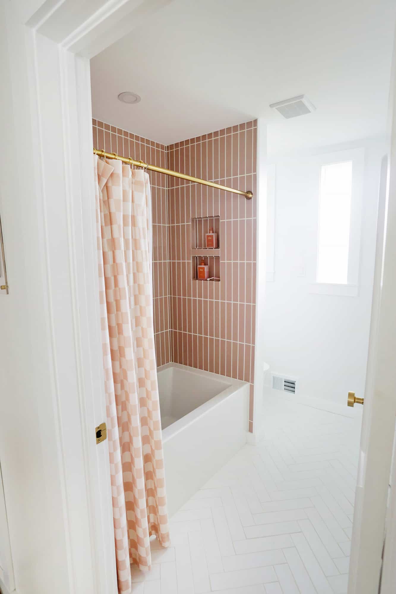
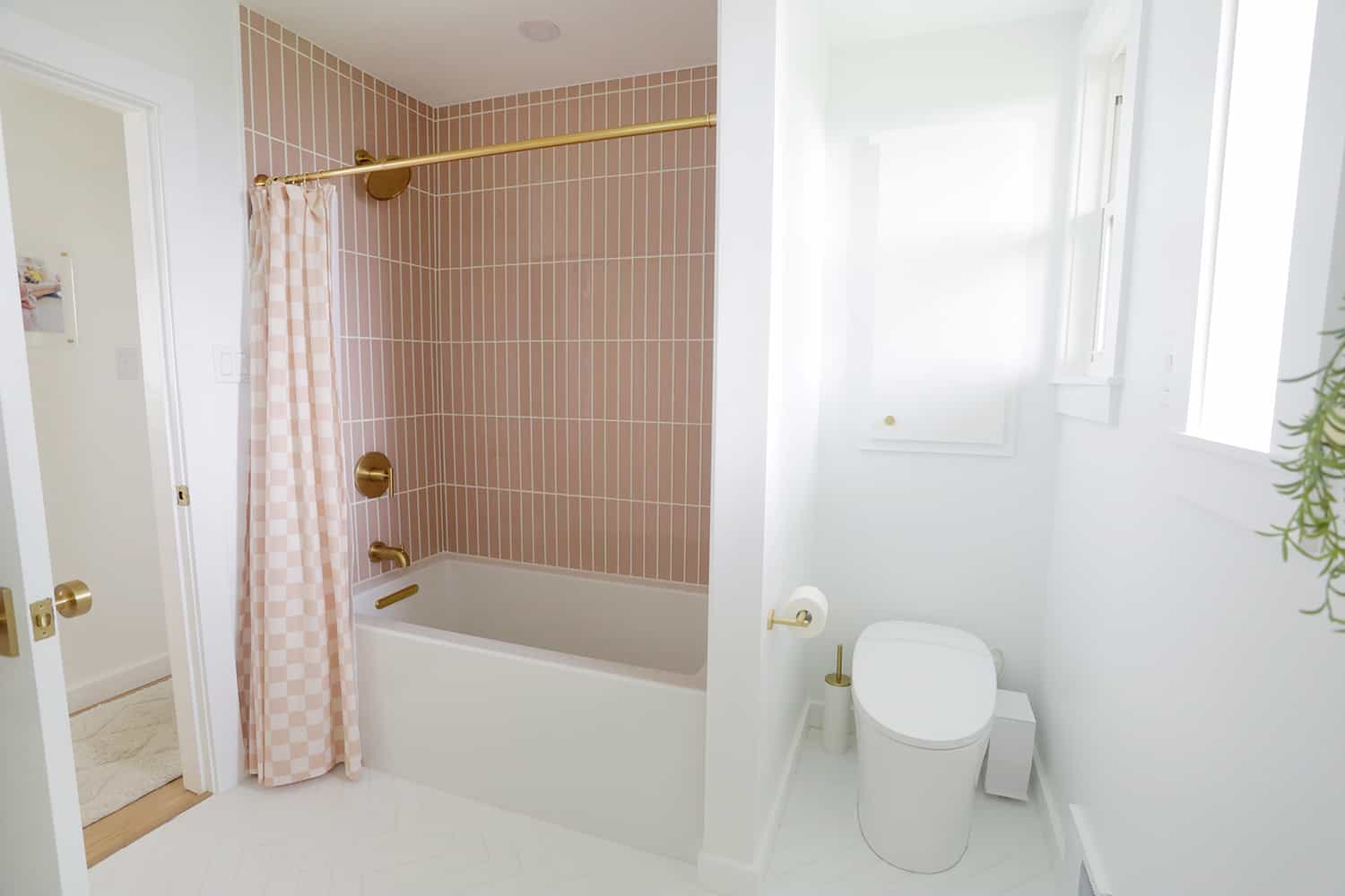
While I did have a bit of a soft spot for the vintage pink tub that was in the old bathroom, it wasn’t in the best of shape close up. But I made sure to keep some pink with these gorgeous glass tiles by Fireclay in the Rosy Finch Gloss.
I love that they are definitely pink but still kind of feel like a neutral as well, and the stacked bond pattern and size makes it feel very modern and fresh. Lola was so sad to get rid of the pink tub, but I kept telling her she was getting a pink shower, so she was OK with that.
There’s something about glass tile in a shower that feels so luxurious, and I love it.
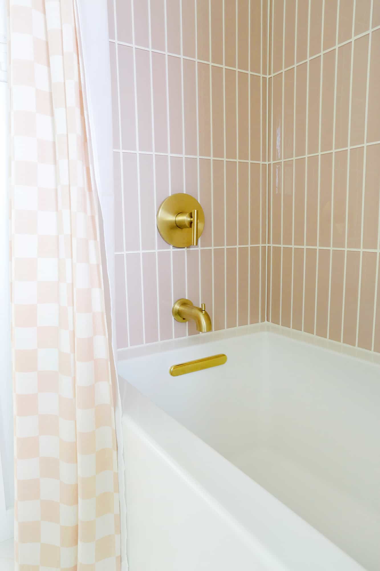
The pink also looks so pretty with the gold shower kit that I picked out, and it’s just such a happy combo to look at while we shower or bathe. Speaking of bathing, switching out the old tub with this clean-line beauty was also a great decision.
It’s an amazing soaking tub for baths and the sides are a lot higher so Lola can splash around a lot more, and very little comes over the sides of the tub now versus the tsunami we had before at every bath.
To match the gold shower kit, I got this shower rod and I love this checkerboard curtain that adds a trendy pattern to the space.
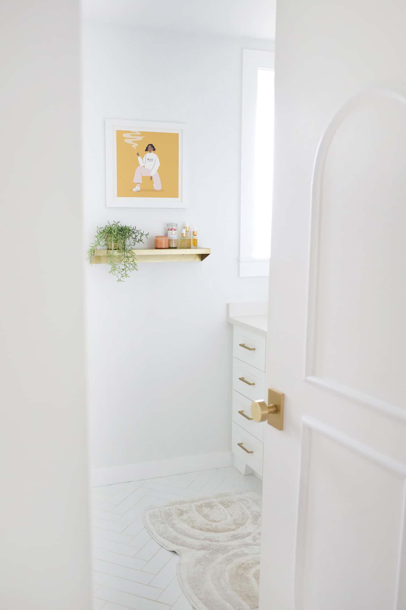
I knew I wanted the rose tile for the shower, but I wasn’t sure what to do with the floors for a long time. I do love a clean look of white on white on white (sue me, but I do), so I wanted to do something bright, but with a little twist.
I settled on this beautiful Fireclay tile in Calcite and decided to have it laid out in a herringbone pattern. I feel like the herringbone was a little nod to my love of all things Parisian, but since it has white grout as well, it’s not crazy and doesn’t compete too much with the pink and white pattern that the shower creates.
We also decided to add a heated floor system under the tile which wasn’t that much more since it’s a comparatively small space. Worth. Every. Penny.
My husband has already fallen asleep on the floor and the cats go in there to lay on the pre-warmed bathmat at night (similar style here). I like that the arch in the rug mirrors the custom trim I added to the doors upstairs as well.
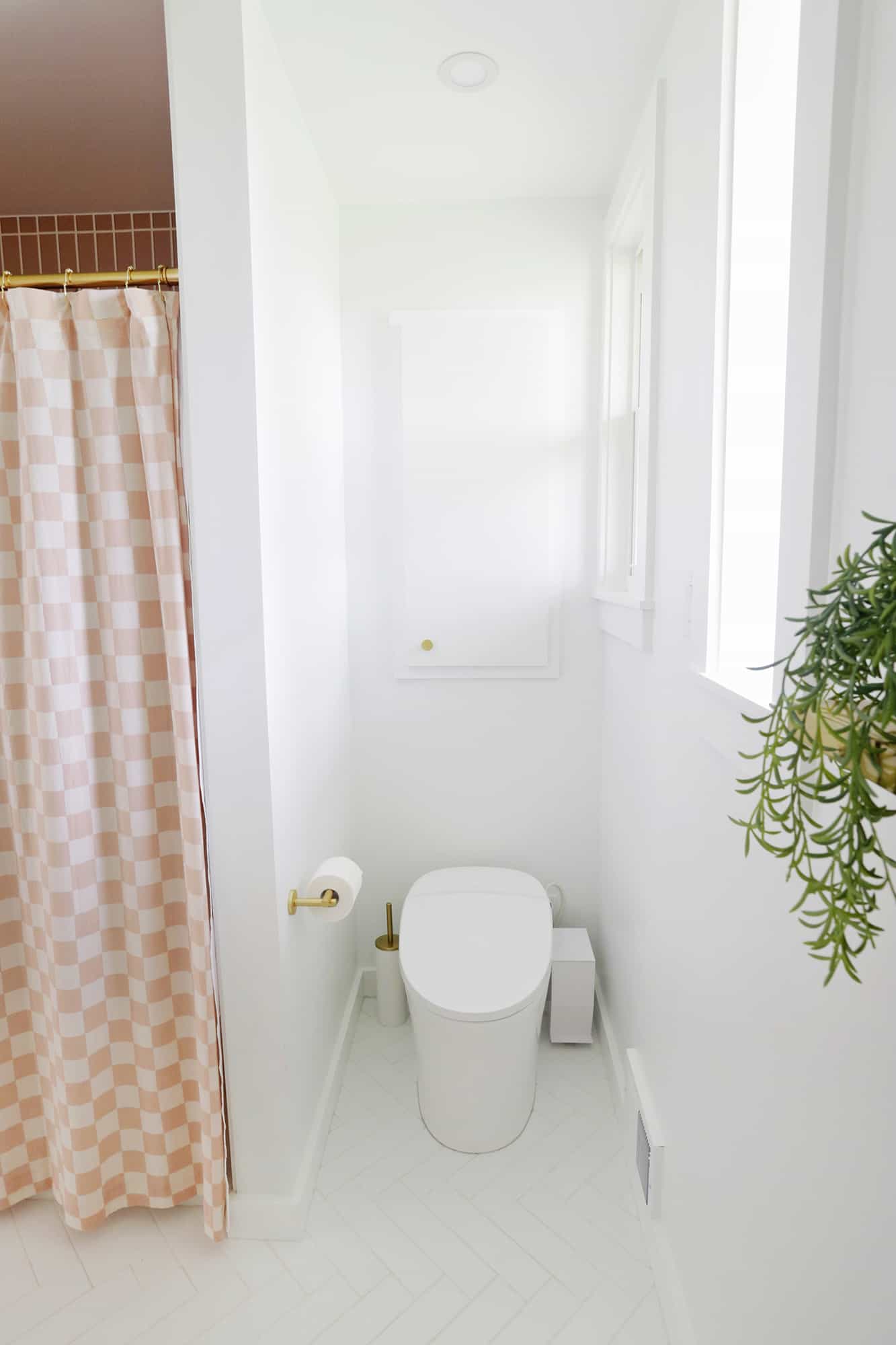
My brother was the one that introduced us to this fancy toilet that he installed when he redid his own bathroom himself, and while it feels a little nuts to geek out about a toilet, let me first tell you that it has programmable bidet settings (with adjustable temperature warmth), a dryer for post-bidet sessions (with adjustable warmth), automatic flush, and a heated seat.
It actually needs its own outlet as it runs on electricity (we still have a “regular” basement toilet in case the power is ever out, if you were wondering), but it’s a pretty amazing toilet overall.
It’s hard to find a “pretty” toilet brush, but I found this one to complete the set. There’s not a lot of space in the area, but this slim trash can fits perfectly.
I also asked my contractor to add a cabinet above the toilet so we could have more precious storage space. It looks like that area used to be a laundry chute, but now it’s kind of above the basement shower, so we closed it off and made it storage instead.
My husband grew up with a laundry chute though, and he swears it’s the best thing ever and we need to find a way to add another one …
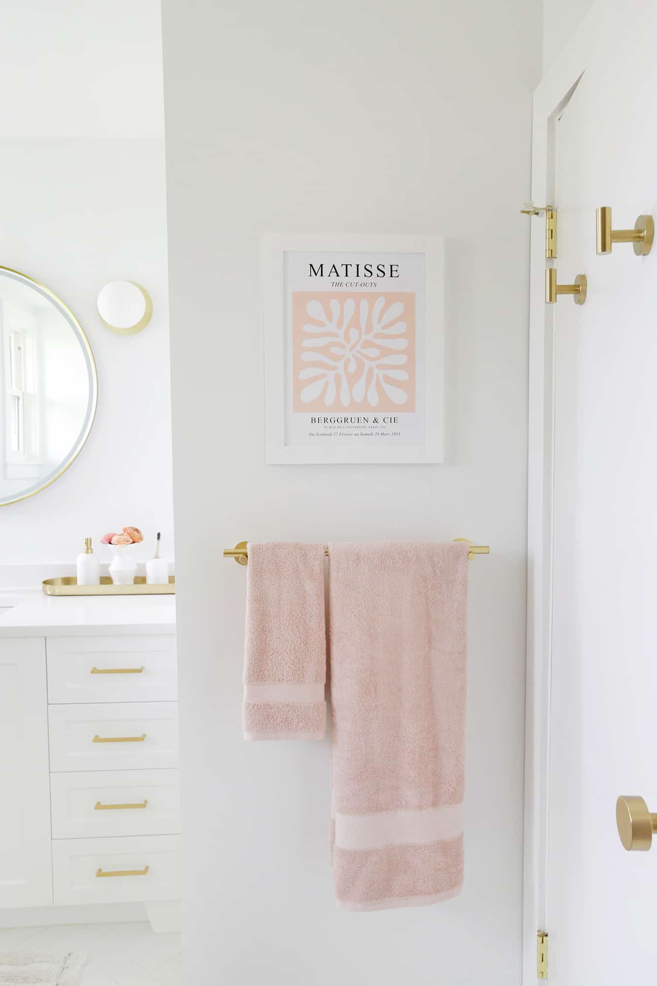
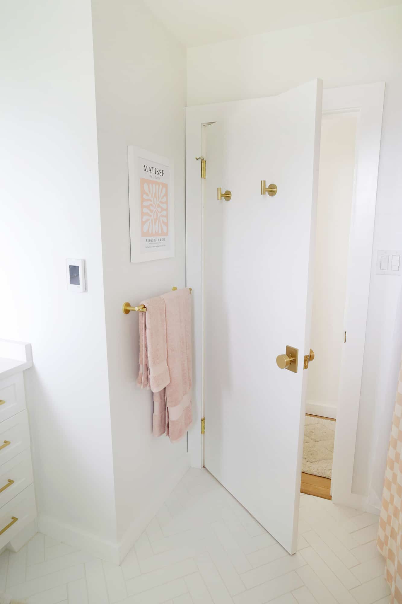
The previous bathroom didn’t have any towel racks since the stucco/glass tile combination was so hard to mount anything to, but I chose this towel rack, hand towel holder, and toilet paper holder to match the look and added this Matisse print above the towel rack to compliment it.
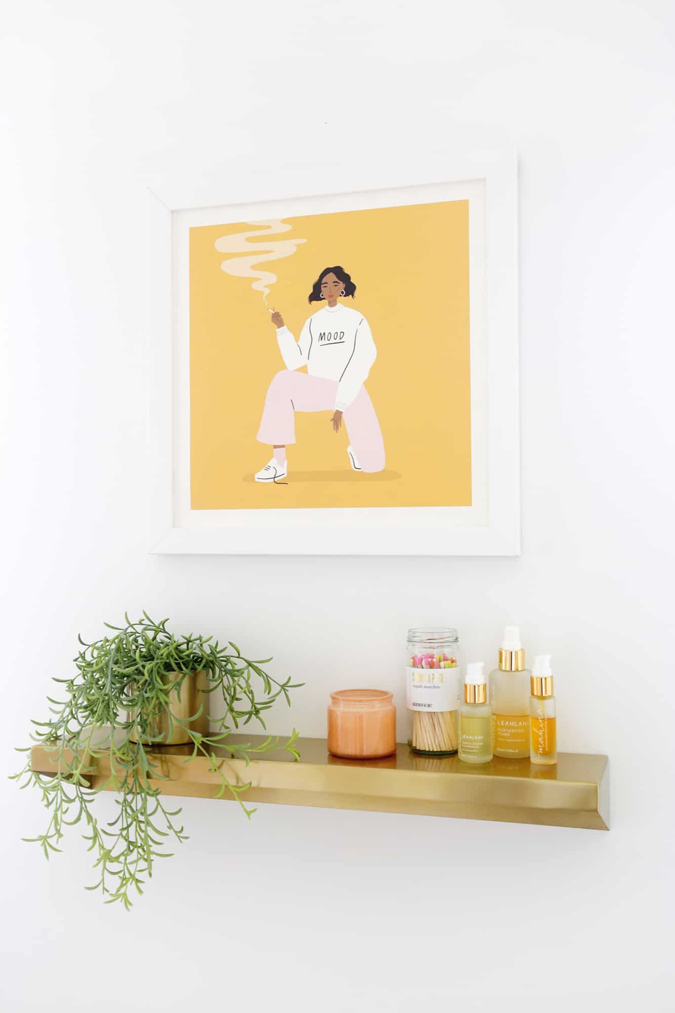
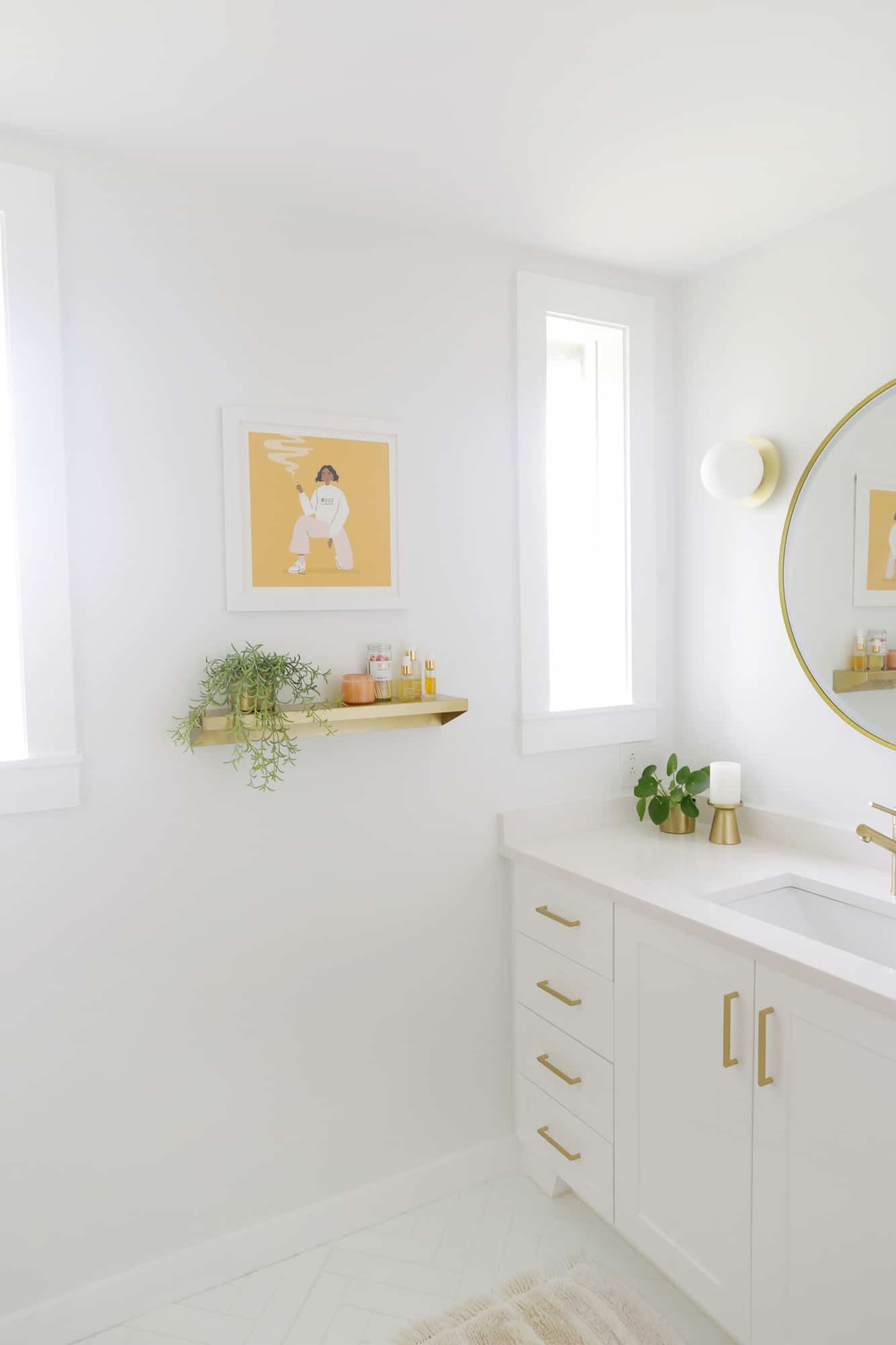
To add some color for the main art in the room, I hung this print by one of my favorite artists that we had in our last home.
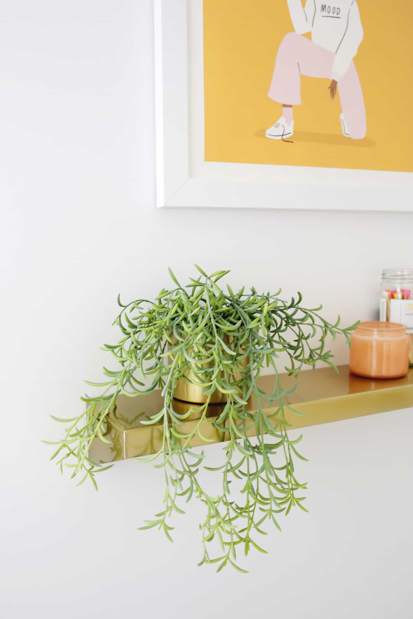
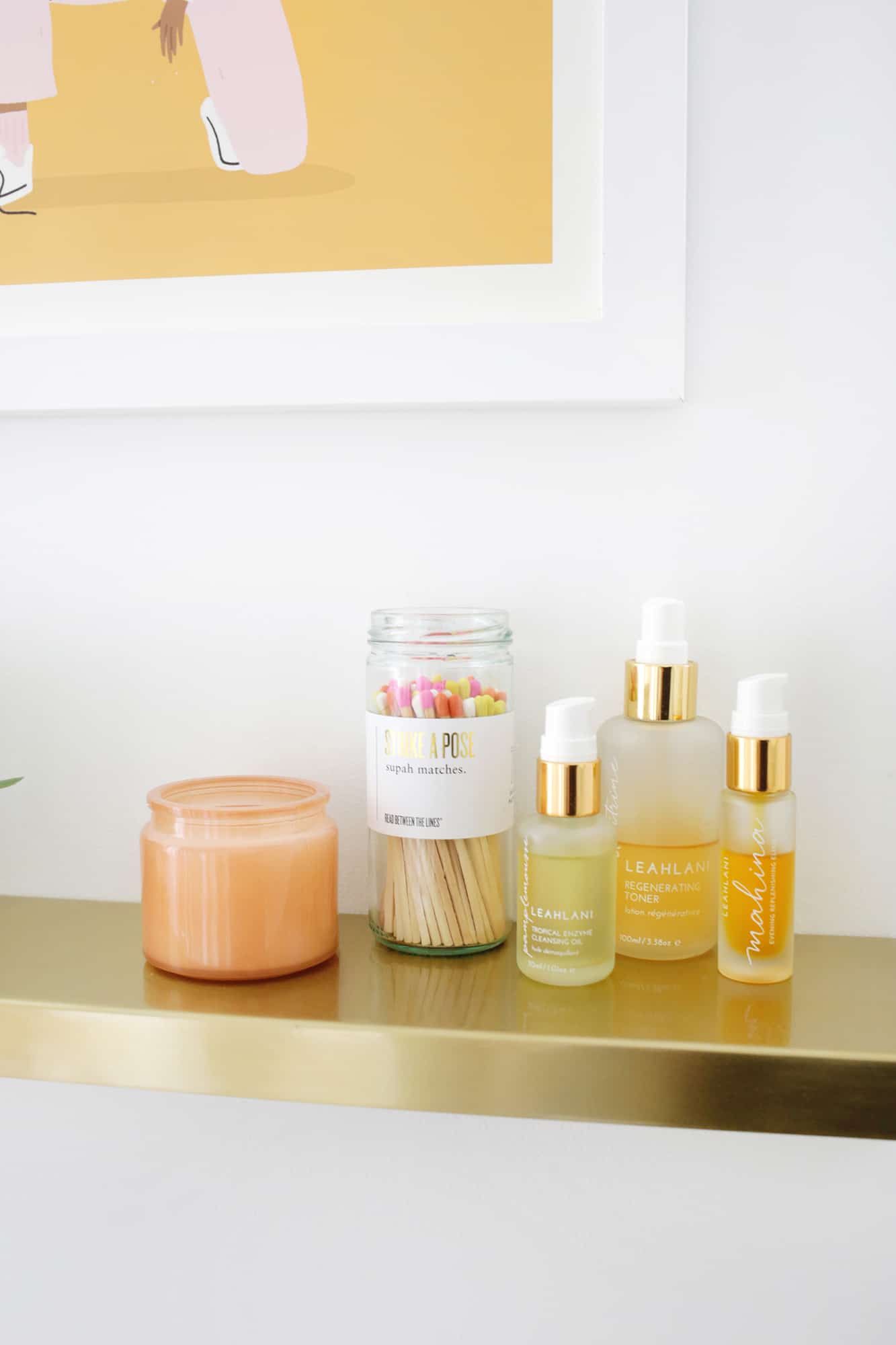
I also wanted a shelf to keep my most used Leahlani skincare items out since I use them multiple times a day (and they are pretty enough to keep out too). I also got this gold floating shelf to hold them and added some greenery and these super cute matches from our friend Sarah’s shop (she used to be the A Beautiful Mess photographer back in the day!).
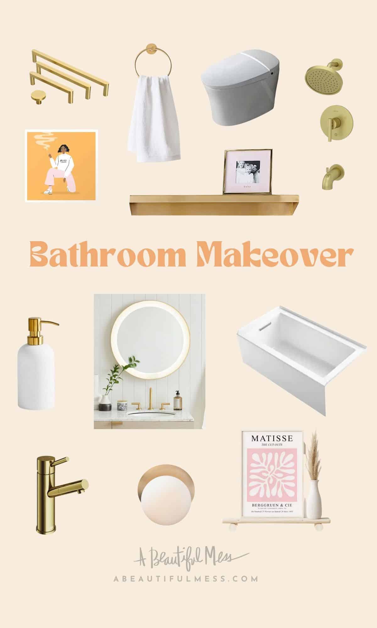
Gold Hardware / Towel Holder / Girl Print / Gold Shelf / Toilet / Gold Shower Kit / Soap Dispenser / Lit Mirror / Bathtub / Gold Faucet / Globe Sconce / Matisse Print
Want to see other room makeovers in my house? Check out…
I can’t tell you how much we love the new bathroom and how it’s SO much more functional than it was before. Taking a soak in the tub for the first time when it was all done felt like I was at a spa and it was just magical.
Someday, I may do something a little more colorful or add some pattern to the walls, but for now I’m just enjoying it all looking so fresh and bright. What’s your favorite part? xo. Laura
