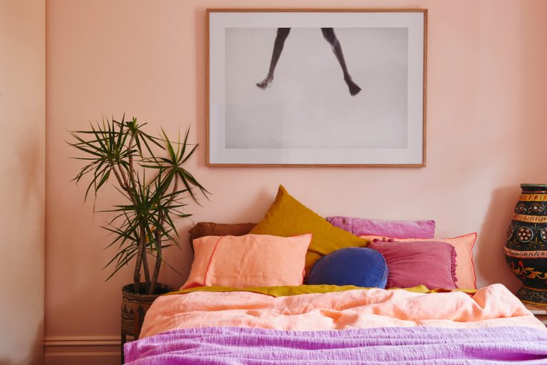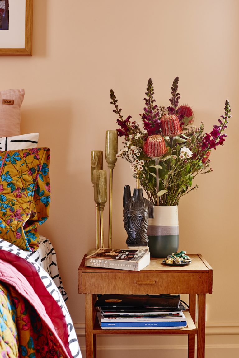
This April, Architectural Digest took readers inside Kacey Musgrave’s serene Nashville home. Renovated to be an inspiring sanctuary for the beloved, Grammy-winning singer-songwriter, the 3,500-square-foot dwelling was painted mostly white or off-white, but the occasional pink pops in certain corners—the sunset-inspired hues chosen for “specific, personal reasons,” according to AD. The best interiors are deeply subjective, but those dusky pinks could also be evidence of a design trend that continues to dominate: coral paint colors.
Dubbed the Color of the Year by Pantone in 2019, coral’s buoyant qualities continue to influence the design world years later, in part because of the reason it earned its COTY title in the first place.
“In a time when so many of us are increasingly immersed in digital experiences that can be cold and isolating, Living Coral felt like an appealing shade of connection,” Leatrice Eiseman, executive director of the Pantone Color Institute, shared with Elle Décor in 2019. Three years and one life-altering pandemic later, the need for connection—especially at home—is still at an all-time high.
For a bit of a primer on the connective paint color, we tapped interior designer Kim Lapin, who just painted the hue in her personal Los Angeles home.
“Coral or any soft peachy pink tone evokes a feeling of warmth and charm,” Lapin shares. “There is a light-hearted playfulness to the color, which is why it is my absolute favorite for interiors—as well as décor, fashion, and really just life.”
Featured image by Nikole Ramsay.
What rooms does coral paint work best in?
For Lapin, the cheery, welcoming color works particularly well in a guest room or a kid’s room—the latter of which the designer has personal experience with.
“I painted my two-year-old daughter’s bedroom a peachy pink in our new home that just underwent a one-year gut remodel, and it is perfect,” Lapin shares. “It is the most dreamy and cheery little girl’s room without being a literal baby pink, which I do not love. This color feels modern and fresh.”
For daring homeowners, she also recommends a paint color in the coral family for dining rooms. “I love to do unexpected things in my design, so I had my dining room plastered in the most dreamy pink tone,” Lapin adds. “The tone is flattering on any guests that might come to our dinner parties.”
What color goes best with coral?
Though Pantone offers a few compatible “color harmonies” for the best coral paint colors, if you’re going with a more muted version of the hue, Lapin suggests a sea-foam green or a very muted charcoal.
“If you are going for a strong coral, I would pair it with a super washed-out muted color,” Lapin adds. “Something off-white or bone white to soften the room.”
Is the coral paint color trend here to stay?
Before you dedicate time, money, and literal square footage to the best coral paint colors, it’s nice to know if your investment will be worth it.
“Coral is here to stay because it is universally flattering and makes a statement with very little effort,” Lapin explains. “It is a star in my book and because of its cheery tone, it is more relevant than ever. I couldn’t be happier with the spaces I painted coral pink. They instantly lift my mood and are the stars of my home.”
The Best Coral Paint Colors in 2022
With Lapin’s help (the designer used a peachy Sherwin Williams coral for her daughter’s room), we zeroed in on a few brands that produce the best coral paint colors for dreamy spaces that manage to be both calming and stimulating all at once.
