Welcome to our guest room! This was the first room we redesigned after we moved into this house. Given its small size and enclosed footprint, I decided to start here. I figured if we made a mistake when it came to the guest room design, it wouldn’t be that noticeable in our daily lives.
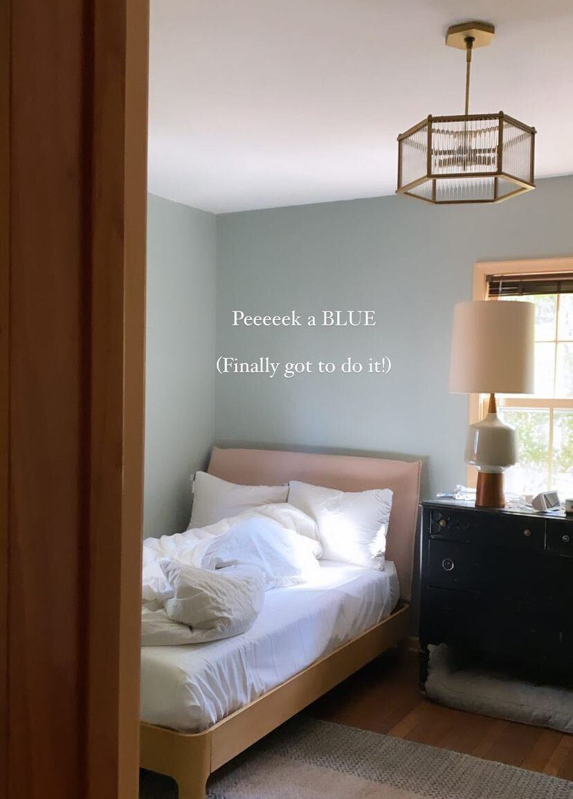
When we updated this space originally, Joe and I stripped the wallpaper and painted the walls. We went with a blue color I really liked that worked well with the existing trim color. We also added a new overhead light and added molding to the back of the doors to tie in with some of the traditional touches throughout the rest of the house.
Now that we’ve lived with this space for a couple of years, I’m ready for a change. One of the main issues was that my original paint job wasn’t done super well, so I was ready to upgrade it.
Today I’m sharing the first two changes to the guest room design—the new wallpaper and trim paint color!
Read on for all the details about why we selected these design elements and what else we’ll be updating as we go.
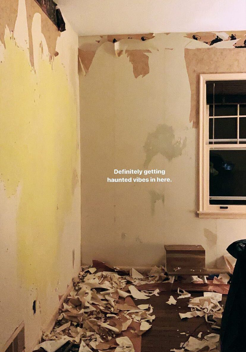
Before we get to the current photos, let’s take a look at how the room has changed over time. This was how the guest room looked when we first toured the house in the spring of 2020.
At the end of the summer of 2020, Joe and I stripped the wallpaper.

That fall, we painted the walls blue (Light Blue from Farrow & Ball, to be exact).

Throughout the rest of the fall, we updated the decor in the room.
Without further ado, let’s take a tour of the space as it looks now.
New Wallpaper
Wallpaper is one of my favorite ways to add character to a space. For this room, I chose a wallpaper from Sandberg, which is one of my go-to wallpaper brands. We used their wallpaper in the main bedroom and kids’ room and I love both prints.
They just launched a new collection, Huset i Solen (or House in the Sun). The collection is inspired by the home of Carl and Karin Larsson, Swedish designers whose design sensibilities were very avant-garde for the time. The home and garden Carl and Karin designed is an incredibly inspiring place full of personal details, artistic expression, and a love for creative living. I chose the Spring Green wallpaper and I love how it makes you feel like you’re in a lush garden. It’s not terribly formal and it has the softness and calmness you’d feel from being outdoors.
I think that a wallpaper choice is so personal. Sometimes the story behind the print is an afterthought because we gravitate more toward what we like visually. Yet I think that stories like the history of this wallpaper collection are a great way to make the design decision extra special and personal.
Updated Trim Color
We painted the trim Setting Plaster by Farrow & Ball, the same color we used for the trim in the entryway. I really like this paint color, but seeing it in the space against the colors in the wallpaper, I realized the color palette as a whole is so soft it almost feels like a child’s room.
After some back and forth about whether to change the trim color to something bolder, I decided to keep it as is. I still want this guest room to have a bit of an adult edge to it, and I have some future design changes up my sleeve which will reflect that overall goal.
What’s next for the guest room design?
This room is essentially a square box with two windows. As we move forward with the refresh, I’ll be focusing on ways to add more character. I’ll also focus on ways to balance out the softness of the wallpaper and trim color with bolder design elements.
We recently swapped out the overhead light, which I’ll be sharing soon. We also plan to add new curtains, add a new rug, update or touch up the flooring (it’s in horrible shape right now), and update some of the furniture, ideally in ways that increase storage options. I’m also thinking about adding artwork in a bold graphic pattern and potentially adding crown molding. Stay tuned for more updates in the near future!
Product Sources
Wallpaper: Sandberg (gifted)
Trim Color: Setting Plaster by Farrow & Ball
Editor’s Note: This article contains affiliate links. Wit & Delight uses affiliate links as a source for revenue to fund operations of the business and to be less dependent on branded content. Wit & Delight stands behind all product recommendations. Still have questions about these links or our process? Feel free to email us.

Kate is currently learning to play the Ukulele, much to the despair of her husband, kids, and dogs. Follow her on Instagram at @witanddelight_.