
Whether you’re looking for a unique logo design for a new business or considering a rebrand, creating or refreshing your product packaging, or looking to create a business website, you should be familiar with these seven hot graphic design trends for 2022.
And because social media continues to explode in popularity, we are paying particular attention to graphic design trends that can help you boost your social media presence.
In 2022, graphic design is becoming louder and bolder. Graphic design trends across social media channels are seeing a departure from the subdued, monochromatic, minimalist, and muted aesthetics. Instead, designers and marketers are moving towards festive, bright, and saturated colors and a collective emphasis on the unconventional – font pairings, color palettes, and layout.
7 hot graphic design trends for 2022:

1. Retro-groovy
We predicted that nostalgia would be popular in our look at logo design trends. And it is, especially on social media.
Nostalgia is effective as a tactic to capture audiences’ attention because it taps into familiarity and throw-back sentimentality.
Nostalgia triggers a specific memory. When tapping into nostalgia, people access their autobiographical, self-relevant memories.
People find it easier to relate to or feel an affinity with design elements that look familiar to them, especially when it reminded them of their childhood when life was easier and the world safer. And, because they are familiar, these design elements feel less intimidating.
So, if you feel like you’ve time-traveled to the 60s and 70s every time you scroll on a social network, it’s no surprise – 60s mod and the groovy 70s retro revival is everywhere.
This comeback of the retro style is an homage to the vibrancy and liveliness of the 60s and 70s. This trend is best for playful and quirky small business brands. So be sure that your brand strategy can accommodate this visual approach.
You can recreate this trend by using swirly shapes, funky fonts, mod or geometric patterns, flower-power stickers, and unconventional color pairings.
Speaking of color pairings, color palettes for the retro trend mix shocking neon hues with muted or subdued natural colors. The shapes are tilted, swirly, or skewed, and the fonts are rarely formal.
2. the 90s and Y2K sticker bombs
The sticker bomb trend does away with minimalism and thrives on overloading the senses.
This trend heavily borrows aesthetics of the 90s and Y2K years, with a bombardment of brightly-colored stickers, badges, and iconography, often laid out in a collage format.
Forget monochromatic color palettes. The sticker bomb trend relies on loud and saturated colors contrasted with black or white to make the stickers stand out.
This style can get busy and noisy quickly, but you can still achieve balance by grounding the overall look with thick, solid, often sans serif typefaces.
Sticker bombs are appealing to the younger Millenial and Gen Z audiences. After all, in this day and age of a congested social feed, wouldn’t your brand want to capture audiences with a bang?
The sticker bomb trend will be effective with small businesses and content creators who want to stand out, be known for their unique identity, and those who want to be, as the young ones call it, “extra.”

3. Unconventional font combinations
Unconventional font combinations is the rule-breaker for this year’s graphic design trends.
This graphic design approach sharply contradicts the “just pick two font styles – a headline and a subheadline” design rule.
This trend is characterized by using two or more typefaces (usually a combination of serif and sans serif typefaces) in a wordmark or sentence.
Use this trend to highlight something significant in your social content, such as a quote or an announcement.
An image that looks different from the rest of the conventional font selections could attract attention to your content.

4. Fluorescent colors
We’ve observed that the social media landscape in 2022 is about being loud and standing out. Fluorescent colors are fast becoming a hot design trend precisely because of this.
Think of the fluorescent color trend as if you’re digitizing your highlighter pen, the one you used when studying for exams. This trend is naturally eye-catching.
And fluorescent colors are versatile. They work on both black and white backgrounds and busy or straightforward layouts. You can even combine them with other popular long-staying trends such as neon and gradients.
When picking colors, choose acid yellows or shocking hot pink. This trend skews heavily to a younger demographic.

5. Futuristic
In 2022, social media celebrates looking at the future. This future has metal textures, 3D shapes, and holographic finishes.
This trend emphasizes modern industrial themes, space travel, and sleek mechanical elements.
This style bodes well for fashion shoots, product photography, and startups in fintech and trading.

6. Grainy texture
If you’re noticing a recurring theme in this year’s trends, you’re not wrong. 2022 in social media is all about the visual impact – the overstimulation of our visual senses.
In keeping with the resurgence of nostalgia-themed graphic designs, grainy textures are a popular aesthetic look. Adding grain, cross-hatching, or pointillist effects gives images a vintage, on-trend look.
Adding “noise” – grain, imperfect lines, misaligned layers – into your graphic images is technically called the “risograph effect.”
This style is derivative of some grunge elements of the 90s and updates the look by adding neon or pastel colors to make the designs fresh and more eye-catching.

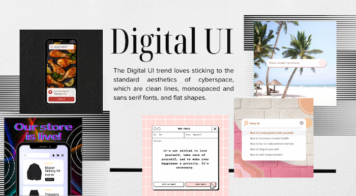
7. Digital UI (User Interface)
This trend creates art based on digital interfaces, with prominent UI elements, such as search bars, an open window, a text message thread, and mock-up social media posts.
The Digital UI trend incorporates clean lines, monospaced and sans serif fonts, and flat shapes.
Because it’s familiar, this style lessens the intrusive and shocking effect of some “loud” design trends.
More mature audiences generally favor this layout style.
If your brand’s visual design is strong, it’s more likely that a prospective customer will notice, like, and remember your content and messages. This will help you grow your business faster.
Want a closer look at all design trends for 2022?
Top 10 Logo Design Trends for 2022
11 Biggest Web Design Trends for 2022
10 Biggest Packaging Design Trends for 2022
7 Hot Graphic Design Trends for 2022
10 Top Book Cover Design Trends for 2022
12 Hottest Marketing Trends of 2022
Want a closer look at all design trends for 2021?
Logo Design Trends 2021: Your Essential Guide to Navigating the Biggest and Hottest Trends
10 Biggest Web Design Trends for 2021
10 Biggest Marketing Trends For 2021
10 Biggest Product Design Trends For 2021
The 7 Biggest Packaging Design Trends For 2021
8 Top Book Cover Design Trends for 2021


